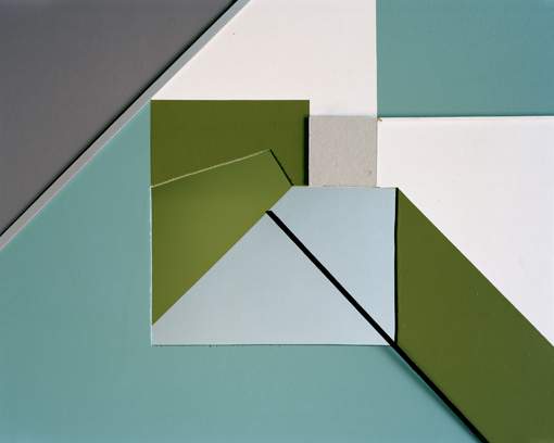
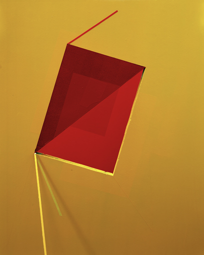
Tamara Lorenz
responce:
Edited responce:
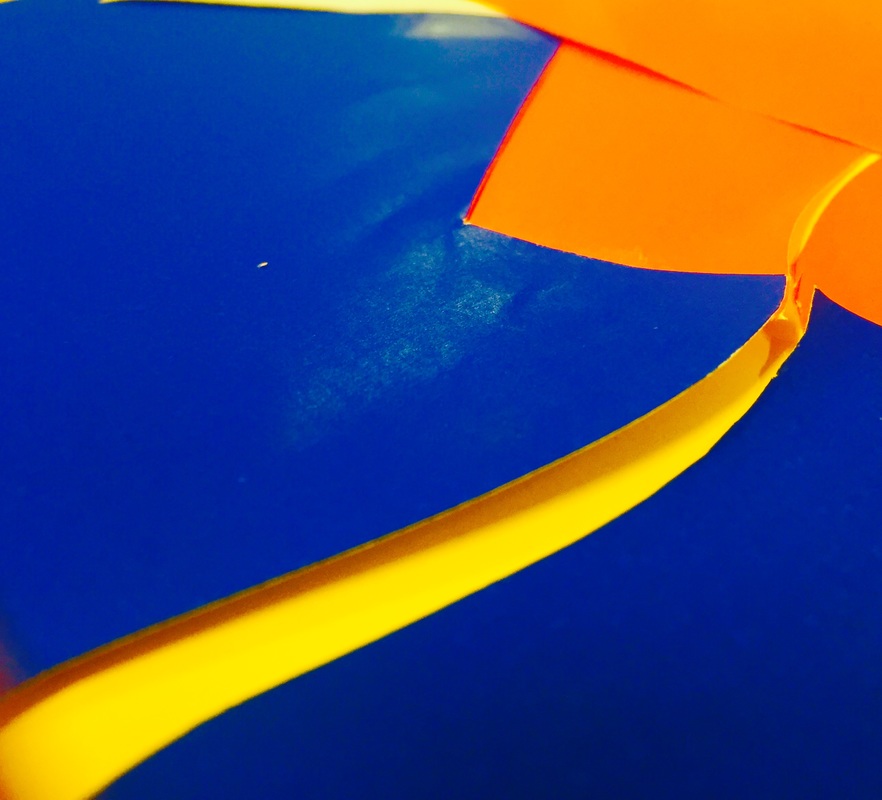
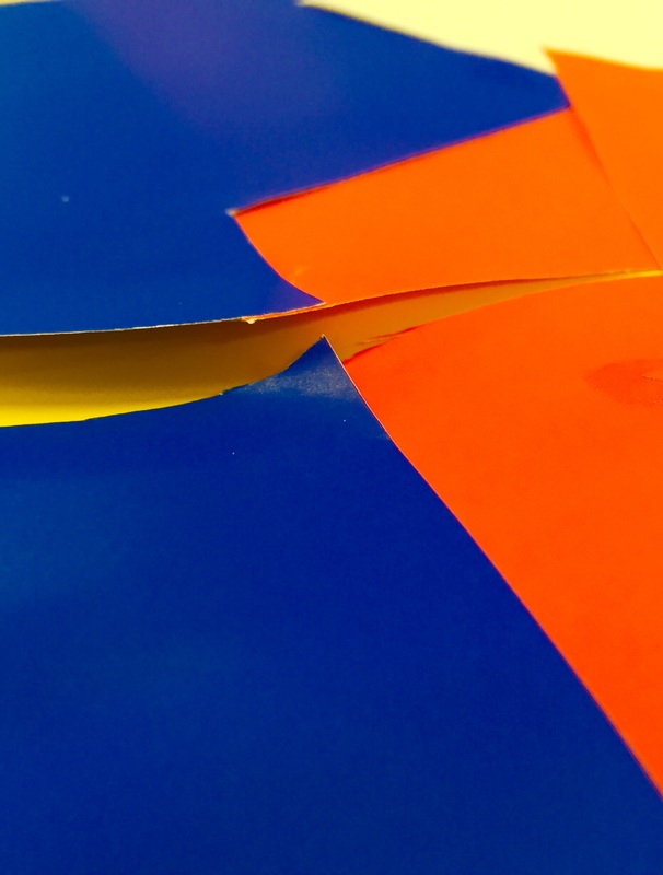
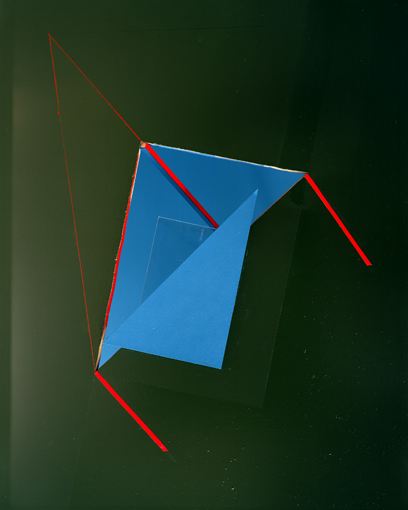
When responding to these images I focused on the way Lorenz uses colour. I thought the use of colour in one particular image was exceptionally interesting. She used mainly green, with blue in the centre and red glimpsing through. The blue and red work well together due to the fact they are complimentary colours. This makes both the red and blue exceptionally deep. In contrast, the blue and green clash, creating and interesting overall effect.
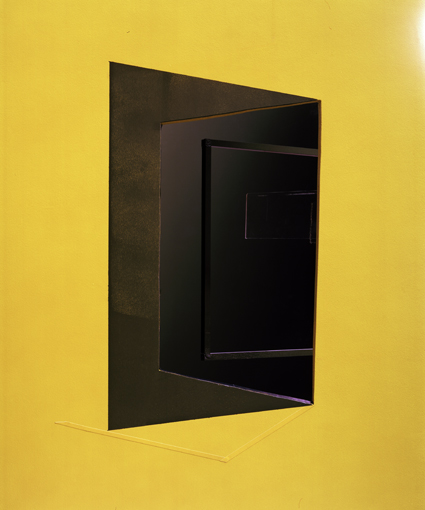
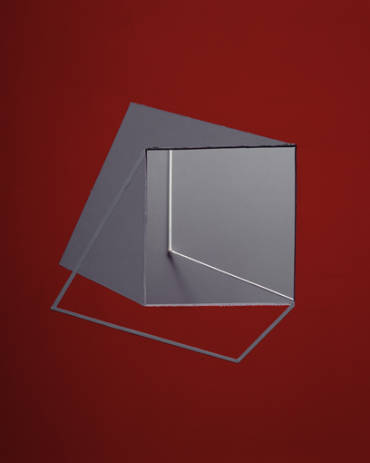
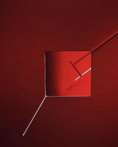
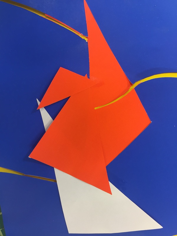
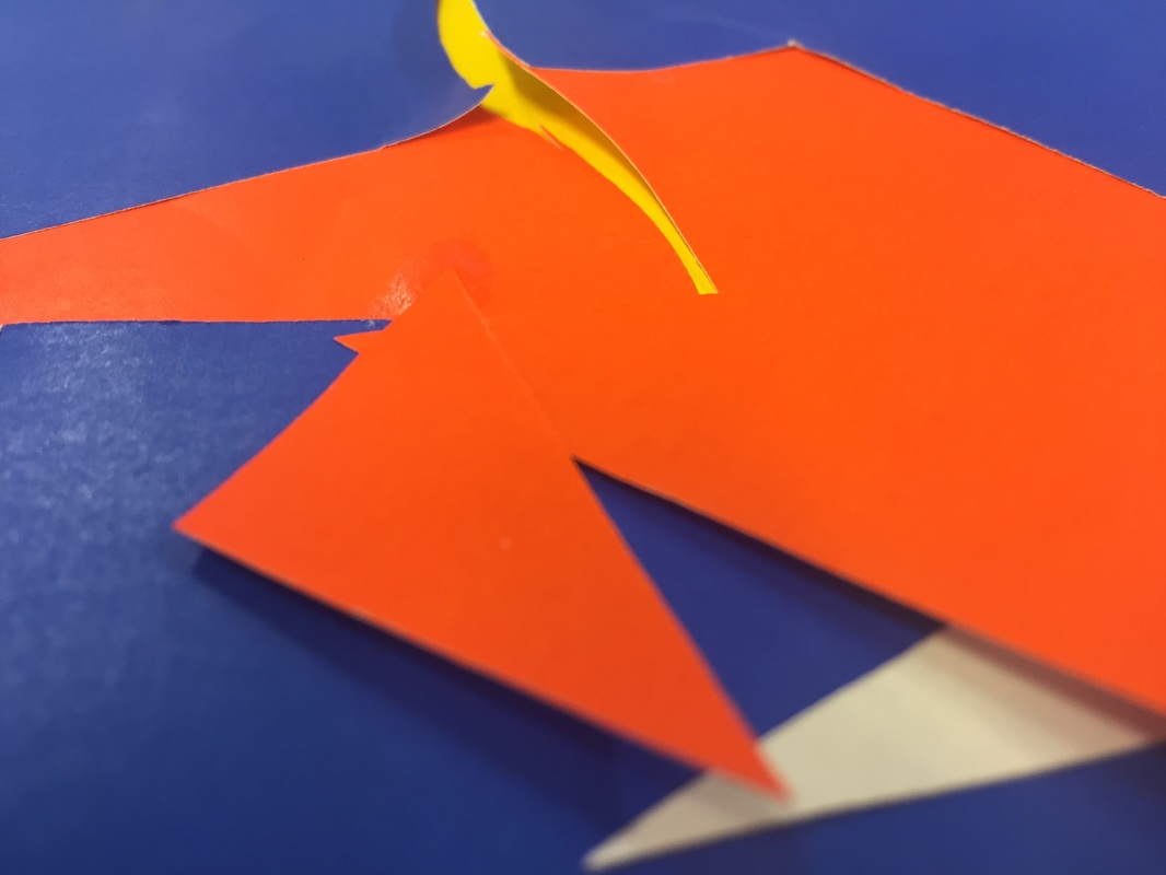
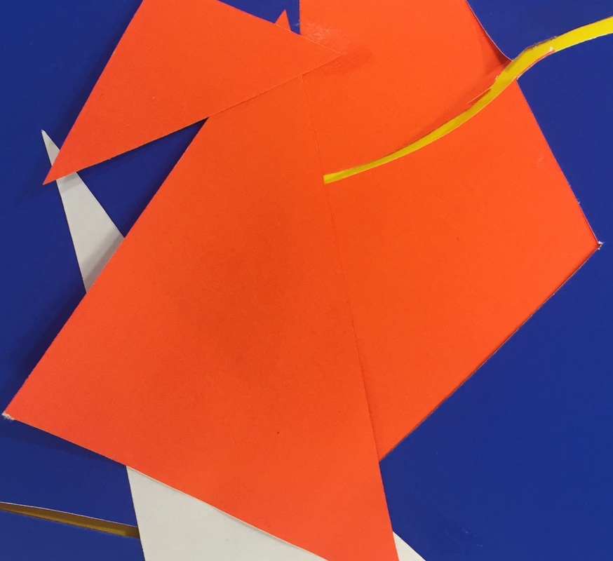
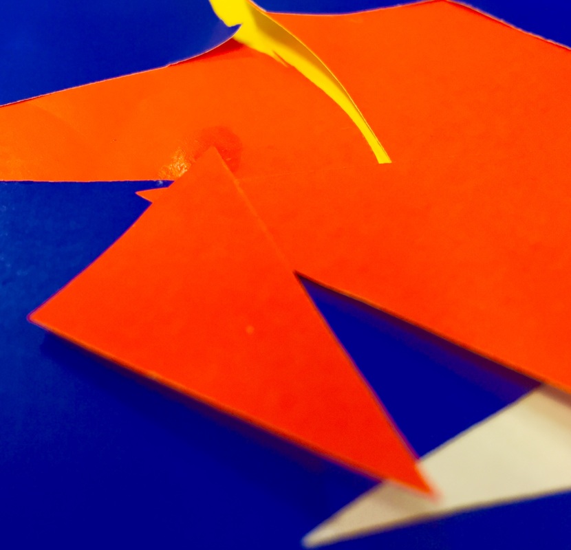
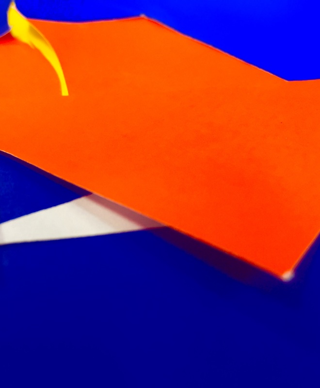
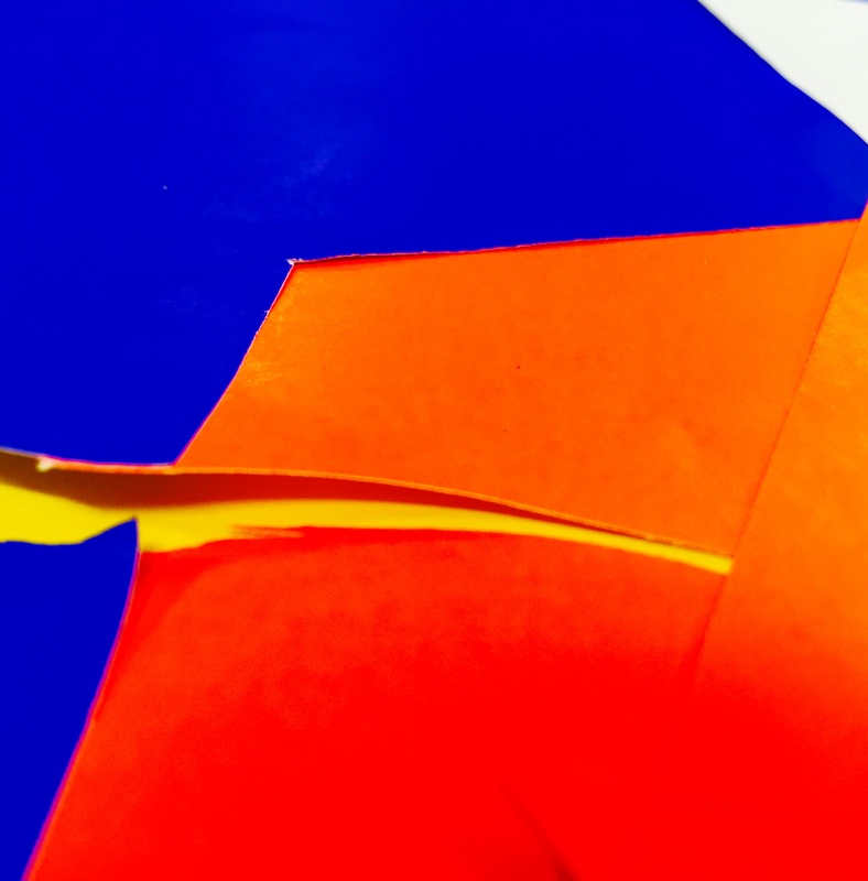
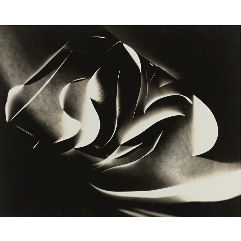
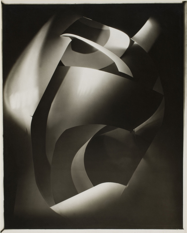
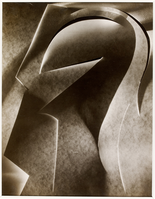
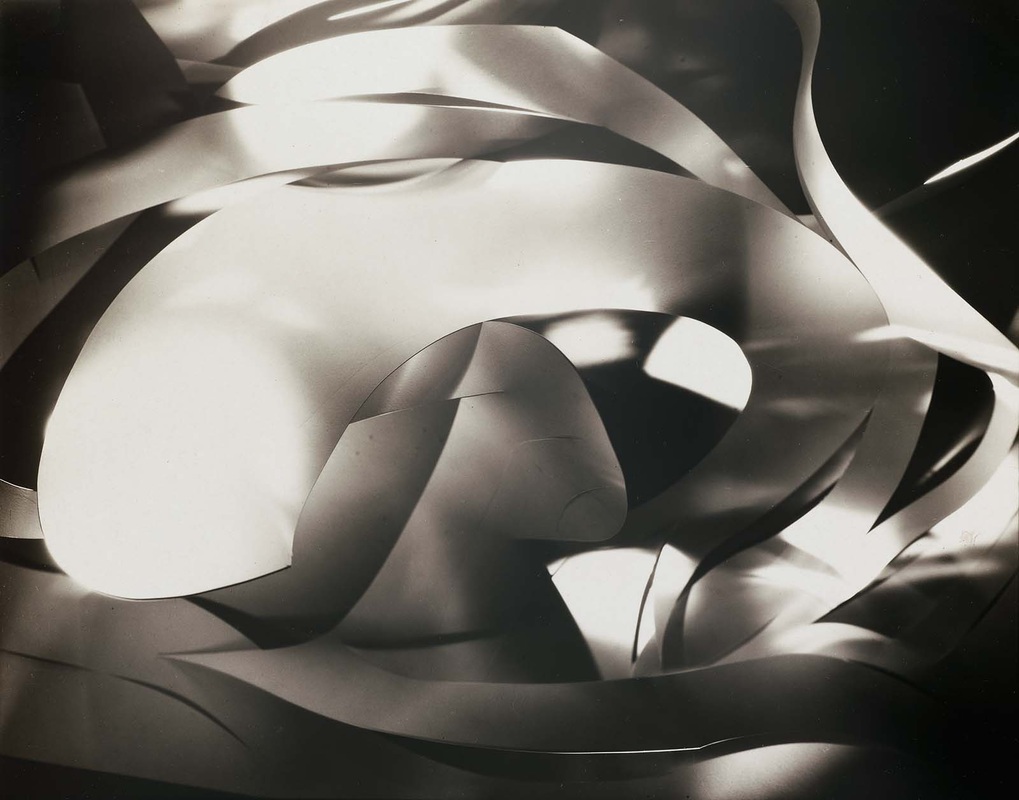
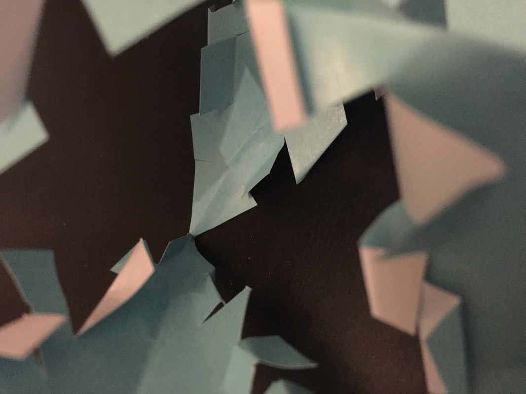
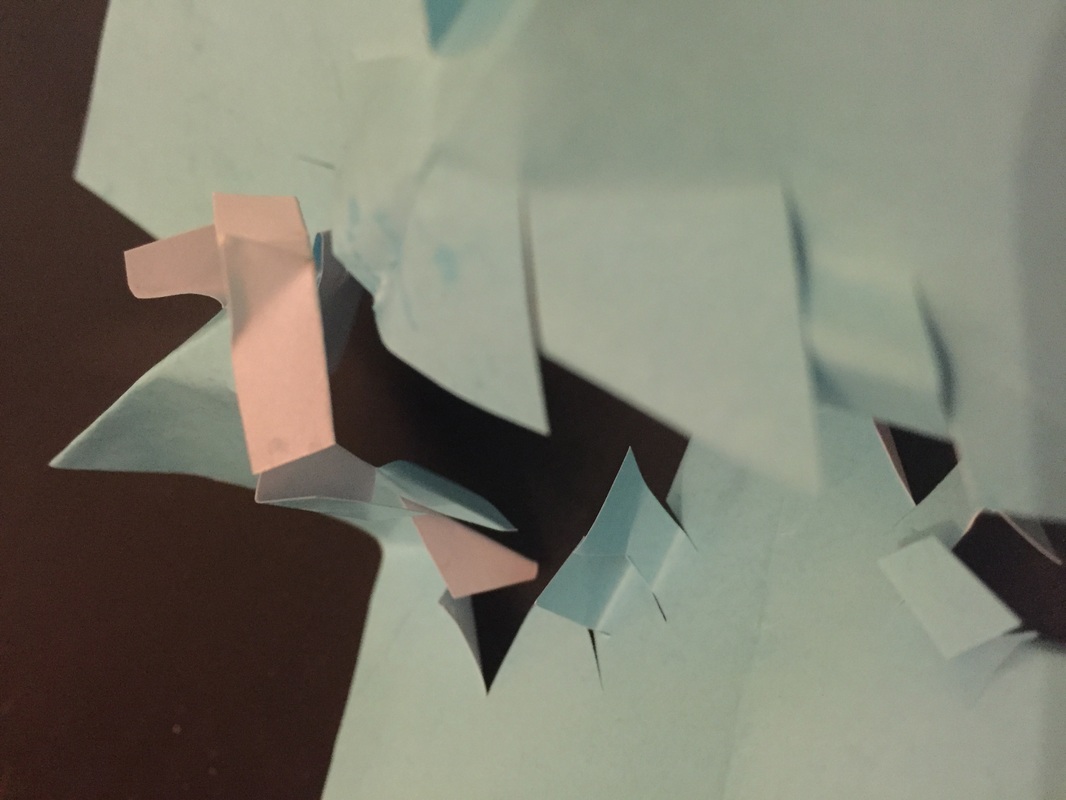
Francis Bruguière
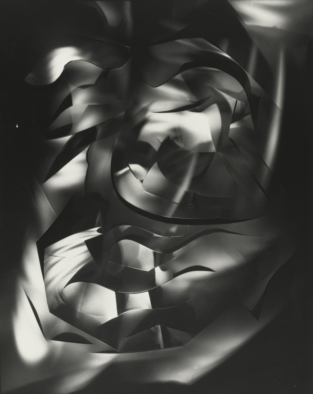
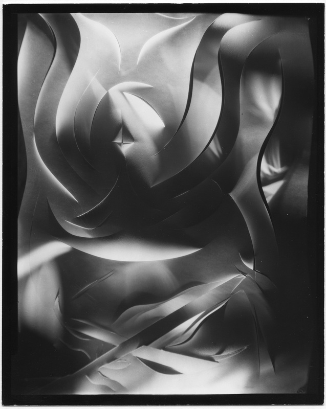
Responce:
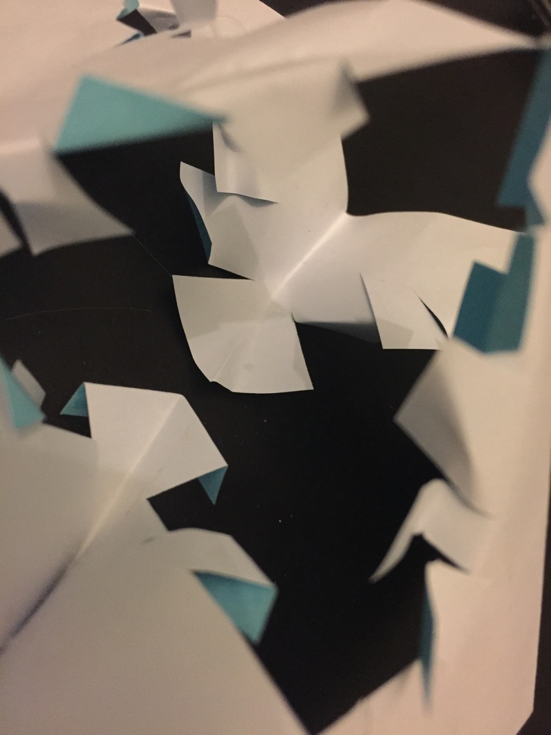
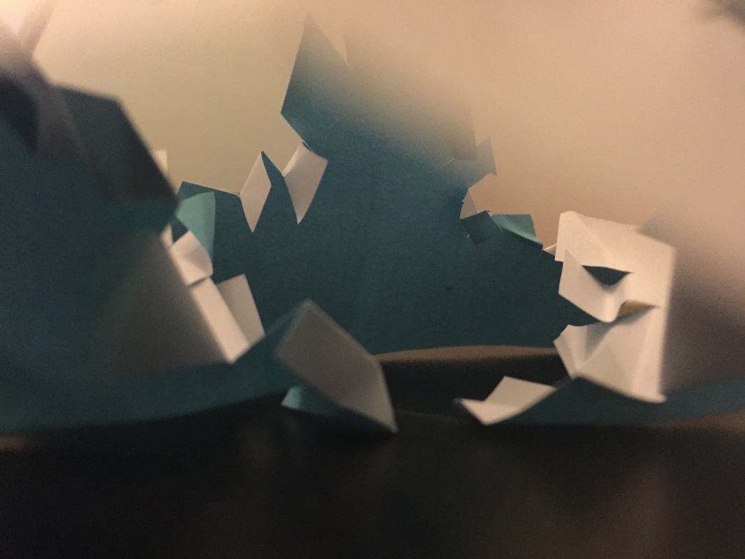
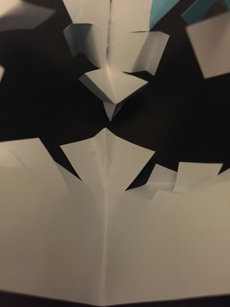
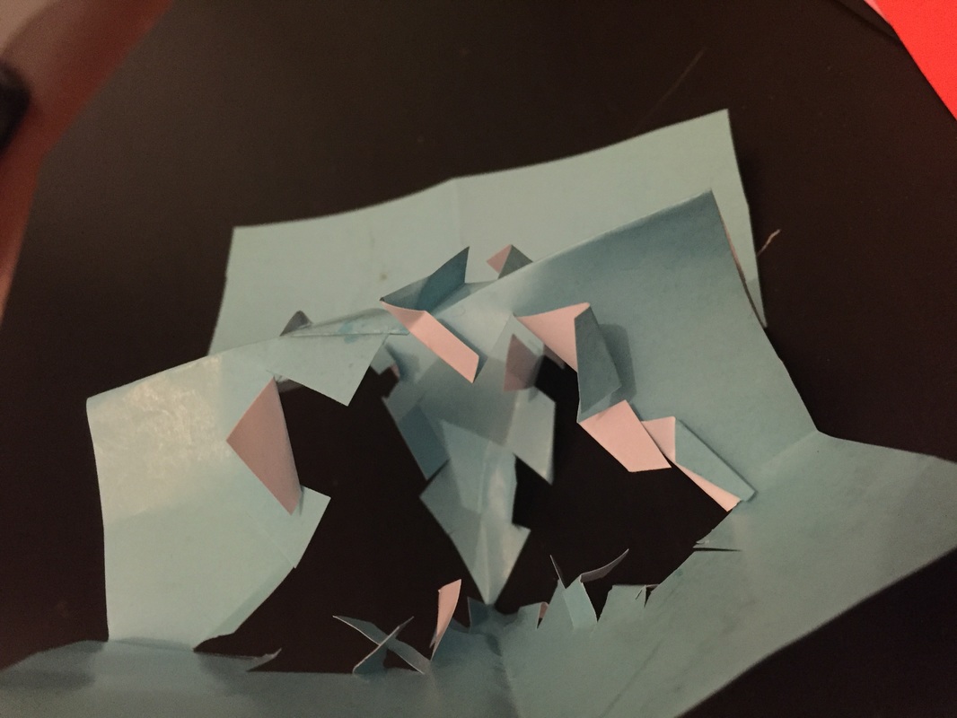
Edited responce:
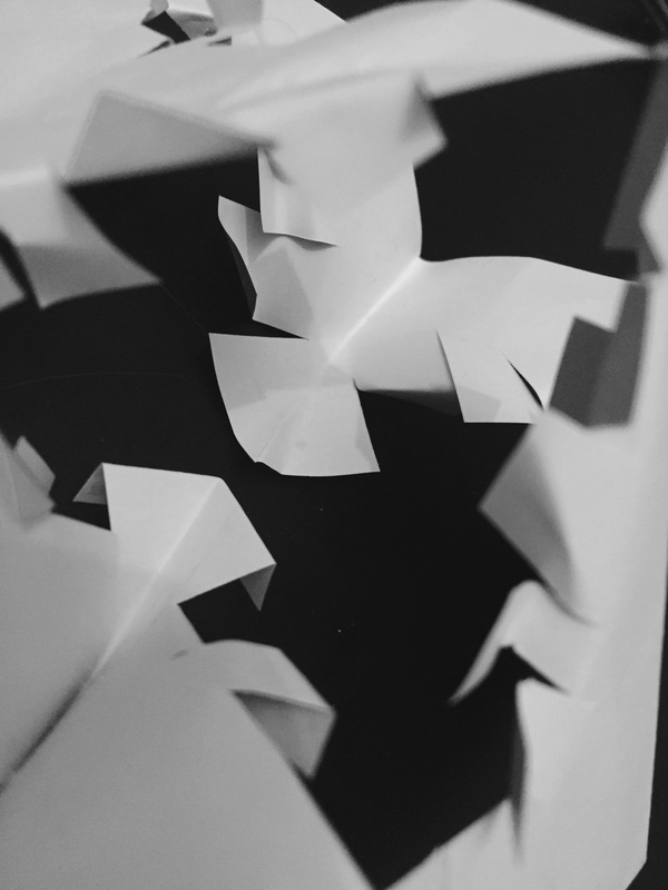
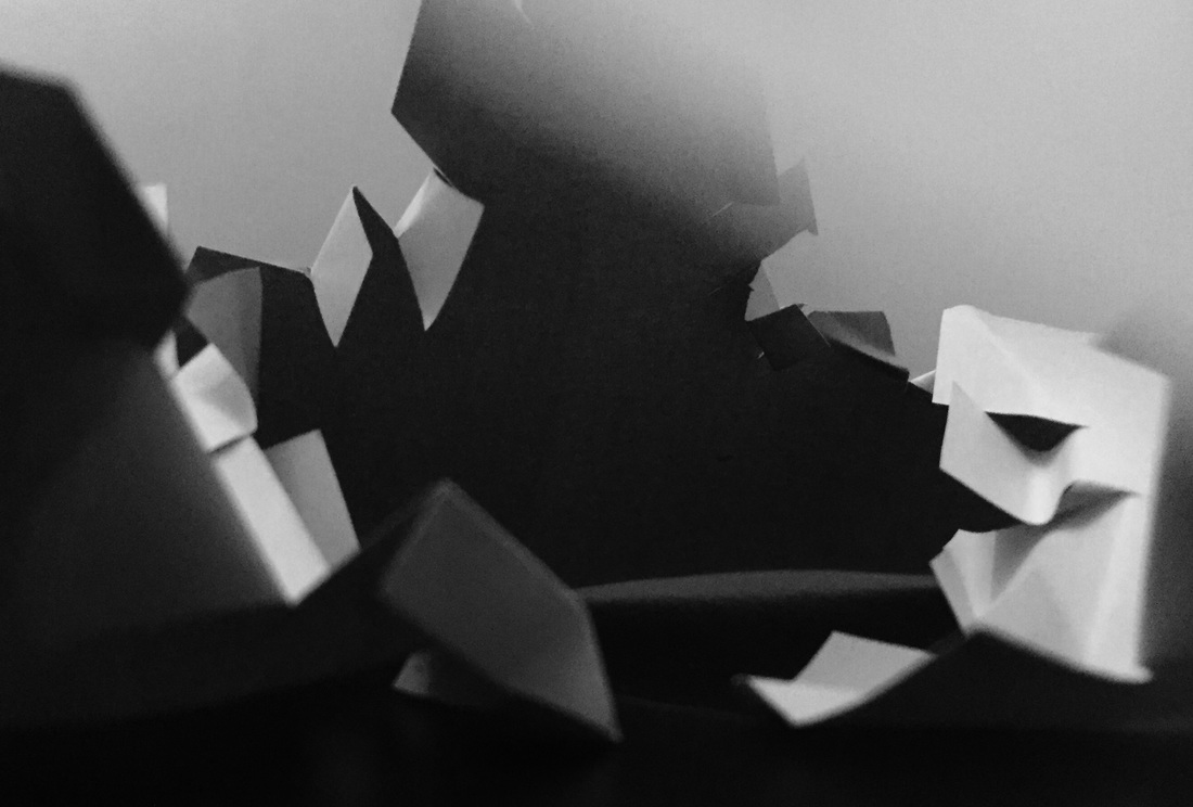
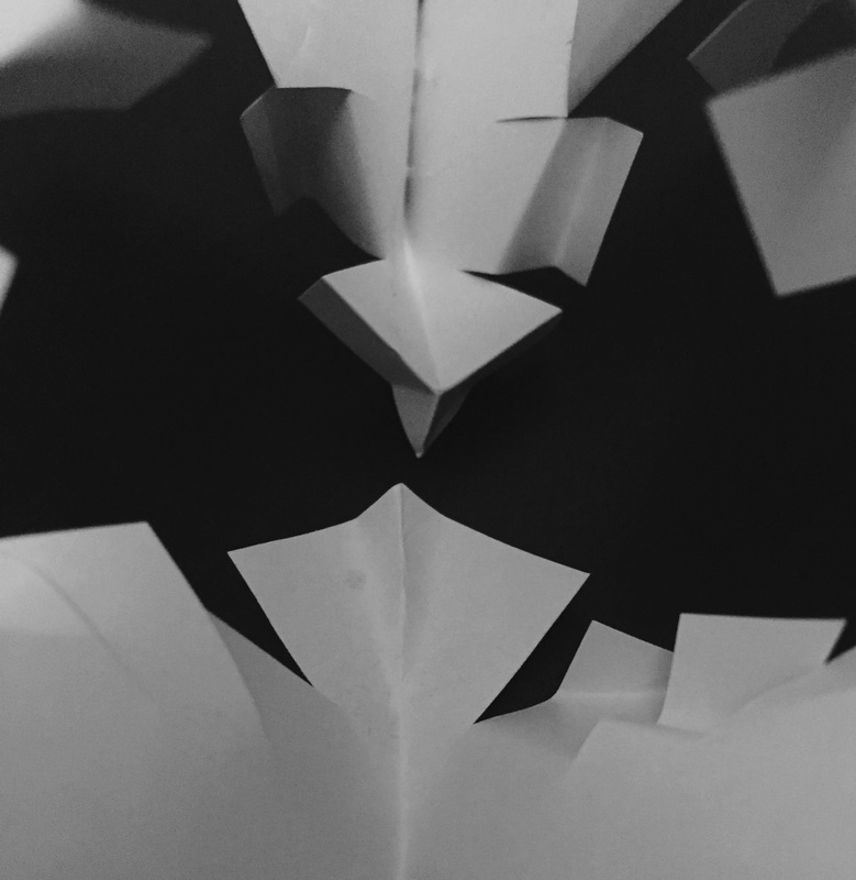
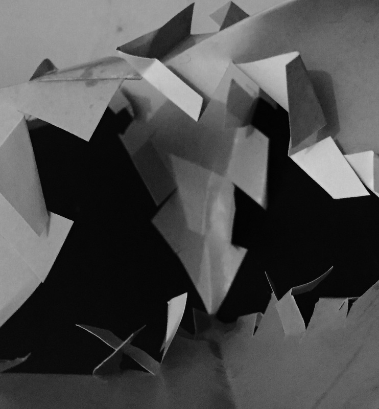
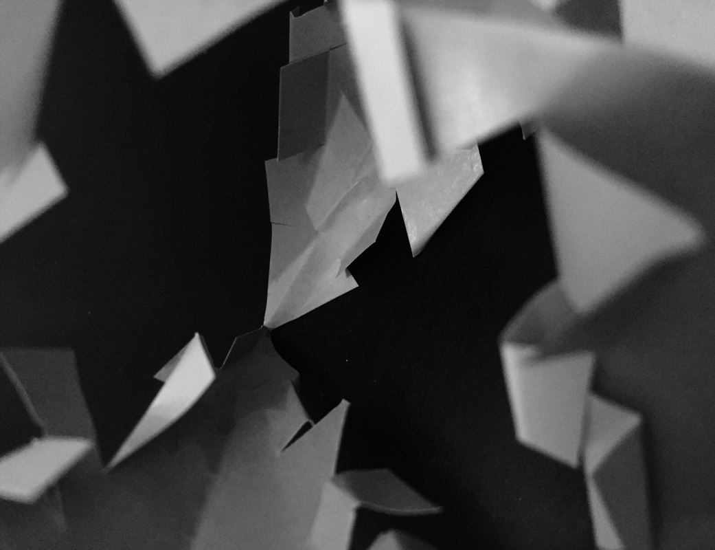
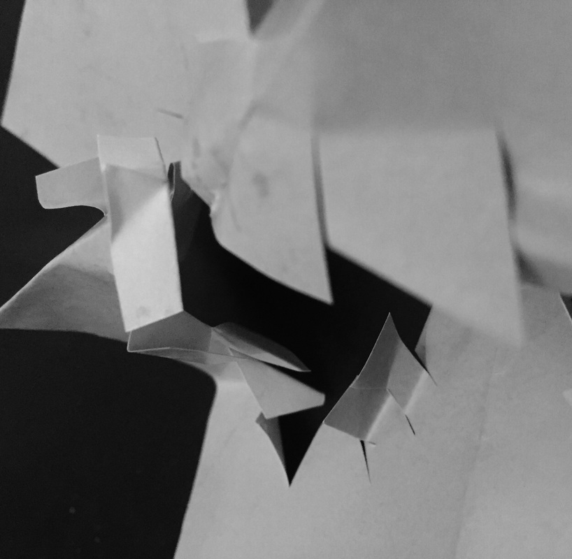
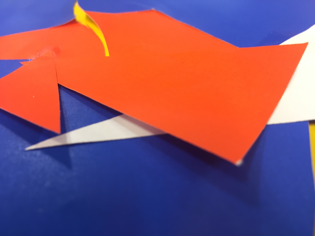
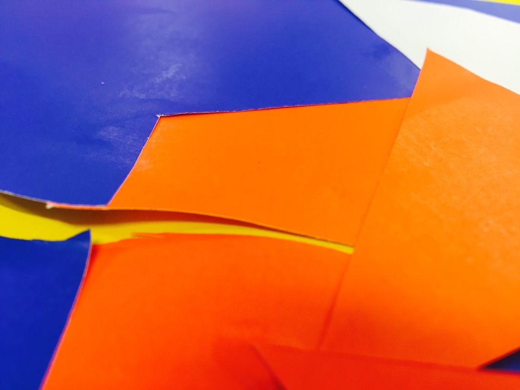
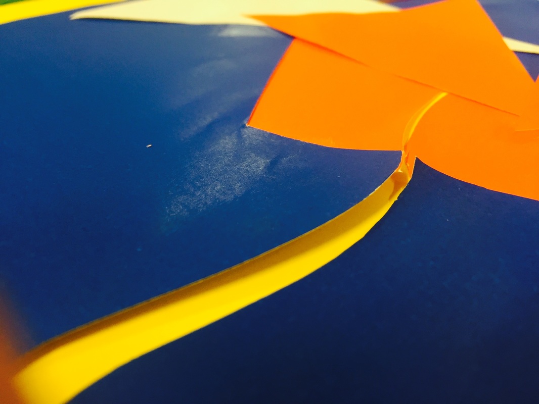
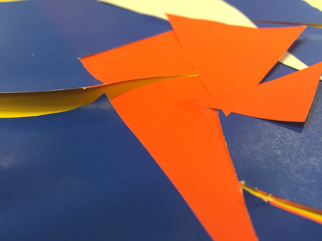
When responding to Francis Bruguiere's forms, i looked at the slits and shapes, as well as the effect they had on light as well as lack of light. I originally chose to use paper that was blue on one side and white on the other, so when photographing the form - even though i attempted to use light in a specific way - the two colours, when in black and white, give the effect of different amounts of light being reflected on the paper. I feel the angles in which i took the photographs reflects that of Bruguiere's work, but the shapes cut into the paper do not particularly reflect his work. I chose not to have curved slits as i thought the texture of the jagged cuts would be more striking and interesting than curved ones. I doing this again, i would take the photographs in a dark room with led lights or torches, making light - rather than shape - a primary focus of the images.
