Man Ray
During his career as an artist, Man Ray allowed few details of his early life or family background to be known to the public. He even refused to acknowledge that he ever had a name other than Man Ray. Man Ray was born as Emmanuel Radnitzky in south Philadelphia, Pennsylvania in 1890. He was the eldest child, his parents were Russian jewish immigrants. In early 1912, the Radnitzky family changed their surname to Ray. Man Ray's brother chose the surname in reaction to the ethnic discrimination and anti-semitism - the prejudice against jews - which was common at the time.
Man Ray displayed artistic and mechanical abilities during childhood. While he attended school, he educated himself with frequent visits to the local art museums, where he studied the works of the Old Masters. After his graduation, Ray was offered scholarship to study architecture but chose to pursue a career as an artist. Man Ray's parents were disappointed by their son's decision to pursue art, but they agreed to rearrange the family's modest living quarters so that Ray's room could be his studio.
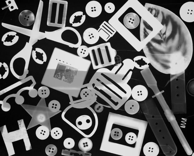
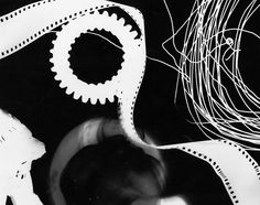
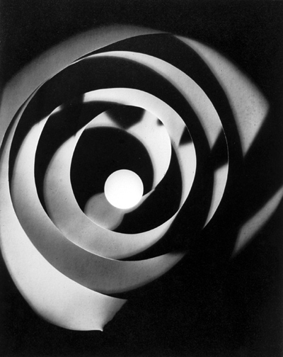
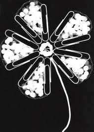
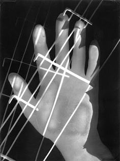
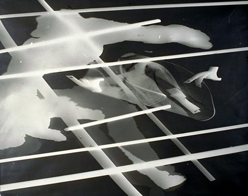
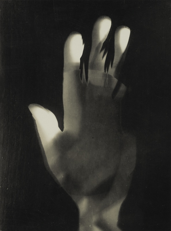
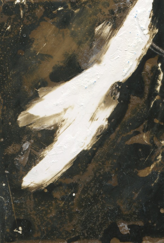
In Man Rays images he uses a lot of spirals which gives an interesting effect to the photograms as it plays with the contrast; leaving areas more exposed than others and therefore some areas more white and clear against the black background. He also places objects onto the paper with thought although sometimes making them look randomised. Some images have more objects than others.
Man Ray displayed artistic and mechanical abilities during childhood. While he attended school, he educated himself with frequent visits to the local art museums, where he studied the works of the Old Masters. After his graduation, Ray was offered scholarship to study architecture but chose to pursue a career as an artist. Man Ray's parents were disappointed by their son's decision to pursue art, but they agreed to rearrange the family's modest living quarters so that Ray's room could be his studio.
In Man Rays images he uses a lot of spirals which gives an interesting effect to the photograms as it plays with the contrast; leaving areas more exposed than others and therefore some areas more white and clear against the black background. He also places objects onto the paper with thought although sometimes making them look randomised. Some images have more objects than others.
MOHOLY NAGY
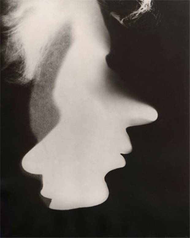
Moholy Nagy was a Hungarian photographer, painter, and many other things, who was also a professor at the Bauhaus school of the arts. He was influenced by the idea of constructivism and was very keen on the idea of the integration of art and technology. He also used photograms as a medium.
In 1923, Moholy-Nagy replaced Johannes Itten as the instructor of the foundation course at the Bauhaus. This effectively marked the end of the school’s expressionistic leanings and moved it closer towards its original aims as a school of design and industrial integration. The Bauhaus became known for the versatility of its artists, and Moholy-Nagy was no exception. Throughout his career, he became proficient and innovative in the fields of photography, typography, sculpture, painting, printmaking, and industrial design. One of his main focuses was photography. He coined the term “the New Vision” for his belief that photography could create a whole new way of seeing the outside world that the human eye could not. His theory of art and teaching is summed up in the book The New Vision, from Material to Architecture. He experimented with the photographic process of exposing light sensitive paper with objects overlain on top of it, called photogram. While studying at the Bauhaus, Moholy’s teaching in diverse media — including painting, sculpture, photography, photomontage and metal — had a profound influence on a number of his students, including Marianne Brandt.
In 1923, Moholy-Nagy replaced Johannes Itten as the instructor of the foundation course at the Bauhaus. This effectively marked the end of the school’s expressionistic leanings and moved it closer towards its original aims as a school of design and industrial integration. The Bauhaus became known for the versatility of its artists, and Moholy-Nagy was no exception. Throughout his career, he became proficient and innovative in the fields of photography, typography, sculpture, painting, printmaking, and industrial design. One of his main focuses was photography. He coined the term “the New Vision” for his belief that photography could create a whole new way of seeing the outside world that the human eye could not. His theory of art and teaching is summed up in the book The New Vision, from Material to Architecture. He experimented with the photographic process of exposing light sensitive paper with objects overlain on top of it, called photogram. While studying at the Bauhaus, Moholy’s teaching in diverse media — including painting, sculpture, photography, photomontage and metal — had a profound influence on a number of his students, including Marianne Brandt.
martha madigan
On her website Martha Madigan states the process she uses:
"A sheet of photographic paper with an emulsion much slower in its light-sensitivity than that used for typical darkroom-based photographic printing is laid out in sunlight and objects are placed upon it in any desired arrangement. Given a five-minute exposure, the uncovered space on the paper around the objects (and, if they’re at all translucent and/or transparent, the areas beneath them) become visibly darkened by the sun. The exposed paper is then processed with gold chloride toner to make the image permanent. This solar photogram may then be exhibited as is or used in turn as a paper negative. For the later purpose, one places it on top of a new unexposed sheet of the same light-sensitive paper and then exposes it to sunlight again. The resulting image or “positive” print displays the reversal of the original paper negative’s tones and/or colors. The varying intensity of sunlight throughout the seasons, as well as the infinite variety of forms in human and botanical nature, make each such print unique, providing the magic of the unexpected."
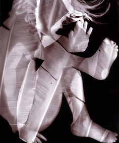
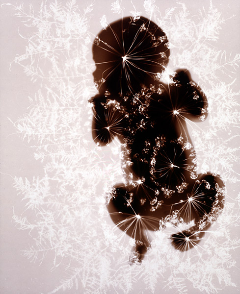
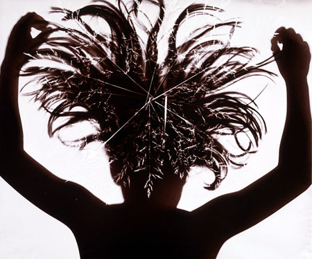
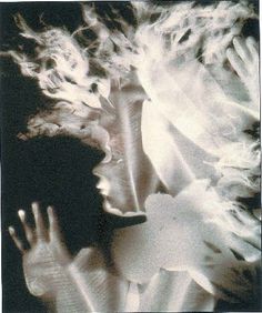
I like her images as i like the way she captures the body focusing on shape and curves, and incorporates patterns onto sections of the silhouettes. I also like the simplicity as it really allows you to focus on the one object and also the contrast against the background.
"A sheet of photographic paper with an emulsion much slower in its light-sensitivity than that used for typical darkroom-based photographic printing is laid out in sunlight and objects are placed upon it in any desired arrangement. Given a five-minute exposure, the uncovered space on the paper around the objects (and, if they’re at all translucent and/or transparent, the areas beneath them) become visibly darkened by the sun. The exposed paper is then processed with gold chloride toner to make the image permanent. This solar photogram may then be exhibited as is or used in turn as a paper negative. For the later purpose, one places it on top of a new unexposed sheet of the same light-sensitive paper and then exposes it to sunlight again. The resulting image or “positive” print displays the reversal of the original paper negative’s tones and/or colors. The varying intensity of sunlight throughout the seasons, as well as the infinite variety of forms in human and botanical nature, make each such print unique, providing the magic of the unexpected."
I like her images as i like the way she captures the body focusing on shape and curves, and incorporates patterns onto sections of the silhouettes. I also like the simplicity as it really allows you to focus on the one object and also the contrast against the background.
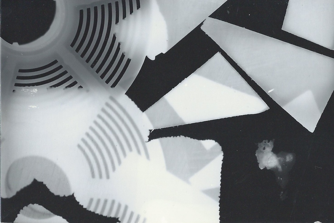
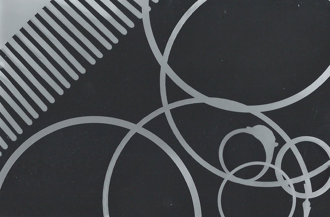
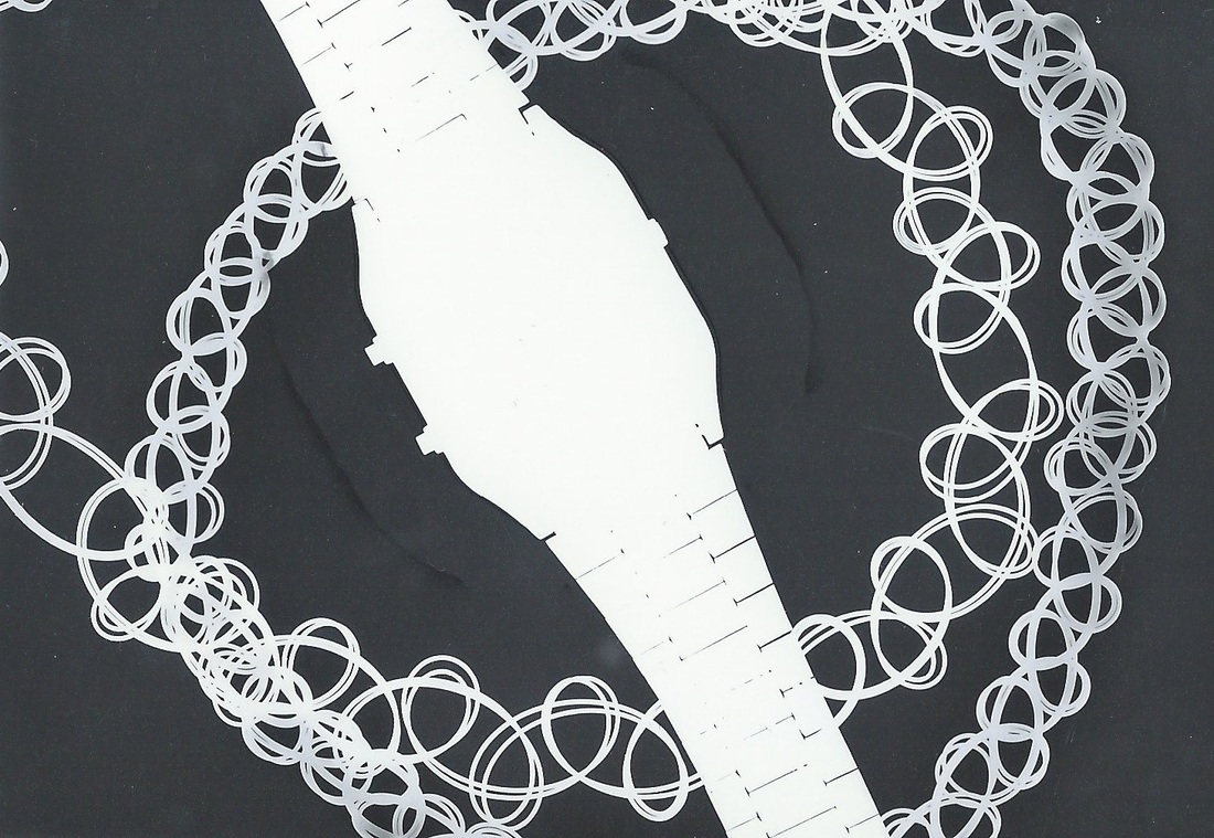
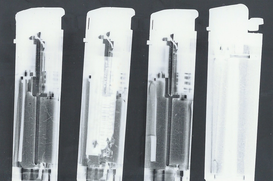
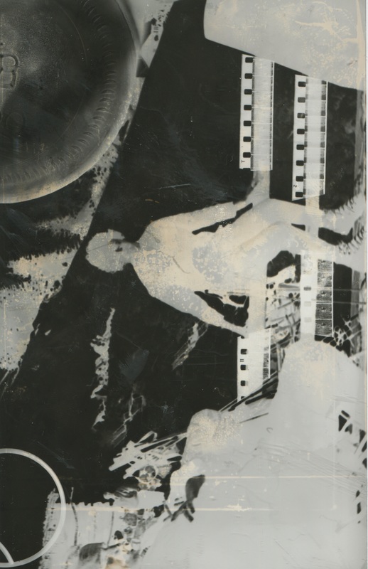
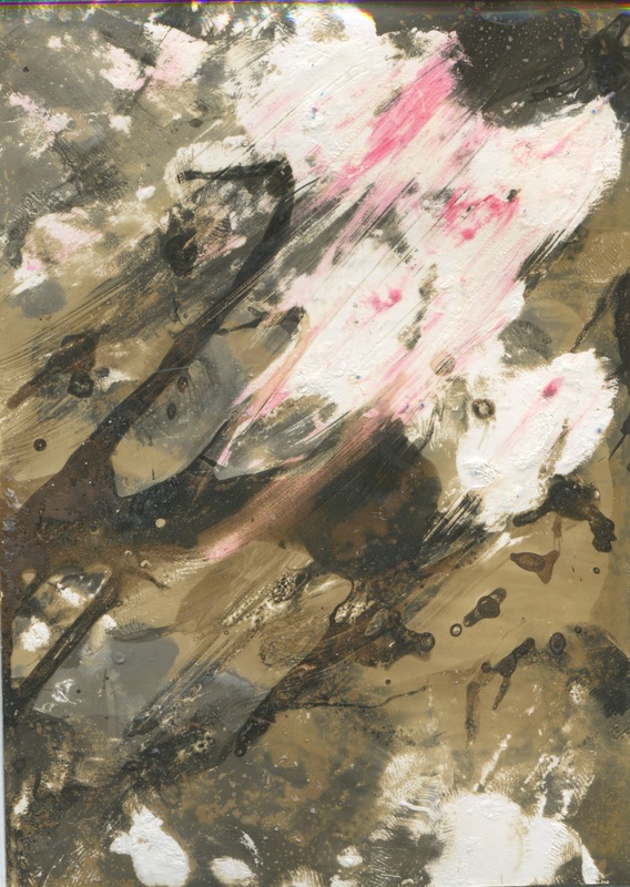
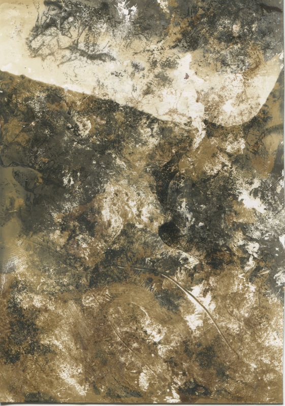
photograms - artist response:
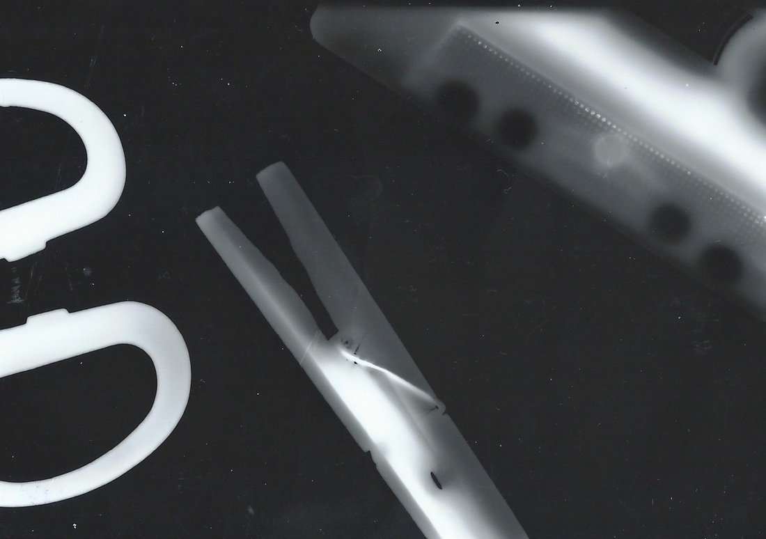
The majority of these images are photograms developed after playing around with the developing process - with the exception of the bottom two. Primarily i was unsure of exposure time and what aperture time to use; hence the first batch of images lacking clarity and contrast. The image on the right is especially grey as i set it to be exposed for 8 seconds on an aperture of 8.
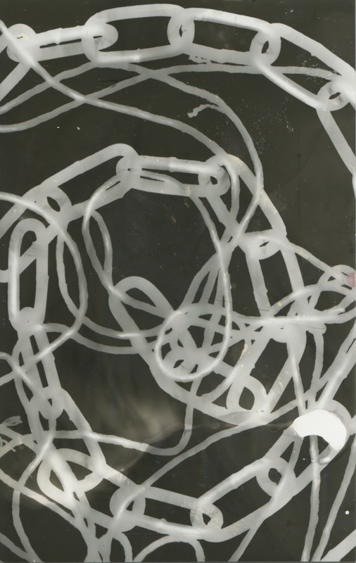
I then went on the next devise the top right image, focusing on lines and circular patterns. I did this in response to man rays images (focusing on spirals). I used an aperture of 5, and exposure time of 4 seconds. When developing i noticed that the shapes could have been crisper and whiter to really stand out on the black.
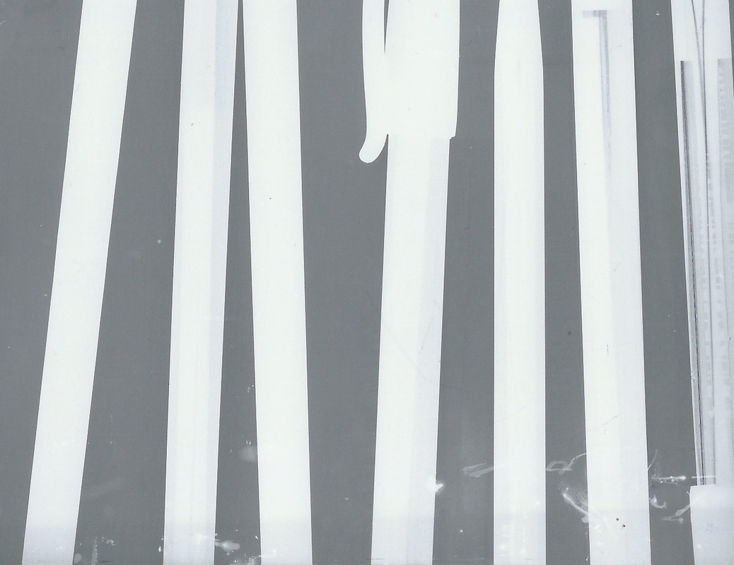
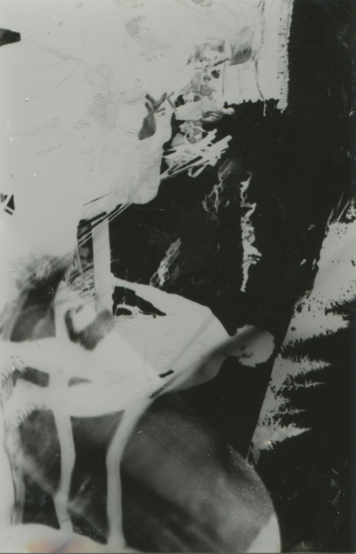
Next i created the middle left image by setting an aperture of 5.6 and exposure time of 6 seconds. I found this over exposed the image slightly - over compensating the element of contrast. As a result of this I assumed that the next photogram should be exposed for a shorter amount of time.
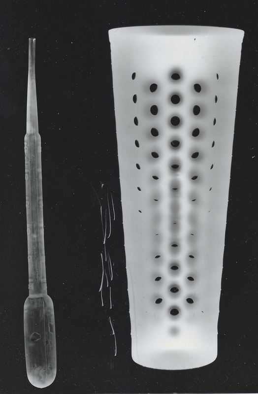
The next image to be made was the middle right image which was made using an aperture of 5.6 and exposure time of 3 seconds. This gave a pleasing result with a satisfying level of contrast as well as crisp detail (for example the scratches on the lighters and the eroding bar code on one).
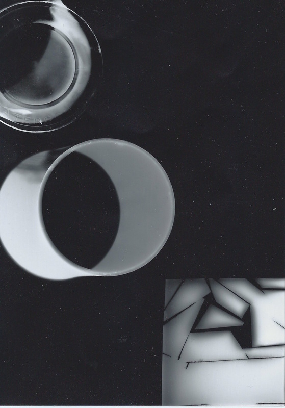
Since i was pleased with the variables on the last image i opted to experiment with the final image. I started my placing the appropriate objects onto the light sensitive paper, but the wrong way round. I then exposed this for 3 seconds, using an aperture of 5.6. Then i turned the paper over to be the correct way up and re-placed the objects and once again exposed the paper to light using the same variables, and developed those accordingly.
I then went on the next devise the top right image, focusing on lines and circular patterns. I did this in response to man rays images (focusing on spirals). I used an aperture of 5, and exposure time of 4 seconds. When developing i noticed that the shapes could have been crisper and whiter to really stand out on the black.
Next i created the middle left image by setting an aperture of 5.6 and exposure time of 6 seconds. I found this over exposed the image slightly - over compensating the element of contrast. As a result of this I assumed that the next photogram should be exposed for a shorter amount of time.
The next image to be made was the middle right image which was made using an aperture of 5.6 and exposure time of 3 seconds. This gave a pleasing result with a satisfying level of contrast as well as crisp detail (for example the scratches on the lighters and the eroding bar code on one).
Since i was pleased with the variables on the last image i opted to experiment with the final image. I started my placing the appropriate objects onto the light sensitive paper, but the wrong way round. I then exposed this for 3 seconds, using an aperture of 5.6. Then i turned the paper over to be the correct way up and re-placed the objects and once again exposed the paper to light using the same variables, and developed those accordingly.
photograms using objects and acetate
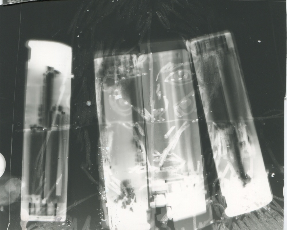
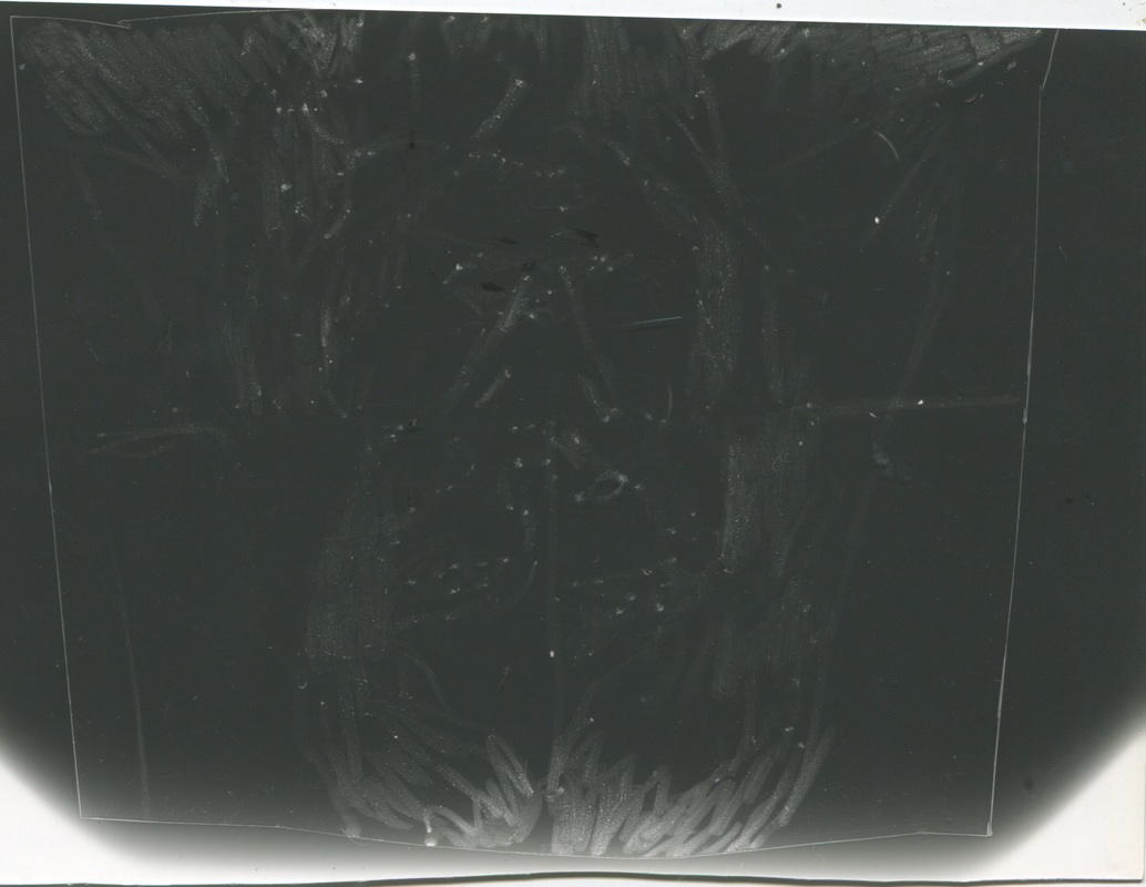
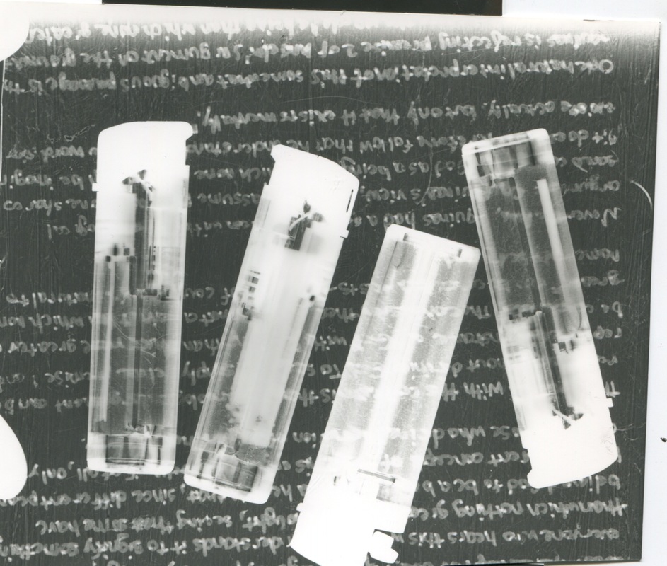
i like these images as i like the effect the lighters have with the acetate. On one piece of acetate i drew a face and the other i had a piece of writing. The lighter, as a transparent plastic, gave an enlarging effect to the acetate which was rather effective. I also accidentally moved the piece with the drawing on acetate and the lighters on top which gave a really interesting effect which was kind of ghostly and really interesting. I used an aperture of 5.6 for all of the images and exposed then for 3/4 seconds which i think works nicely as it gives the desired amount of detail. The drawing on the acetate wasn't done with a dark enough pen and therefore wasn't clear on the photogram on its own it was therefore that the lighters created clarity in the image. Due to exposing on the right aperture for the correct amount of time, the writing came out defined and looked effective as a detail for the background behind the lighters; as the acetate was on top of the lighters rather than underneath.
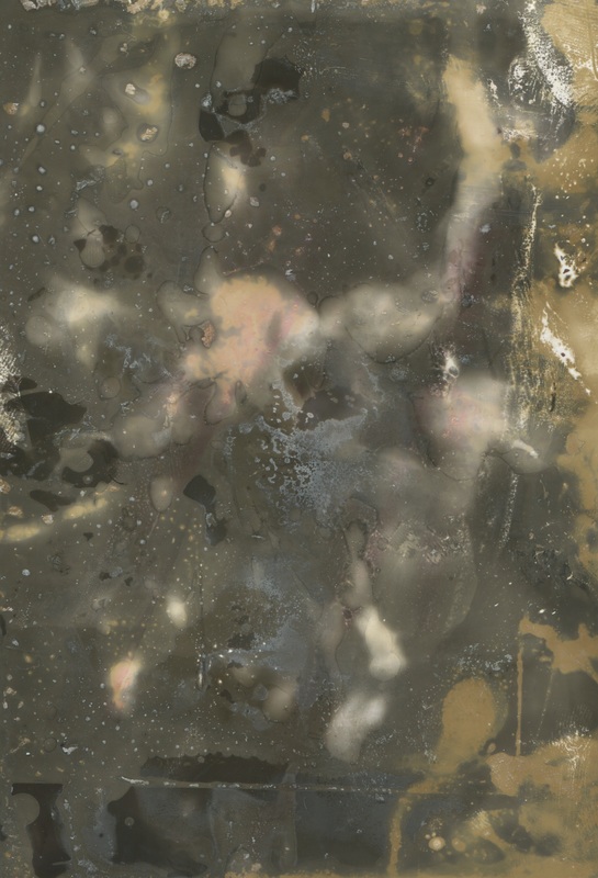
experimenting further
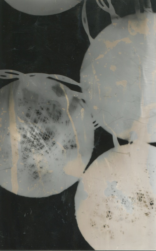
first of all i used objects as i have done before - these are the two images on the right. First i used a chain and string to experiment with layering and i think this was effective as there are some section where they overlapped that are whiter. I think this is effective and the contrast between the deep white, faded white, and black background gives the image depth. Next i used fairy lights as as i thought the texture of the mesh was interesting and would give an interesting effect as a photogram so i wanted to test this. Also i thought the spherical shape would once again experiment with layers and some sections again were once again whiter. On the right i used a section of film and placed it in the enlarger and i also placed a bottle over a section which made the image distorted and gave the image a semi zoomed effect. I found capturing detail in these difficult - hence repeating the process twice. I also used cut up film for further detail just to add layers and detail to make the image more interesting.
pierre cordier - chemigrams
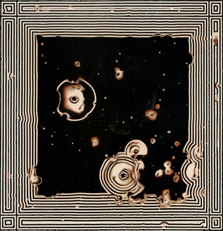
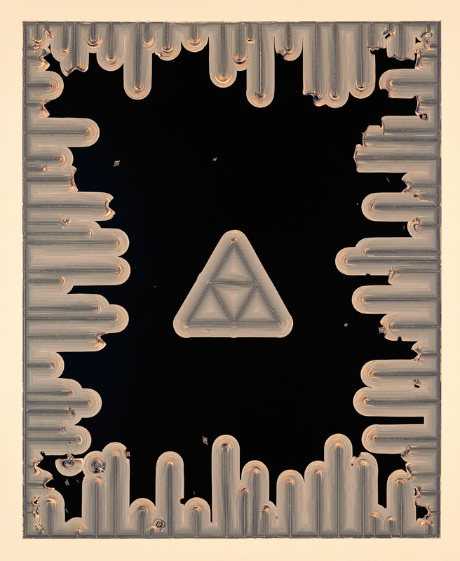
Pierre Cordier was born on January 28th, 1933 in Brussels was known as the 'father of the chemigram'. He is a Belgian artist and considered the creator of the chemigram and of its development as an artistic expression.
On November 10, 1956, writing a dedication with nail polish on photographic paper to a young German woman named Erika, Pierre Cordier discovered what he later called the chemigram. This technique, which "combines the physics of painting (varnish, oil, wax) and the chemistry of photography (photosensitive emulsion, developer, and fixer), without the use of a camera or enlarger, and in full light", became for him a source of experiments and a plastic language. It opened up a new visual space at the boundaries of painting, photography, and writing, allowing him "to create entrancing images impossible to realise by any other means.
I found the bottom left image particularly interesting in this chemigram Cordier recasts Klee's painting diagrammatically, transforming the solar disc into a triangle and retaining the original placement of forms but as if in an alien code. Paul Klee's original image shows prehistoric-looking creatures and foliage surrounding a solar motif. I like the idea of giving the chemigram a ritualistic feel as well as strongly incorporating the idea of geometry. I also like the way the lines on the outer boarder contrast with the empty space in the middle surrounding the triangle, this makes the shape really stand out.
Chemigrams RESPONSE:
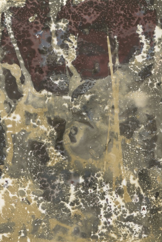
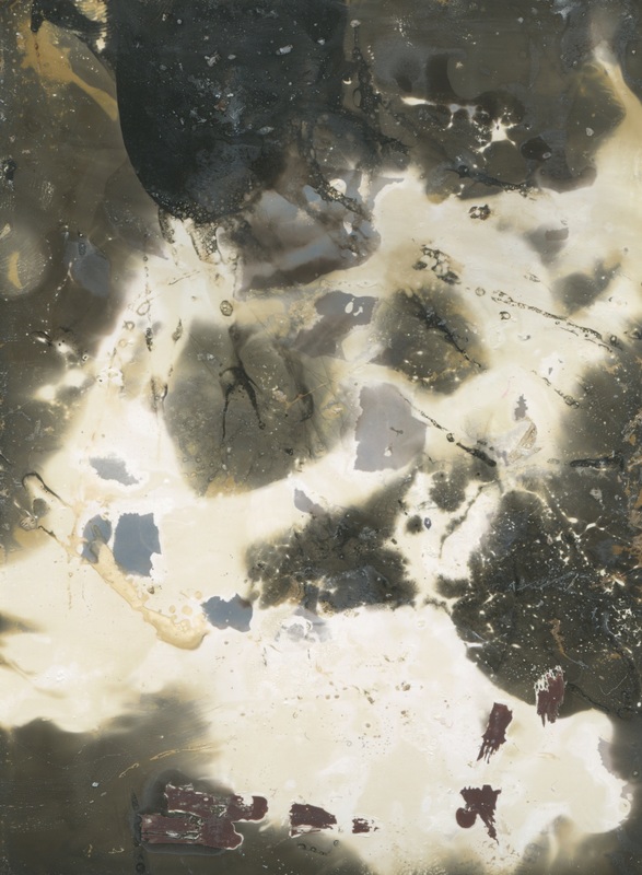
When creating these chemigrams i used a range of chemicals to develop various effects. The image on the top left i used oil, bleach and ink (which gave the red effect). The oil preserved a lighter section and the bleach made the image black. To create the second image used bleach and cream and i applied it to the paper using a tissue which gave a graduated blotted effect. The image second left i used window cleaner and oil. before doing anything to the paper i exposed it to natural light which over all lightened the paper. when developing the image i dipped half of the image into the fix and left half which made half reddy and the other half milky. The bottom right image had cream and bleach and oil put on it which made the contrasting tones which i though effective as it created an interesting and varying pattern.
