Photo books
Vertical veiw - horst hamann, 2001
Subject Matter:
- This book is aimed to show the world from quite literally a vertical view, as our eyes are trained to look at things from a horizontal perspective.
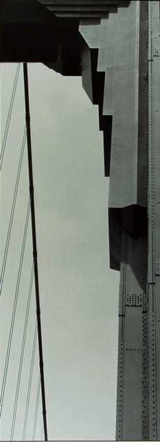
- He mainly photographs buildings, but there are also some images of a basketball player. He takes images around the world, from San Fransisco, London, Paris, Frankfurt, and Hong Kong.
Cover Design:
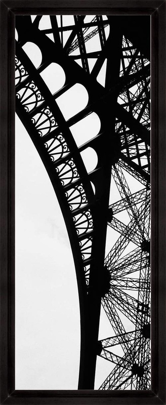
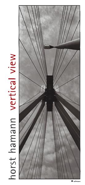
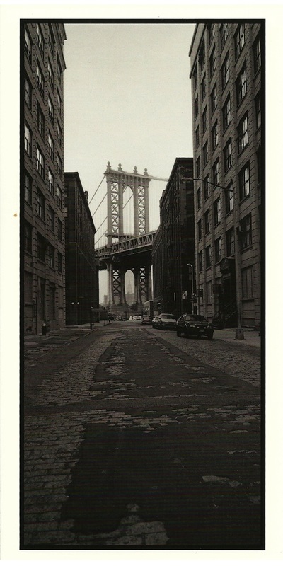
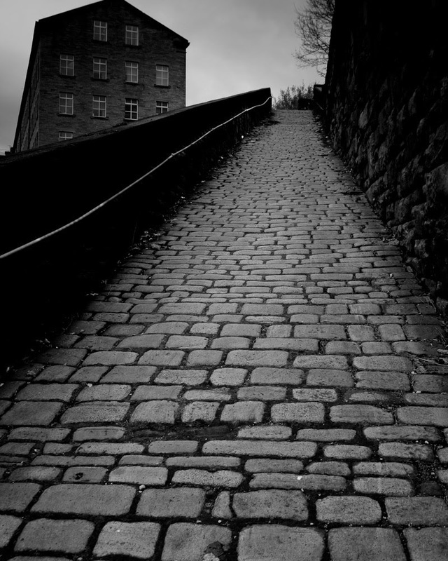
- The image used for the cover is taken form a worms-eye view, the image is central, so it almost look symmetrical. The image has interesting lines and various tones, which look effective in contrast to the light grey tones of the sky. In the top right corner there is also a lamppost, which helps the image demonstrate verticality.
- This image fit the long height and short width of the book, and is on a white background with a black boarder. On the left hand side the artists name and the book title is written vertically; the whole cover is in black and white apart from the red title - this makes it really stand out.
Strength of the Photography:
-Firstly, and quite obviously, the perspective makes the collection stand out. Also the detail hamann looked at contours and lines makes each photo detailed and therefore interesting as theres a lot to look at.
-Each photo creates a totally new persepective for the viewer, and makes each structure interesting and individually significant. The photographer intended to do this, and was therefore effective in his motives.
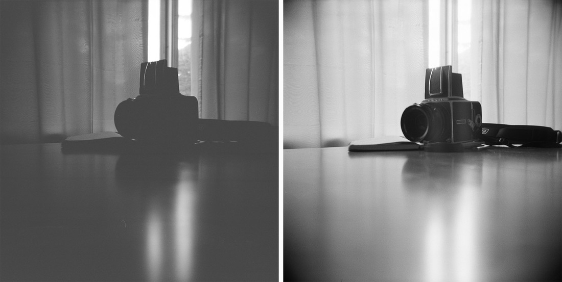
-His absolute black and white compositions lend these photo a dramatic, often surreal quality, and suggest unique reinterpretations of the world's most famous and recognisable cityscapes. He used a 6 3/4" X 2 1/4" panaramic camera, which fits the theme of verticality.
-All of his photographs presented are unconditionally sophisticated, and entirely aesthetically pleasing. He took five years to complete this book, and his finished collection is precisely fitting and fully representative.
Page Layouts:
-Each photo seems purposely placed in a particular order, rather than randomly placed. The pages seem organised, and neat. Each double page has a photo on one side and a quote or statement on the other, on a white page. Each placements seems conscious, which is logically coherent considering the theme running throughout the book, and purposeful decisions.
- This book is aimed to show the world from quite literally a vertical view, as our eyes are trained to look at things from a horizontal perspective.
- He mainly photographs buildings, but there are also some images of a basketball player. He takes images around the world, from San Fransisco, London, Paris, Frankfurt, and Hong Kong.
Cover Design:
- The image used for the cover is taken form a worms-eye view, the image is central, so it almost look symmetrical. The image has interesting lines and various tones, which look effective in contrast to the light grey tones of the sky. In the top right corner there is also a lamppost, which helps the image demonstrate verticality.
- This image fit the long height and short width of the book, and is on a white background with a black boarder. On the left hand side the artists name and the book title is written vertically; the whole cover is in black and white apart from the red title - this makes it really stand out.
Strength of the Photography:
-Firstly, and quite obviously, the perspective makes the collection stand out. Also the detail hamann looked at contours and lines makes each photo detailed and therefore interesting as theres a lot to look at.
-Each photo creates a totally new persepective for the viewer, and makes each structure interesting and individually significant. The photographer intended to do this, and was therefore effective in his motives.
-His absolute black and white compositions lend these photo a dramatic, often surreal quality, and suggest unique reinterpretations of the world's most famous and recognisable cityscapes. He used a 6 3/4" X 2 1/4" panaramic camera, which fits the theme of verticality.
-All of his photographs presented are unconditionally sophisticated, and entirely aesthetically pleasing. He took five years to complete this book, and his finished collection is precisely fitting and fully representative.
Page Layouts:
-Each photo seems purposely placed in a particular order, rather than randomly placed. The pages seem organised, and neat. Each double page has a photo on one side and a quote or statement on the other, on a white page. Each placements seems conscious, which is logically coherent considering the theme running throughout the book, and purposeful decisions.
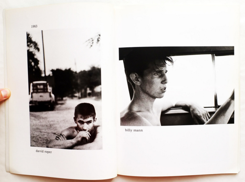
Tulsa - Larry Clark, 1971
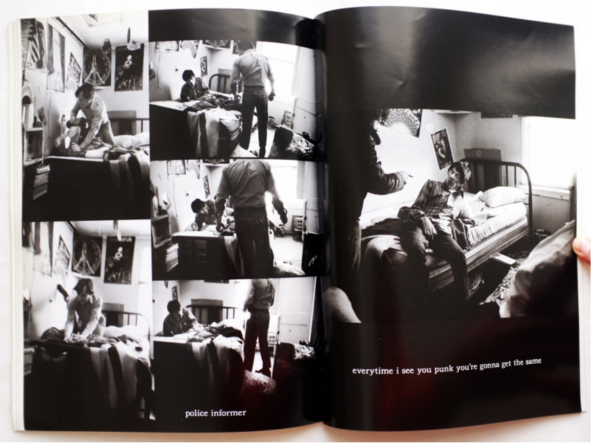
This book is the first of it's kind; showing sex, drugs, and violence. It was therefore extremely controversial. Some thought it inspirational and others devastating. The book made a huge impact in the world of photography and cinema; the book has been used in various films. In contrast, it has been said, by the press, to be a devastating portrait of an american tragedy. People had not seen anything like it before. The book captures deviance; there is a juxtaposition of the status quo in america at the time, it shows how dark it really was in contrast to how it was portrayed. As a teenager, Larry got involved with drugs, and as he'd have a camera with him, he would take photographs. His parents were photographers, and owned the 'Lew Clark' photography studio. His mother was the main portrait photographer- specialising in people and their pets; Larry would assist her. Tulsa ignored the book, as it gave it a bad reputation and didn't want to be associated for the things the book entailed.
I like that the images are dark, because it corresponds with the dark content of the images. There is also a more black and white, high contrast, under exposed feel to the images which makes them bold. This also shows the way the book divided society, going to one extreme to another - no grey areas. The images are seemingly thoughtfully placed on the page and each double page is related. This makes the book feel complete and like a book with a theme rather than a collection of images.
I like that the images are dark, because it corresponds with the dark content of the images. There is also a more black and white, high contrast, under exposed feel to the images which makes them bold. This also shows the way the book divided society, going to one extreme to another - no grey areas. The images are seemingly thoughtfully placed on the page and each double page is related. This makes the book feel complete and like a book with a theme rather than a collection of images.
Compare:
Both books from the 1970's are in intense black and white, with a grainy sort of texture. They are also on controversial topics, in contrast to the book from the 2000s - which is simply giving a different perspective rather than conveying controversy. The images are also less intense, and more detailed. Also, rather than capturing a moment - like the 70s books - the 00s book is capturing an angle, and structures. The presentation is also more individual in the 00s book as the layout is dependent in communicating Hamman's idea; whereas in both the 70s books the layout is more generic, although the link between the images is far more thought through.
Both books from the 1970's are in intense black and white, with a grainy sort of texture. They are also on controversial topics, in contrast to the book from the 2000s - which is simply giving a different perspective rather than conveying controversy. The images are also less intense, and more detailed. Also, rather than capturing a moment - like the 70s books - the 00s book is capturing an angle, and structures. The presentation is also more individual in the 00s book as the layout is dependent in communicating Hamman's idea; whereas in both the 70s books the layout is more generic, although the link between the images is far more thought through.
Initial response - photobook mock experiment:


Selected edited images:
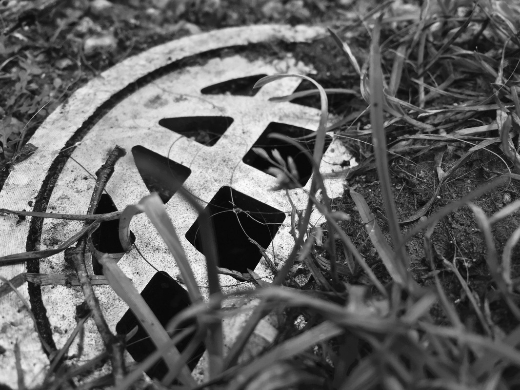
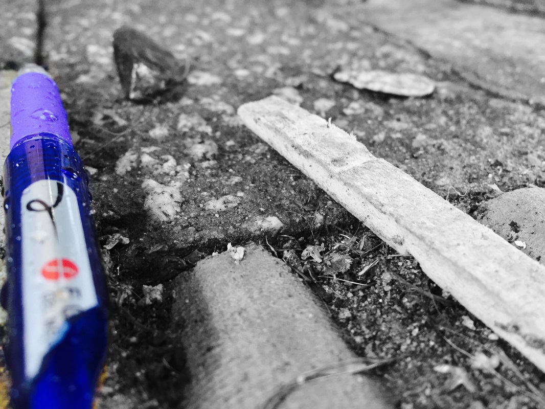
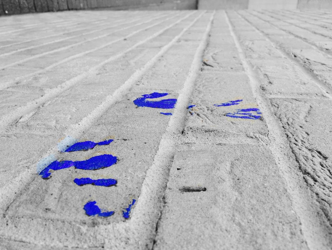

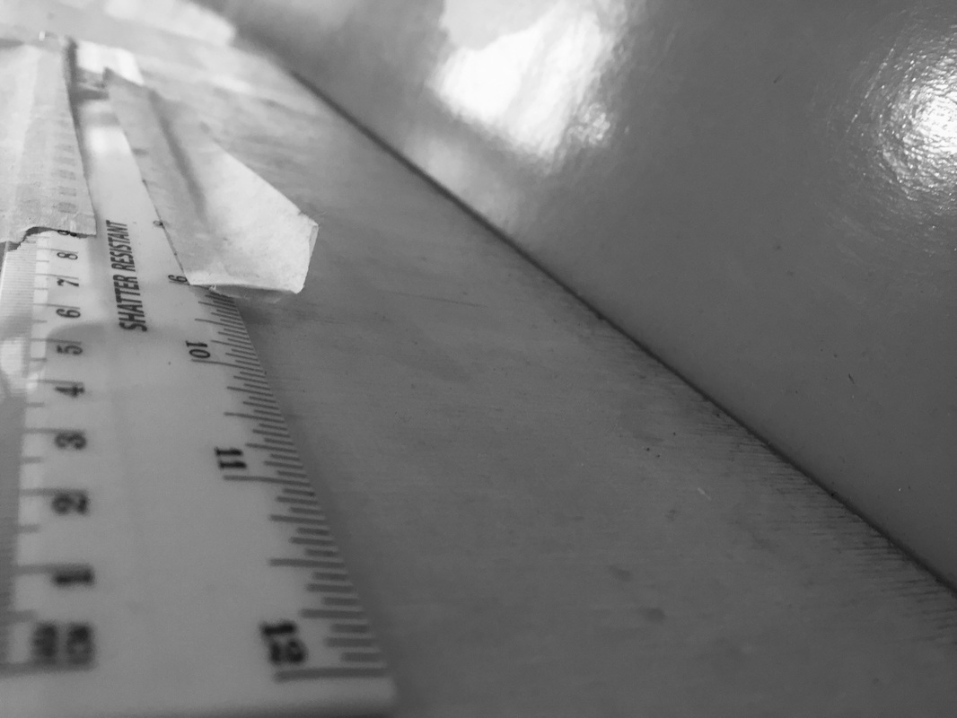

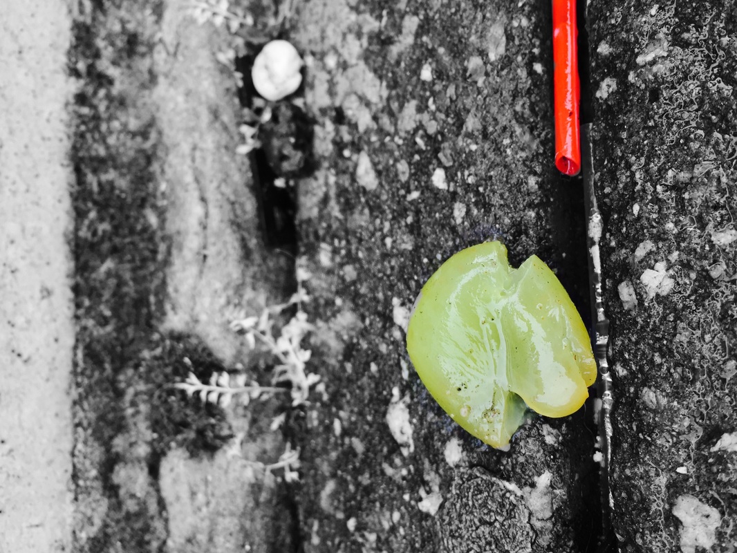
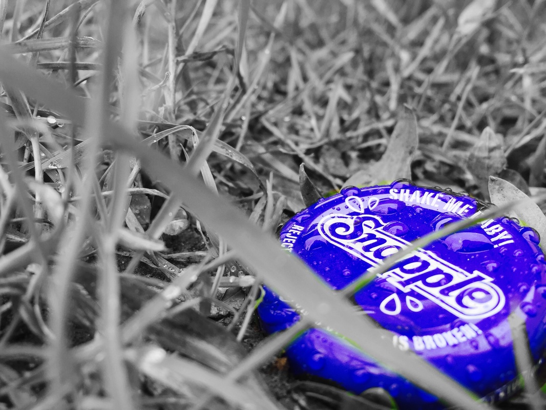
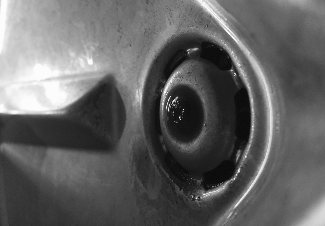
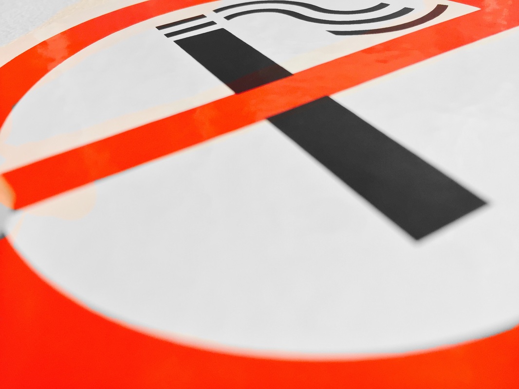
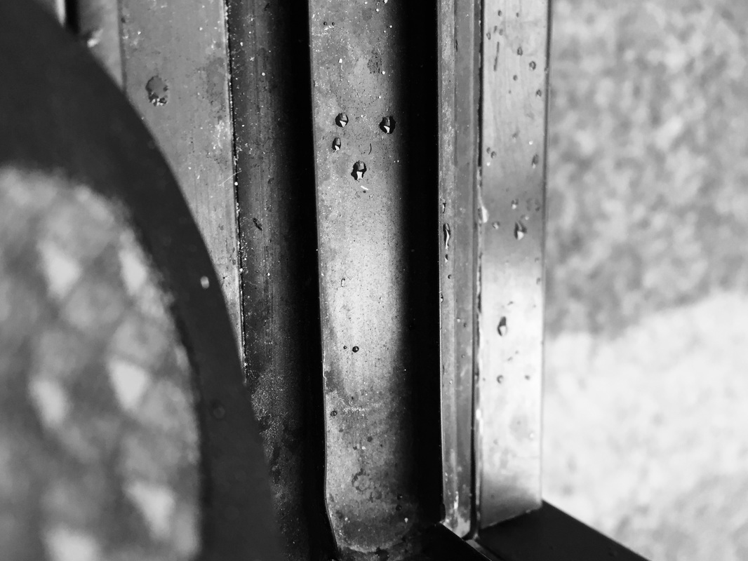
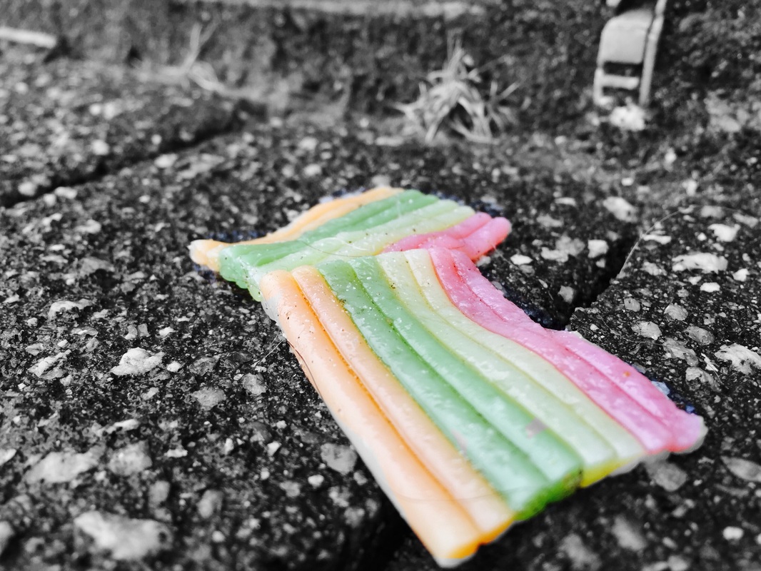
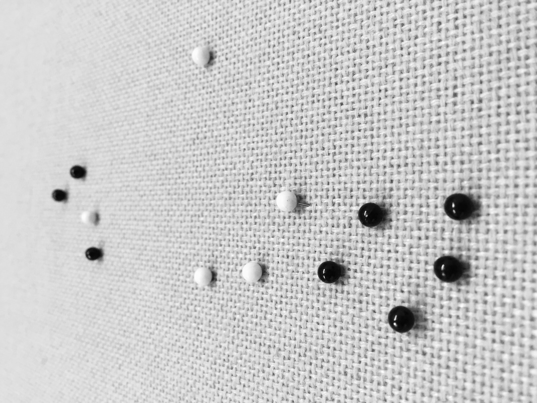
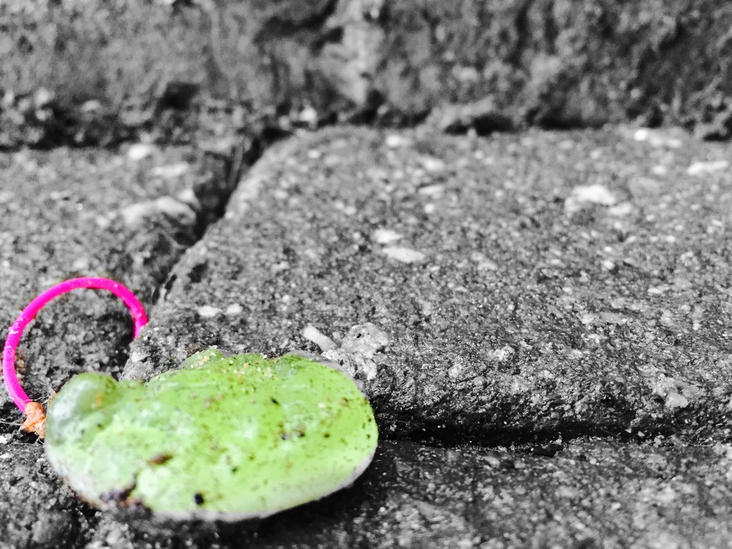
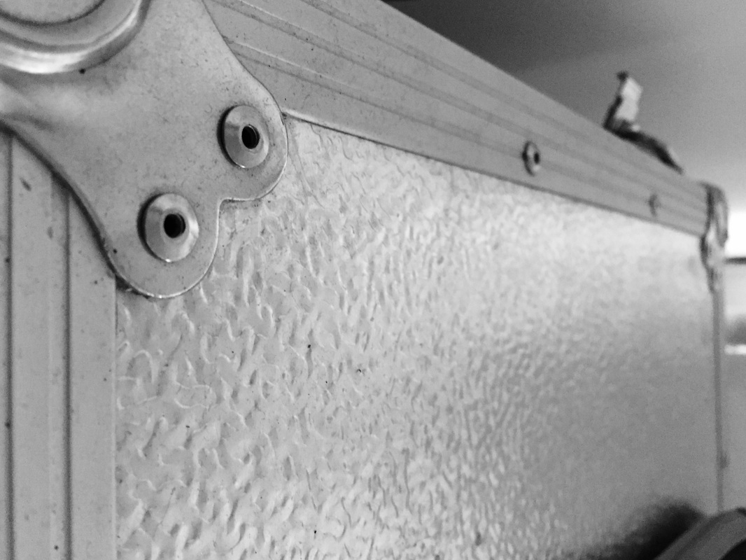
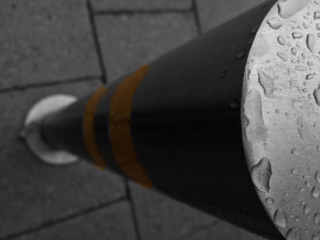
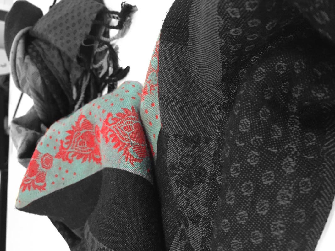
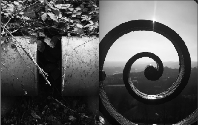
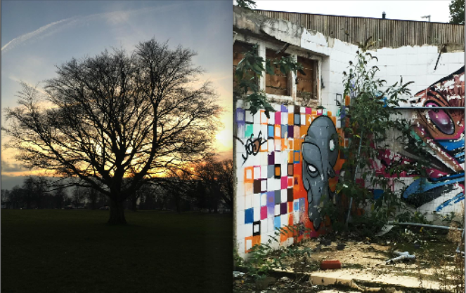
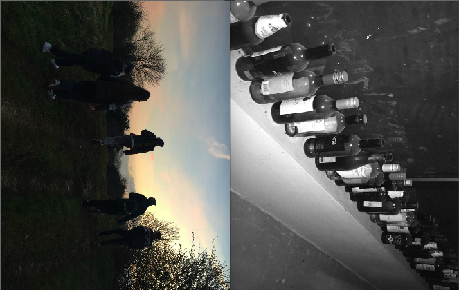
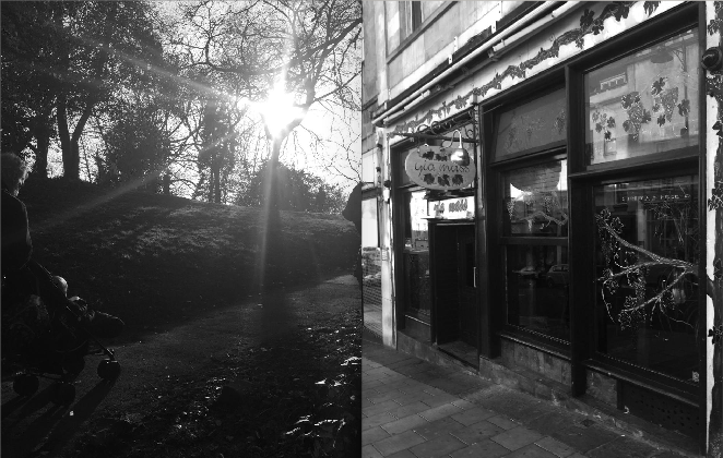
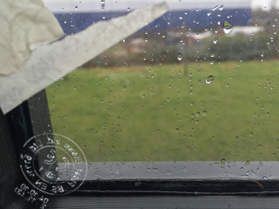
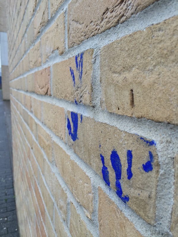
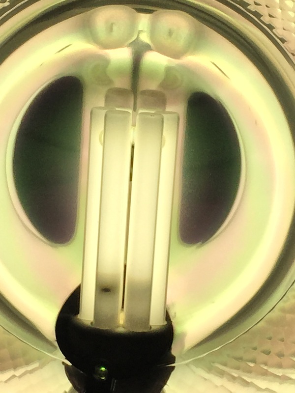
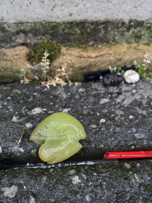
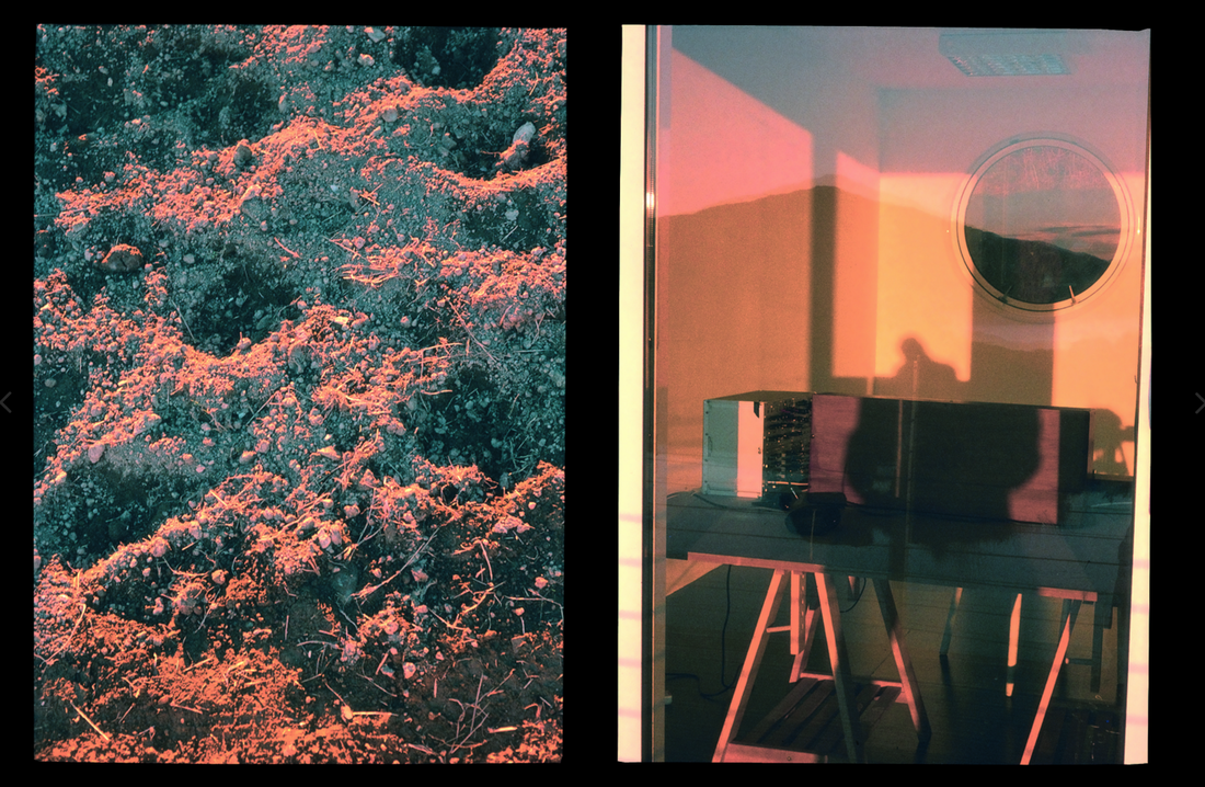
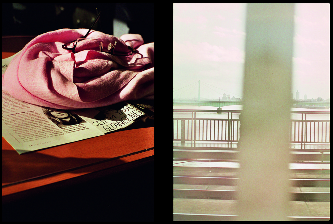
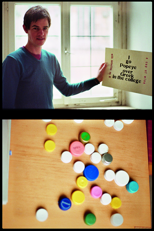
I selected these images because the way the line and angles are, are interesting and make each image individual. When taking the image - as well as line - i focused on naturally placed/occurring colour. When selecting the images i chose the ones that best executed this idea of vibrant colour and interesting line. I then looked at ways to manipulate the images to make these further stand out. I went into photoshop, and after reviewing the images as a collective, decided to put all of the images in black and white except the parts that show colour. I liked the effect this gave the images as they went from averagely simple, to more sophisticated and interesting. This also allowed me to manipulate what the viewer sees, which is helpful when translating a message through images.
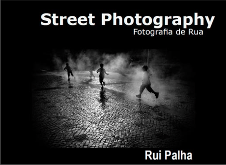
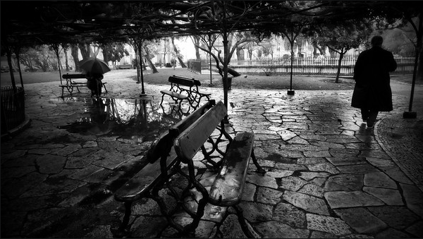
rui palha
"Photography is a very important part of my space… it is to discover, it is to capture giving flow to what the heart feels and sees in a certain moment, it is being in the street, experiencing, understanding, learning and, essentially, practicing the freedom of being, of living, of thinking…”
Rui Palha was born in Portugal, in April 1953, but lives in Lisbon. He was been into photography since the age of 14, although it was initially just a hobby. Since 2001 his work and time has been devoted to street photography.
Rui Palha was born in Portugal, in April 1953, but lives in Lisbon. He was been into photography since the age of 14, although it was initially just a hobby. Since 2001 his work and time has been devoted to street photography.
|
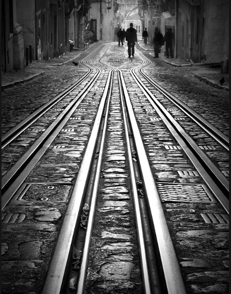
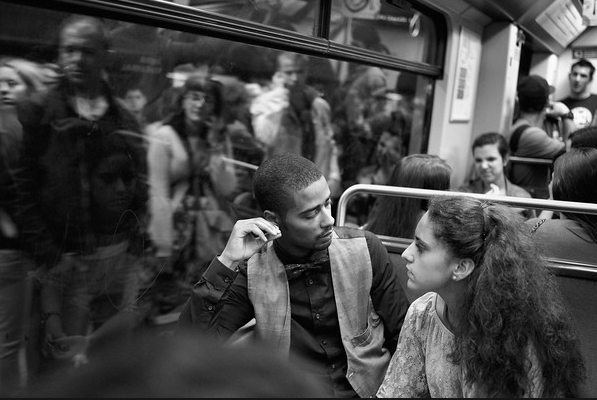
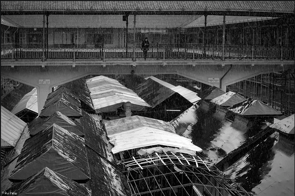
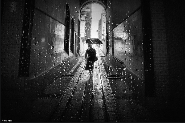
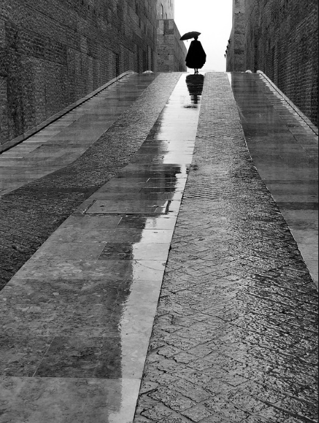
His book 'Street Photography' is filled with astonishing images. On his website, he has his portfolio with multiple sections: Macau, Cova de Moura, People, Rainy Days, Street Moment, Underground, Gipsies. He has so many inspiringly beautiful photographs, it's hard to choose favourites but i especially like the categories: Street Moments, Underground, and Rainy days.
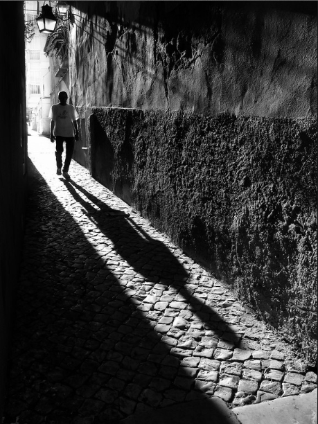
His images have a really different feel to them compared with other artist, and are therefore engaging and they stand out. All his images are dark (so he has adjusted his light meter to create a perfect exposure - really exaggerating contrast between light and dark). Palha states he rarely edits his images, spending a maximum of 2 minuted on them, but this is a hard effect to get, |
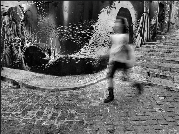
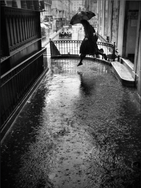
really showing his skill. It will therefore be hard for me to achieve this effect, and i will therefore need to edit the images. My favourite 'street moment' images all follow this style, i've looked at his use of line and light. I was also interested in his use of shutter speed - using a lower shutter speed to create blur, really capturing every element of the moment including speed. Also, he uses various interesting camera angles, which is something i don't usually consider in depth. (see below).
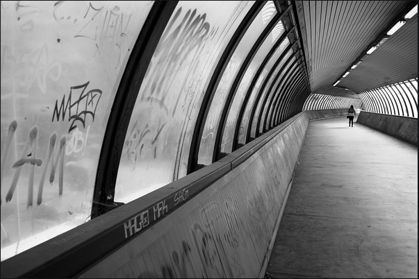
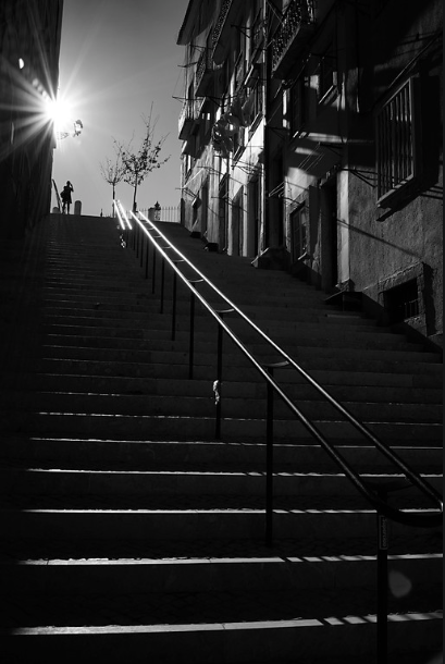
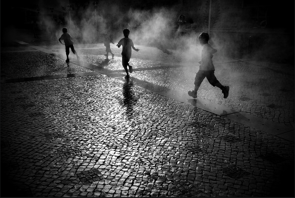
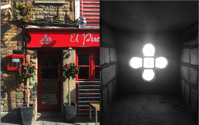
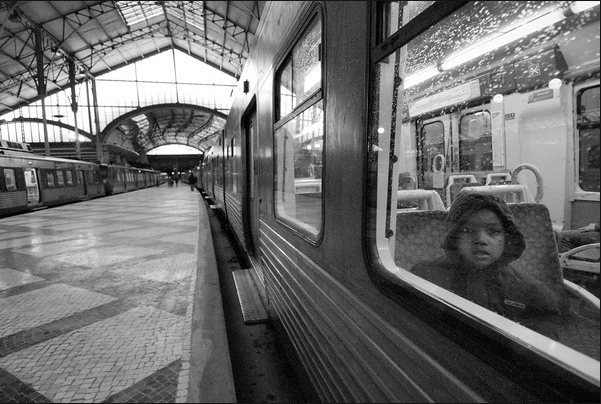
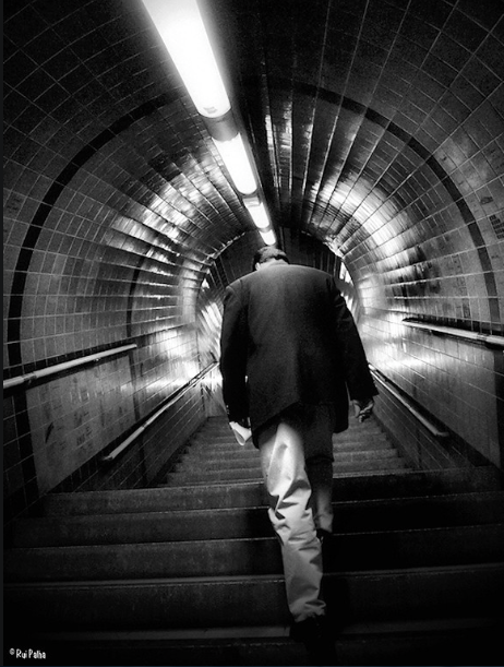
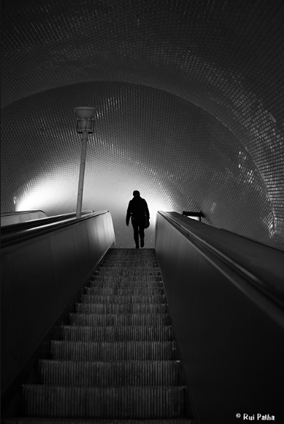
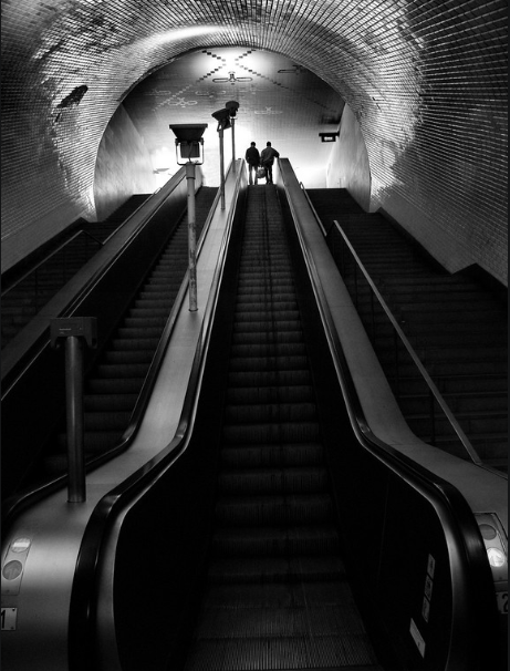
In the 'Underground' category, the images are very similar - maintaining the same feel. He focuses a lot on light and line yet again, but also people and reflections. I think the way he includes at least one person in his images makes them increasingly personal, and almost gives the image context. The exposure in every image is yet again perfect, identifying every inch of light and creating deep contract with shadows and areas the light doesn't touch. The exposure is so accurate, the reflections are totally clear and you can see the reflection of light on the condensation on the walls of the image in the tunnel. He uses light in some scenarios make the peoples figures simply a silhouette. I feel that these images are more achievable if i were to mirror Rui Palhas' images, especially as the setting parallels that which i would be able to photograph. (see below)
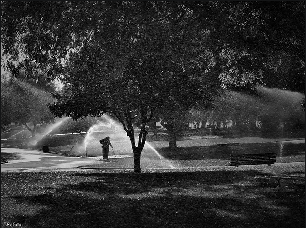
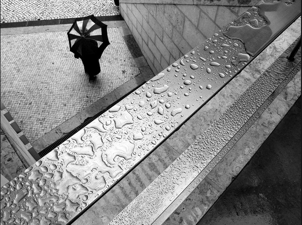
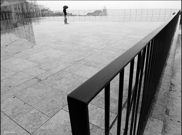
In the 'Rainy days' category the images are lighter, and the exposure is slightly less perfect, have far less contrast between light and dark. He focuses on line and reflection of water and different textures. These images are very different from the rest in this way, but i prefer the other images to these ones; although some of the angles are intriguing. I feel the angles of the images i will take for my photo book could reflect the images below. (see below).
bill brandt
- Street photography
|
|
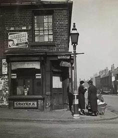
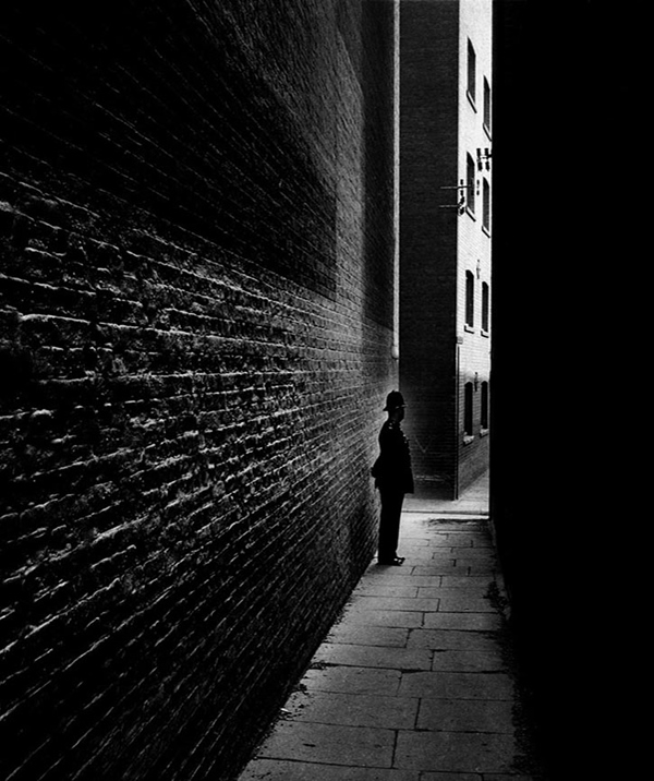
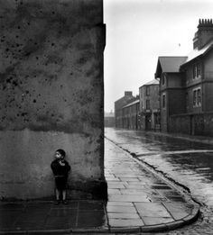
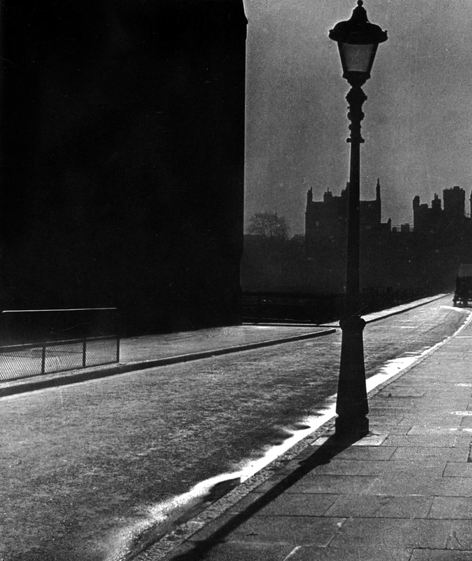
Bill Brandt was a British photographer and photojournalist. Although originally born in Germany, but moved to Britain and now is considered one of the most important photographers in the 21st century. Brandt grew up during World war 1, during which his father, who had lived in Germany since the age of five, was interned for six months by the Germans as a British citizen. Brandt later disowned his German heritage and would claim he was born in South London. During the second World War, Brandt concentrated on many subjects – as can be seen in his "Camera in London" (1948) but excelled in portraiture and landscape. To mark the arrival of peace in 1945 he began a series of nudes. His major books from the post-war period are Literary Britain (1951), and Perspective of Nudes(1961), followed by a compilation of his best work, Shadow of Light (1966). Brandts images are of a similar style to those by Rui Palha. I like his images because they of parts of streets that would go unnoticed and unappreciated but his images change this view and make every part significant. This is something i hope to achieve in my photos. I like the way his images are dark, as Rui Palha's are, with certain parts highlighted. |
Luke Fowler
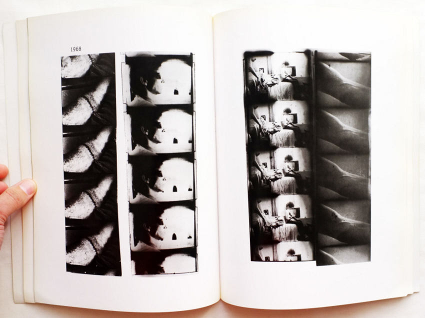
Luke Fowler created a collection of half-frame photographs and published them into the book entitled 'Two-Frame Films'. His books get you to consider the editorial part of photography, and the layout of the images - considering the juxtaposition of the images, as well as the way the images engage the viewer and effects the way they think. Fowler is well known for his work in film but has also used a half-frame camera in his work. His work specifically focuses on juxtaposition and relationship between images. Half frame cameras expose two photos on each of the 35mm frames. This turns 36 exposures into 72 images. These diptychs are images but they incorporate the idea of montage. This idea was first clearly shown by Russian film makers in the 1920s.
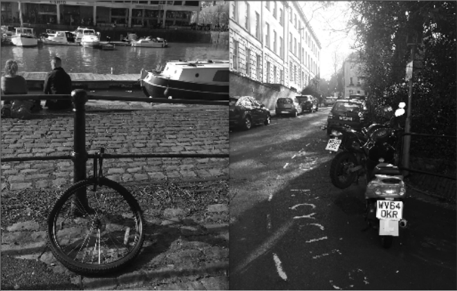
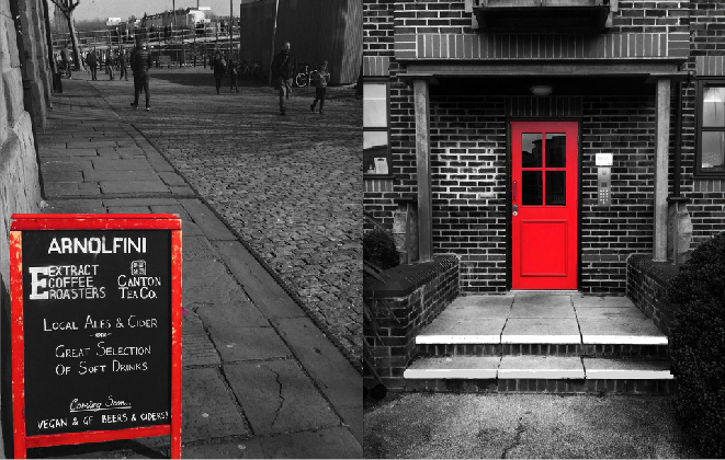
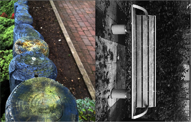
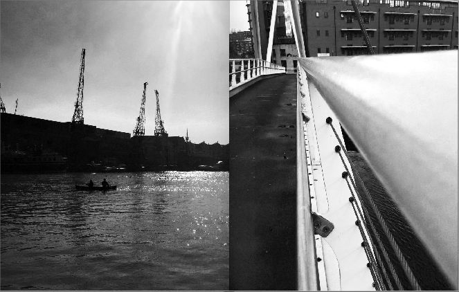
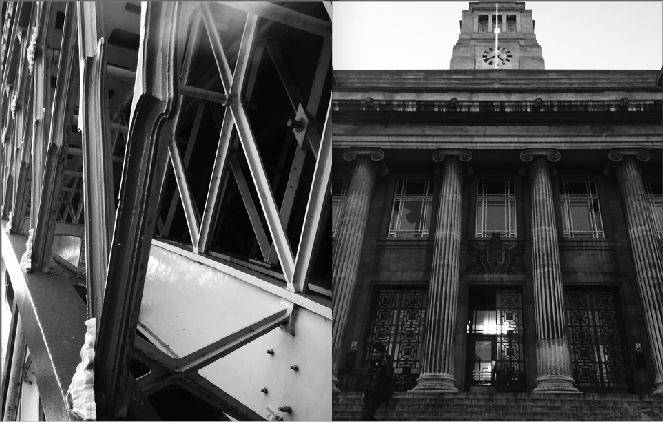
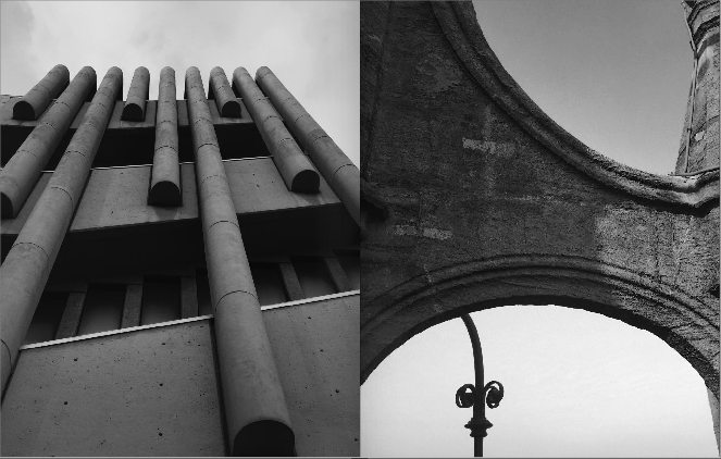
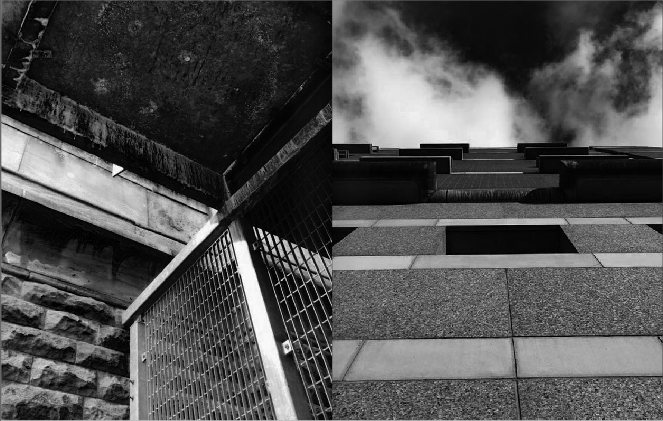
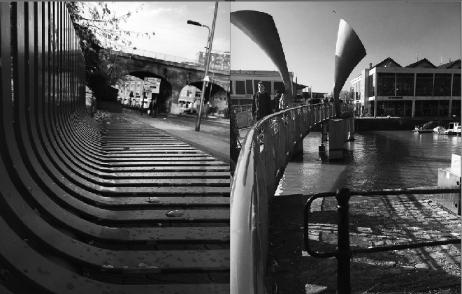
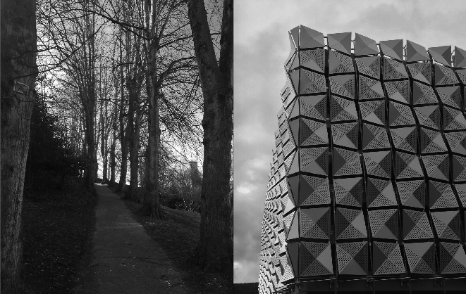
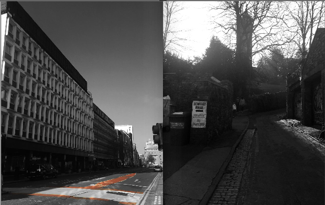
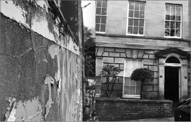
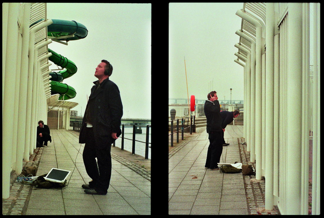
Diptych - What can be classed as a diptych?

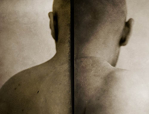
A diptych is any object with two flat plates attached at a hinge. (from the Greek, di "two" + ptychē "fold"). I like images that have a connection. Especially in a phonebook. After looking at various photo books, i decided that just filling each page and using the double page spread for presenting/ connecting two images, was my favourite way of creating a diptych. The images on the right all have an obvious connection, and i think this connection is really what makes the diptych meaningful. My favourite of the images i found, is the second down on the left, and the third down on the right. I like the contrast and quality of the image used, as well as the deception when viewing them. I want the photo book i create to be meaningful, so i therefore believe that the link the images have are key to portraying the message i want the viewer to receive. Each dyptech has to demonstrate the theme of the photobook, or the image - in my eyes - should not be included in the phonebook as they have no purpose or meaning (no matter how interesting the photo is).
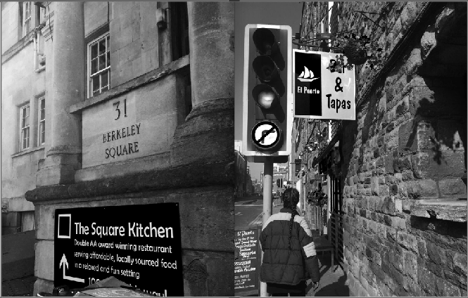
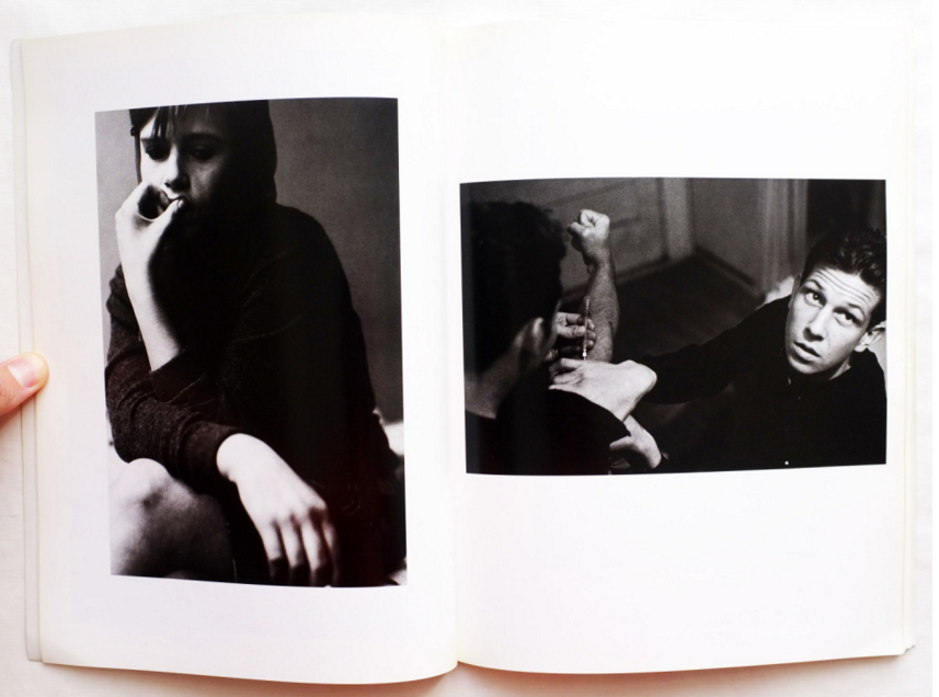
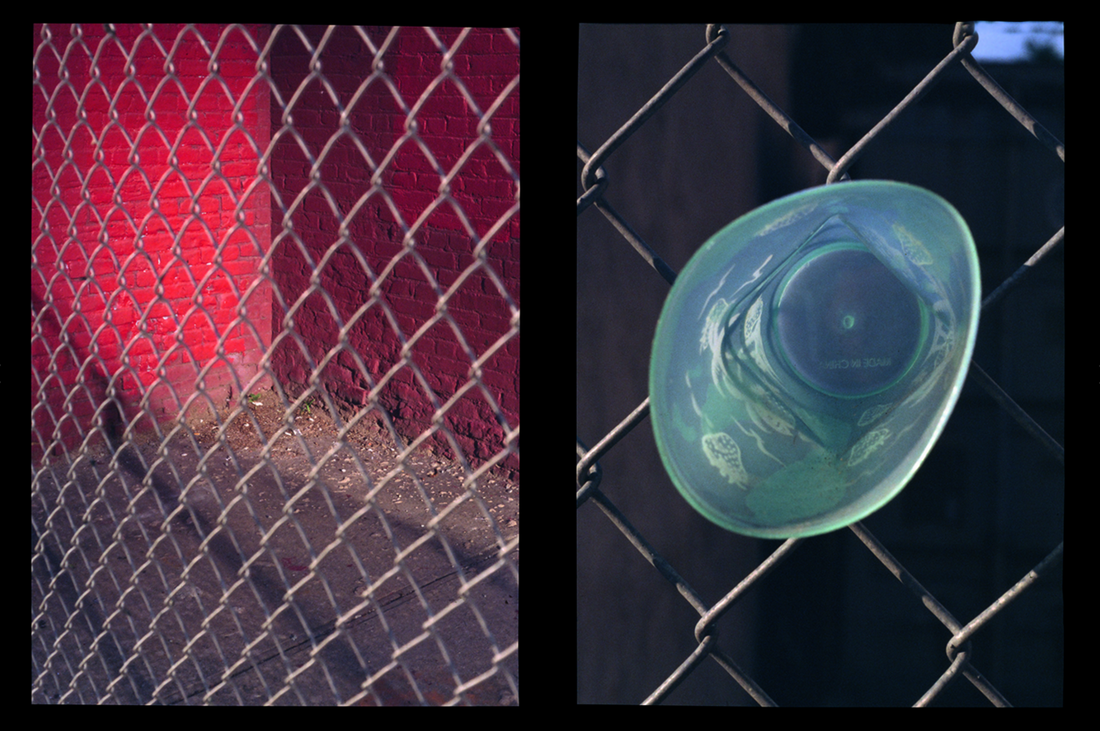
Diptych - My PhtotosI chose these images to go together primarily because they're both of women and both demonstrate reflection. When looking t the images, i noticed how both women were looking to the same side, and both had brown hair. I think this demonstrates a strength both the women have - the women on the bottom is a subject photographed, and put in a gallery, and the women above is an ordinary women, with a baby - making her seem strong, and independent. The subjects themselves have a similar contrast, but the sky in the top image is bright (excluding detail), and the image below is the same, but the wall is dark (excluding detail). I like the images slightly underexposed or dark, as then only certain parts are bright and show detail, and you can manipulate the audiences perception.
|
|
Final Book - Evaluation