Connected images:
"Photographers often produce work which is composed of a number of connected images. Varied examples can be seen in the photo-essay work of Gordon Parks, in the composite documentary images of Patrick Winfield and in the photographic installations of Nobuhiro Nakanishi. Investigate appropriate examples and respond in your own way."
QUESTIONS TO CONSIDER THROUGHOUT MY INVESTIGATION:
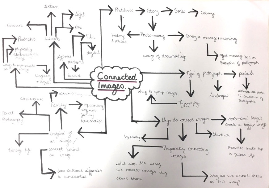
1.What does an artist have to consider when connecting images?
1. what is the most important element in the composite?
2. Will the format in which I choose to connect my images have an effect on the viewers perception of the concept behind the connected images?
3. Do I want to create a story through the images, and what am I trying to communicate by connecting these images?
4. I am I trying to make the veiwer focus on a certain section of the images, and if so how will I achieve this?
5. What purpose does each individual image have and does me connecting them change this?
2.Do connected images have to consist of the same subject matter?
I believe that in many cases the images are more clearly connected when they possess the same subject matter, and this gives the viewer a more immediate insight into what the photographers intentions are. In contrast, I also believe images with contasting subject matter can be connected as long as the artists intention as to why the images are connected is clear - and so there is a clear concept put forward. Connecting imges by something other than subject cause the veiwer to more deeply consider them to comprehend the artists intentions.
3.Who created the first photobook and how were the images connected?
The first photo book was crated by Anna Atkins, she used images of british Algae. The book was made to help the scientific community identify marine specimens. The images were connected by both subject matter (the fact they are all algae) and with in the physical format of being in a book.
4.Do all connected images have to tell a story or have a narration?
I think that even if an artist doesn't intend to necessarily portray a story through the images, the veiwer creates a narrative for them in order to 'make sense' of them. Focusing on this individual interpretation could be an interesting way to look at images being connected. Even with this, I don't think connected image have to tell a story, sometimes they just elicit their own story.
5.Is the artists perspective of their own work different from the viewers, and can this distort the concept in which the images are connected?
I think that an artist generally has a more intricate understanding of their own work and they can only do their best to portray a concept through their work, the rest is down to the relationship their work creates with the veiwer. An experienced artist should be able to accurately portray a concept through their work, but the veiwer could have different political veiws for example, and this can therefore distort their interpretation of the photographers work. with this, I don't see this distorted interpretation necessarily as a negative thing as I believe all art is created to be open to interpretation (at least to some degree).


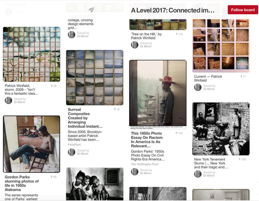
Patrick Winfield


Patrick’s composite images are made up of lots of individual instant photographs on Impossible and Polaroid film. He creates his work by putting this film together. Patrick is an artist woking in Brooklyn, creating work about accidents and how these flaws then become a sort of perfection. He started his work creating collage before moving over to polaroid film.
“I may jam or manipulate the films to play up the surface, the tangibility of the film medium. I create a moment out of several various instances – a walking perspective controlled and pulled in by the structure of the grid, not an instant view, but a clustering of memories and visuals. Each photo is competing with the image as a whole, causing this movement of the eye as it takes in a single image then back to the whole.”
Patrick’s work has been featured in many art and design magazines and blogs and also in Urban Outfitters due to a 2010 collaboration.
Each individual image is in itself beautiful and eye catching but when the images are put together they make a whole beautiful image yet each individual situation stands out. This work is like how a person has a series of event that make them. The process of Winfield creating these pieces goes two ways: He either knows what he wants to portray or he relies on his intuition. (my initial response is on the left).
Second response:
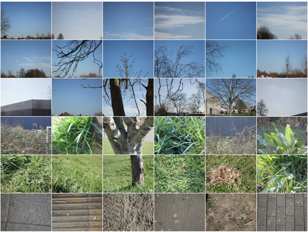
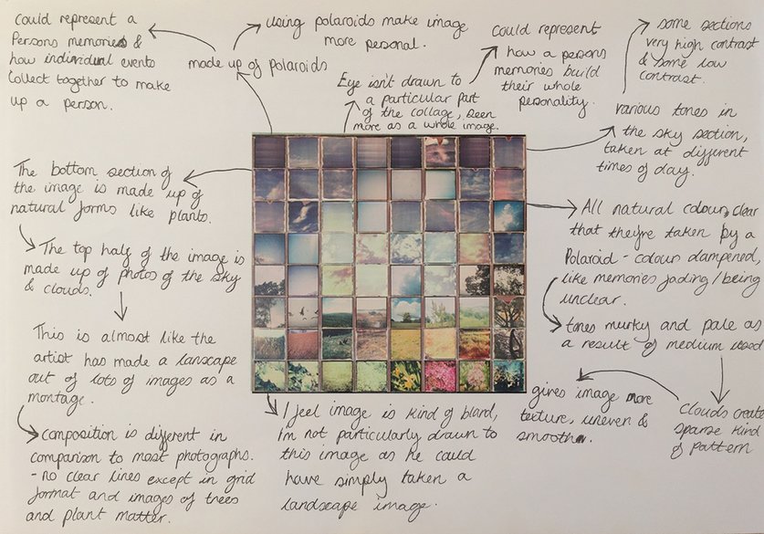
My initial response was based more on the layout of Winfield's work, and the images were collages only relating to genre (street photography). My second response (as seen above) is based more closely on his work. I looked at each individual photograph in Winfield's collages, and started to experiment in creating a landscape out of individual images myself. I started by taking images for the bottom section of the collage, focusing on darker coloured ground like tarmac and mud, trying to vary the textures of each photo. I then began taking photography for the next layer, looking at shorter grass and also where the bottom of the tree meets the grass. Again I wanted to vary the textures in the photos - which is hard at grass is all similar - so I played around with the depth of the image, the thickness of the grass and the colour of the grass, making the composition more interesting. For the third layer of the collage I started capturing the tops of grass and the mid section of the trees - again playing with depth etc. I then worked my way up each layer in a similar way, next focusing on whole trees (including some sky), tops of buildings as if in the background, higher sections of the tree, and tips of branches. I next moved on to the tops of trees, giving the tree i created more shape and making it a little more abstract, including more sky in each image and the trees in the background. Finally, for the top layer, I looked mainly at capturing the sky and clouds, airplanes trails and the very tops of distant trees.
Compositionally, I feel this image is effective as it conveys the idea of an abstractly composed landscape. I think that this collage as a whole is just too small. I created it in a grid format using photoshop, and chose to have thin lines between the images. The grid is made up of 36 images (a 6-by-6 grid) which i don't think is large enough to be aesthetically interesting, when re-creating this kind of collage I was to make one twice the size so it is more intricate and detailed, like Patrick Winfield's. I would also consider connecting the images by hand to create the collage, adding to its abstract, informal feel.
Compositionally, I feel this image is effective as it conveys the idea of an abstractly composed landscape. I think that this collage as a whole is just too small. I created it in a grid format using photoshop, and chose to have thin lines between the images. The grid is made up of 36 images (a 6-by-6 grid) which i don't think is large enough to be aesthetically interesting, when re-creating this kind of collage I was to make one twice the size so it is more intricate and detailed, like Patrick Winfield's. I would also consider connecting the images by hand to create the collage, adding to its abstract, informal feel.
Third response (Refined reponse):


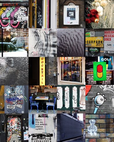
I created these four images by collaging the images into a grid format. I began resizing each and cropping each image to become an abstract tile and I then put the together to form an abstract composite consisting of multiples of a image.
Nobuhiro Nakanishi


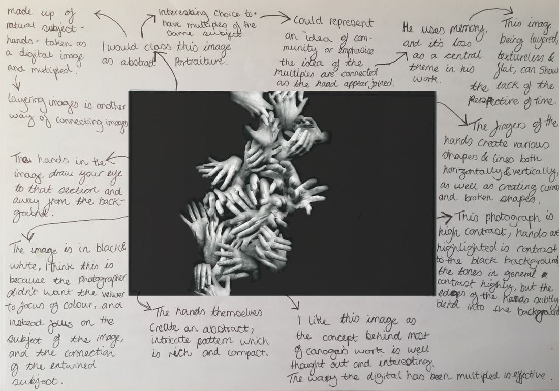
Nakanishi produces atypical landscapes. Japan based artists 'The Osaka' created work he called 'layered drawings' by photographing a scene over a period of time. He then laser prints the images and then mounts each one onto acrylic. There are subtle changes in each of the pictures and once they are layered they portray an untraditional landscape and create the feel of passing time. Nakanishi is interested in the way sculpture is defined by thought, awareness and the method it employs. He seeks to analyse the way we perceive the world. Experiencing a photographic landscape is a two-dimentional process where a viewer hands in front of an image. They can then see what artist saw in the captured scene, but the experience is always a viewer looking at a flat surface. The more physical, dimensional aspects of Nakanishi's sculptural contain far more detail. The effect of this is a richer experience. The landscapes trigger our memories and senses in a way traditional landscapes can't.
Response:
|
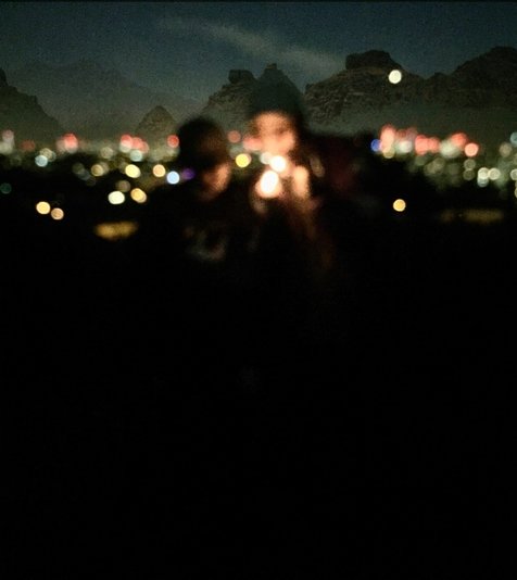
Although using layering to present the idea of time doesn't interest me, I began playing with this idea of layering images and then began to reflect back to the question I considered at the start of this investigation. The second question I wrote 'Do connected images have to consist of the same subject matter?' stood out when looking at layering images as I realised you could have two images with totally different subject matter and connect them by layering them to create one images. This can create a slightly abstract image. I created the image on the left my layering an image taken in London, with the subject of two people in the centre of the foreground and city lights in the background. The lights in this photo stand out as the image is blurred. I layered this image with a completely contrasting image taken in a desert in Egypt with a line squad bike leading from the foreground, and mountain in the background. I chose to layer the first image with just the mountains from the background of the second. This created an interesting effect as the first image now appear to have had a change of setting due the the subtle mountain backdrop.
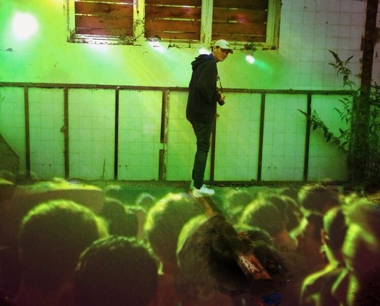
This is a second image I created using this same layering technique, once again playing with different subject matter and setting. I like how this image looks compositionally as the subject matter is in the centre third of the image and the lights in the top third appear to be shining on him and the subjects in the lower third seem to be almost looking at him. I also like the faint grid pattern in the background and the lines from the plank he is standing on as well as the railings behind him and the pipe on the right edge.
|
Gordon Parks


Gordon Parks was an American born photographer, musician, writer and film director as a photographer Parks was known for photographing images of social justice which was the main concept he photographed, mainly in America exploring the culture and diversity that it had to offer within the period of 1940's until 2006. As his work mainly explores culture of people within the early America his work also clearly identifies issues based upon racial differences, poverty, civil rights, and the urban life. He bought a camera at a pawnshop and taught himself how to use it and although he had little professional training, he found a job with the Farm Security Administration (FSA), which was then hiding the nation’s social conditions. Parks soon developed a style that made him one of the most celebrated photographers of his age, allowing him to break the colour line in professional photography and also create extremely expressive images that thoroughly explored the social and economic impact of racism.
Daniel Canogar
Daniel Canogar was born in Madrid with a Spanish father and American mother. Photography was the earliest medium he chose to use, but he quickly became interested in the prospects associated with the projected image and installation art. He started to show a fascination with history of optical devices like magic lanterns and panoramas, which was clear when he started creating his own projection devices.


Digital multiples image filling frame of representation.


Water was the key theme of this exhibition.
'“Vortices” was inspired by the Great Pacific Garbage Vortex, a vast accumulation of marine debris floating at or just below the water's surface in the Pacific. The accumulation is approaching the dimensions of the European continent. This waste will not only remain where it is for the foreseeable future, it is also growing at an alarming rate, fed by the worldwide production and disposal of plastic goods. The Great Pacific Garbage Vortex is an environmental disaster that is only beginning to unfold.'
'“Vortices” was inspired by the Great Pacific Garbage Vortex, a vast accumulation of marine debris floating at or just below the water's surface in the Pacific. The accumulation is approaching the dimensions of the European continent. This waste will not only remain where it is for the foreseeable future, it is also growing at an alarming rate, fed by the worldwide production and disposal of plastic goods. The Great Pacific Garbage Vortex is an environmental disaster that is only beginning to unfold.'
Lamia Naji
Lamia Naji was born in Casablanca in 1966 to a French mother and Moroccan father, a mixture of languages and culture which subsequently led her to a search for a sort of identity. She tried hard to highlight what nations have in common in terms of architecture as well as culture. Naji possessed a desire to unite worlds, rather than separate them. A desire to belong to a group that defines itself beyond established borders, looking for a universal identity that goes beyond gender, religion or nationality. Lamia chose to share her deepest fears with the world through her work.
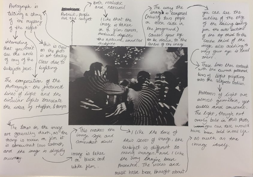
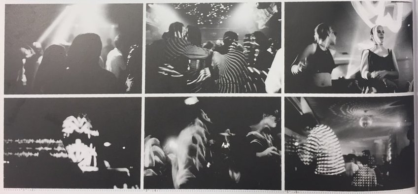
'Madrid, party, house, techno, nights, days, then whole weekends. Until then? This is where the whole mystery of the night lies. And it is because there are only fugitive reminiscences to the rhythm of a tempo that haunts the Madrid night owls (los "gatos") that the creation of a video appeared essential to me.'
This series was made in Madrid between 1997 and 1999 when she took residence at the Casa de Velazquez. This collection was completed in 2000. The music that accompanies her montage of images is by Fernando Gullòn. The video I LOVE CATS was shown on the stage of the Conde Duque in Madrid as part of the "Noches del Festival". She received a prize of honour at the Festival of Creación Audiovisual in Navarra in 2000 and was the subject of a traveling exhibition at the French Institutes of Morocco in 2001.
Her images were published in 2002 in the book "Blink: 100 photographers 10 curators & 10 writers" p.268-271 (where i found her work).
Response 1:
CAMERA: Praktica MTL 5B
FORMAT: 35mm colour film
FORMAT: 35mm colour film


I like the way Naji connects her images, using video and sound the accompany them. The way she's done this excentuates the meaning she's giving to the images, flickering at a seemingly random pace highlighting the idea of tempo and the mystery of the night. I want to create a series of images inspired by Naji's, focusing on night, but in a more personal documentary way, as if combining Gordon Parks photoessay with her work. As well as presenting these in a similar way to Lamia Naji, I want to consider the way Gordon Parks connects his images, considering documentation. Although both Lamia Naji and Gordon Parks document in black and white, when looking at Naji's work I felt that it was missing that element of colour, as the setting in which she takes her photographs seems to me to be colour orientated - considering peoples clothing and coloured lights. I felt these images I have taken reflect that of Lamia Naji, but also incorporated that idea of elaborate colour quite intensely. I think that this small series of images doesn't have the personal feel that Gordon Parks photographs do, which is something I do want to consider.
Response 2 (response 1 refined):
FORMAT: 35mm colour film


When creating this images I focused more on the portraiture and documentary aspects of both Lamia Naji and Gordon Parks. Again I took Naji's idea of focusing on the night, I just considered it in a more personal way. I think the way I executed this aim was effective, capturing the energy of each moment in each image, and they look good aesthetically as a series. The film camera they were take with created a nice effect in terms of colour - each colour is shown clearly but they are all slightly dulled by the camera which coincides with the theme of the series nicely.
Stephen Shore
ukraine
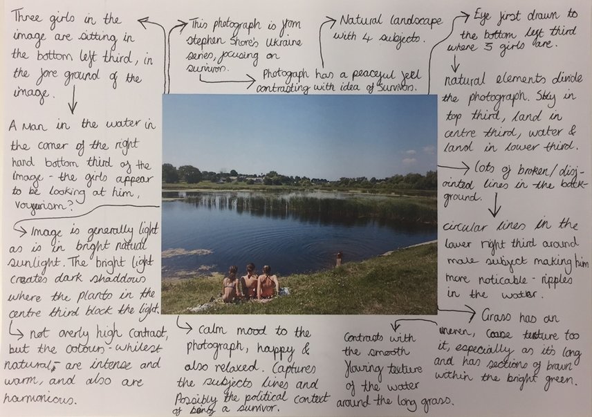


Response: Turkey


When looking at these images as a collective they seem to work well, all high contrast and with vibrant colour. When considering each one individually I think some come across slightly touristy, so I began the refine the collection to make them seem more elegant. This refined series can be seen below.


palma:


I am happy with these images individually, they all incorporate many of the formal elements such as line, tone, and colour. I particularly like the images with the subject of multicoloured bubbles, and think they'd work better as a series on their own, as shown below.


Egypt:


ED TEMPLETON
TEENAGE SMOKERS
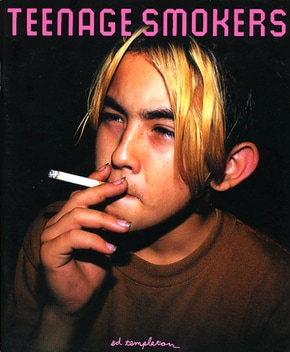
Publisher: Super Labo 2015
Ed Templeton is both an American photographer and artist. The book and its concept began when Templeton would reside in skate parks while kids were there hanging out and smoking. He bought a Polaroid and began photographing them while smoking. He could not comprehend the length that people will go to, considering the harshness of it on the lungs, and so he was astonished by them as they did so. The book shows a typological photographic study of an action, thought about from many angles, with many subjects that relate to the action and its cultural influence and is therefore meaningful, relevant to many people, and interesting to me.
The photographs overall stand out as a collection due to their typological and documentary aspect, and are also descriptive of a specific time period. The collection in a way show an artistic intention, maybe for the viewers to contrast their disgust with the aesthetic of smoking. The camera style is also extremely fitting, as intimate methods of using a polaroid and close 35mm film capture something small and blow it up large, exposing the action. Templeton also adds drawing and writing in an urban nineties style, mostly describing, and talking of the subject and action, as if it were a diary. However all of this is left open to argument so in some ways the book tiptoes on the line between meaning and description. The cover is descriptive of the contents of the book as it is evidence of the subject matter within. The image was well chosen, as it has elements that make it stand out, such as the unusual long bright hair, long nails and bright white cigarette. The placement of the title contrasts this, firstly as purple is the opposite to yellow in the colour wheel and the title is written in a very regular way in comparison to the perceived messiness of the boy.
The layout of the book, in the last four images of the gallery, is very interesting as the layouts often incorporate colour and diptychs within time frames. Each page describes in its own way, fitting with the image, therefore making the book full of interesting changes and differences. It is the constant variation that creates the feel of the book, therefore a sort of logic exists within it. I feel that this approach is definitely different within a zine to the upright and romantic view that street photographers may usually take when making incredibly expensive books of their work and therefore not choosing intuitively through emotion but more through what looks sophisticated. Templeton was not worried about looking unskillful and therefore succeeds in describing the subjects.


Response:
(experimeting in BLack and WHite)
Medium: Lomography Diana mini - 35mm film
IDEAS:
- Smokers: Respond focusing on the same subject, but in my own way. Rather than focusing on young people smoking, maybe create diptychs with both the subject smoking and also the place in which they are smoking. This would change the viewers attention from the subject to the location people choose to smoke in. I feel this could be presented interestingly.
- People alone: When researching people based photo books, I came across Paul Graham's 'End of an age' (1996-98) where he captures 'the threshold moments that mark the ending of adolescence, the small slice of time between youthful indulgence and the emerging awareness of adult responsibilities.'. He took the photographs in nightclubs of people when alone and most vulnerable, often under the influence of drugs, and reflect on this point in a persons life. Capturing a persons emotions when alone seems an interesting concept to experiment with.
- Everyday environment around us: I think when capturing people in this way, it is also important to put them into context.


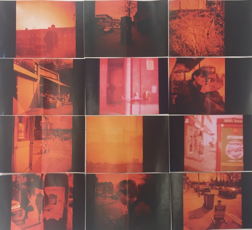
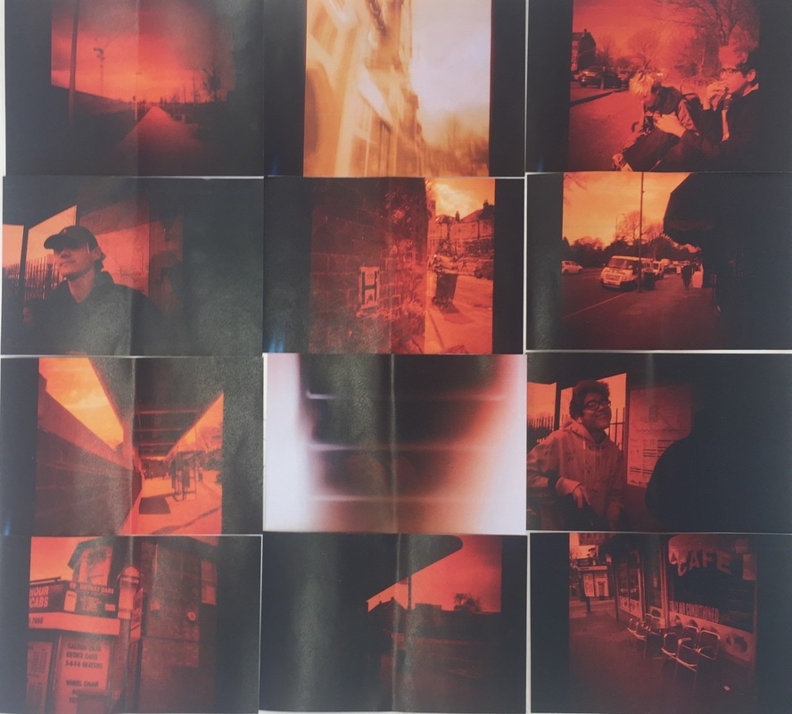
Playing with presentation:
Inspired by: Patrick Winfield.
Aim: To create a grid style collection from a carefully selected number of images from this series. I want this to look imperfect and amateurish, as well as man made, to fit the theme of the images and the medium in which they were taken.
Aim: To create a grid style collection from a carefully selected number of images from this series. I want this to look imperfect and amateurish, as well as man made, to fit the theme of the images and the medium in which they were taken.
|
|
Photobook:


(Experimenting in colour)
35mm film


Photobook - zine:
Created using Indesign.
Inspired by: Ed Templeton, Lamia Naji & Gordon Parks.
Inspired by: Ed Templeton, Lamia Naji & Gordon Parks.


Final Piece
Experiment 1:
Inspired by: Nobuhiro Nakanishi, Lamia Naji, Ed templeton.


I began thinking about different ways of presenting my images and chose to focus on the way Nobuhiro Nakanishi presents his images, using the idea of layering. I wanted to do this physically rather than on photoshop. I decided to try printing the images on acetate so that when I layered them you'd still be able to see the image when overlapping with another. I then started playing with different presentation and orders in which I could layer the images in the result was as seen above. I liked the way this experiment came out as this remained two-dimensional but the images being layered gives the illusion of depth and connects each image physically.
EXperiment 2:


I used these same layouts as in experiment 1 but I started considering the idea of recapturing the images more deeply. I like the geometry created by the sections where the images overlap so began photographing these, making the images abstract through the process of re-photographing.
Experiment 3:


I next started thinking about this idea of dimensions and whether making this piece three-dimensional would add or takeaway from the connected feel layering gives the images. After mounting and\or framing each of the acetate photographs and re-photographing them, I decided that this framing disconnected the images making them feel totally separate, and so I discarded this idea.
Experiment 4:
Lightbox layering.


I wanted to create an even more intricate layering of the images. I thought of how i could do this as the images are already printed on acetate, but I wanted them to be even more opaque. I thought about increasing the opacity or brightness of each image on the acetate images but when i began doing it I realised it took away from the image. I then realised I could use a lightbox to make the acetate images show through the layered ones more. The images above show this process, re-photographing the whole composition as well as where the images meet. This created an abstract double exposure kind of effect.
Experiment 5:
Inspired by: Patrick Winfield, and Lamia Naji.


I created the image on the right initially - which is a square the width of an A3 piece of paper - by printing two of my film images on A4 and cutting them into different sized and shaped sections and then reassembling them in an abstract way. I then chose to add to this reassembled picture by printing the same two images again but on A3 and repeating the same process.
Experiment 6:


I next began trying to combine these two processes by layering the A2 layered acetate images with the A1 abstract images. I felt that this didn't look overly effective as you couldn't clearly see the compilation behind the acetate sheet. I then began to consider creating an A1 plywood frame to go over the abstract compilation so that the acetate sheet would be raised and I could put strip lighting around the inside of the frame so it acts like a lightbox and you can subsequently see the image behind. This still looked too crowded, so I began looking at each team as seperate.
final Idea Refinement: Experiment 7
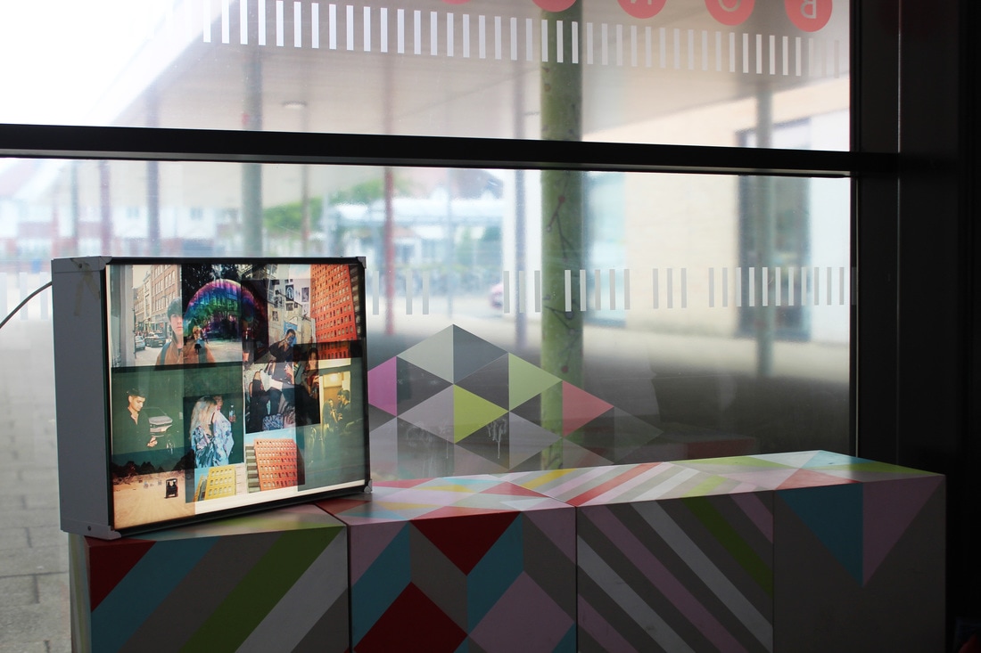


When creating this final piece I focused on this idea of layering, connecting images with contrasting subject matter. I used film images from various shoots, all chosen due to their colours. I presented these images printed on acetate on a lightbox as this allows the layering to be clear and for the colours to shine through and become more vibrant. I especially focused on red and yellow as well as variation between this. The way these images are layered creates a sectioned, divided look to each image, giving the illusion that there are far more than 8 images presented on the box, making the viewer really focus on the sections I manipulated to be focused on, such as the girl in the floral kimono. Although one could argue that making the images appear further divided is not making them connected, I feel that this is the very reason they are connected as this division makes them seem more like a compilation creating one image, rather than lots of images presented together. As a result of this I feel that this experimentation was particularly successful. This feeling was supported by the people I asked about the compilation. I asked a few people 'do you see these images as being connected?' and most looked closely before stating that they do, but for different reasons. Some said this connection was due to the colour element in the images, and some said through subject matter (although that was in no way what I was hoping to achieve), some simply stated that these images became connected through presentation. This also lead me to realise that I had successfully explored this theme due to this variety of responses from viewers, although I do feel that I could have expired the idea of connecting images through subject matter more thoroughly.
This piece will be displayed along side the reassembles images in experiment 5, as I like the way these two presentations are highly contrasting - one being separated in sections, and the over layered as whole images - yet both hold a similar meaning and have a similar effect on the viewer. When creating this layered lightbox piece, I initially used far more images and mounted them onto an A1 sheet of acetate and intended to present them slightly raised over experiment 5, to ensure you could still see the piece behind. After a lot of trial and error experimenting with various arrangements of the images, I realised that there was no need to layer the images to this extent as rather than connecting them in a purposeful and sophisticated way, they instead became overcrowded and took away from the elements I intended the viewer to focus on. This lead me to instead present the two creations a long side each other as two pieces, rather than layered as one.
All of the images I have used are personal to me as they are either from experiences I have had in various countries, or events I have attended with the intention of photographing, like Lamia Naji did. This means that the images often involve people I know well, or places I know well. When I combined these personal images the end compilation became a compilation of personal experience, making the connection between all the images my memory, something I hope the viewers will notice and relate to their own combination of memories, as memories are what make up a person. This concept that memories are the images that are connected to create a person is a key message I hope to convey through my final pieces. If I had unlimited funds and time, I would have created an A1 lightbox and so made a larger version of this, making this piece a sort of maquette for that idea. Another thing I'd have done is have about 30 images printed on acetate hanging with beams of light dividing through them, sort of like a forest that the viewer would walk through, having the A1 lightbox on a wall that they would see once they've walked through the hanging images, as though they are walking through my mind and memories.
