Assessment one.
- 100 images inspired by alber renger-patzch
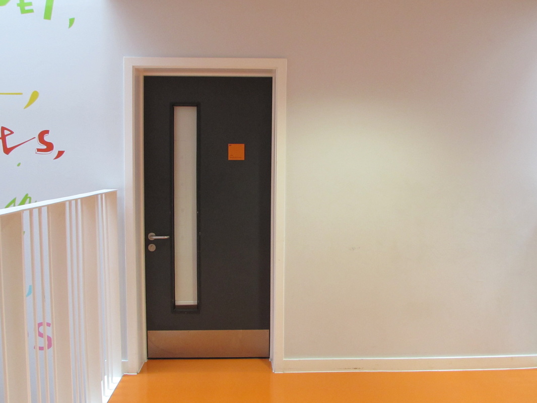
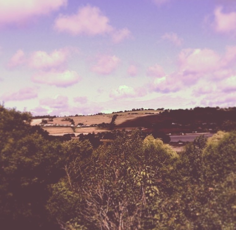

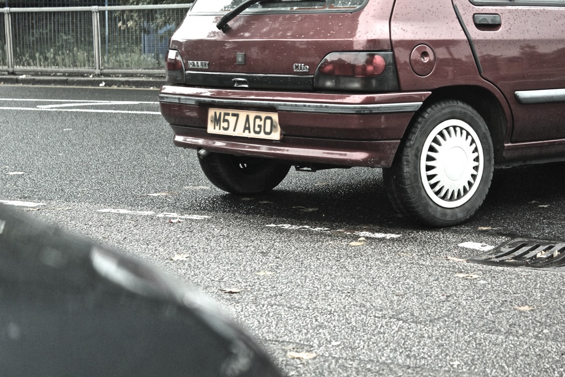
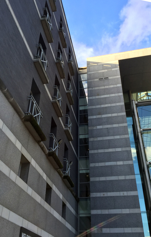
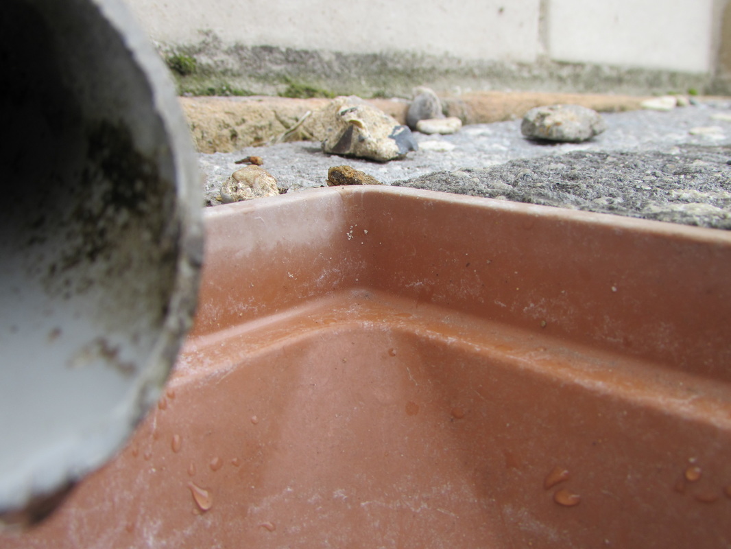
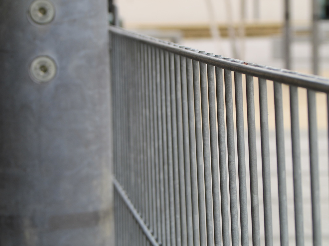
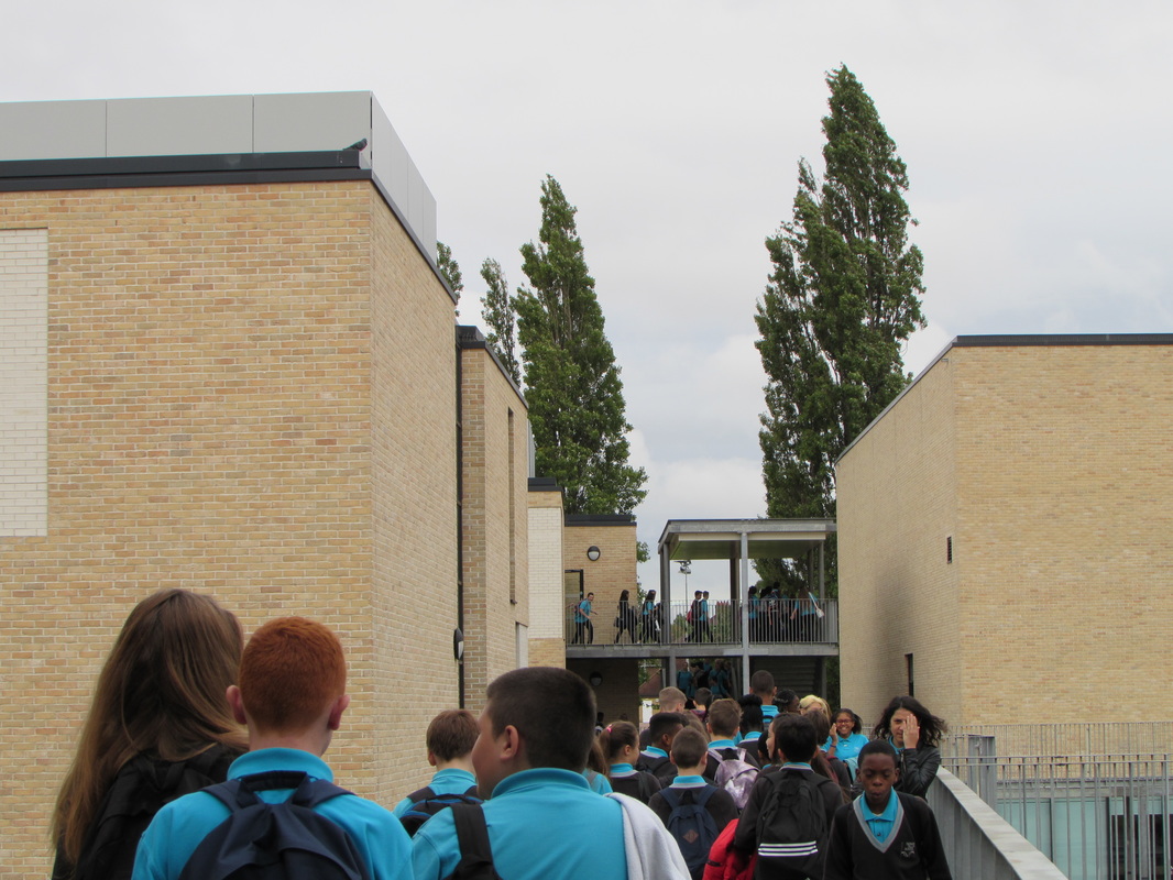
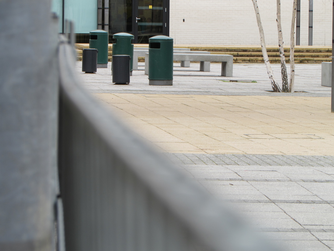
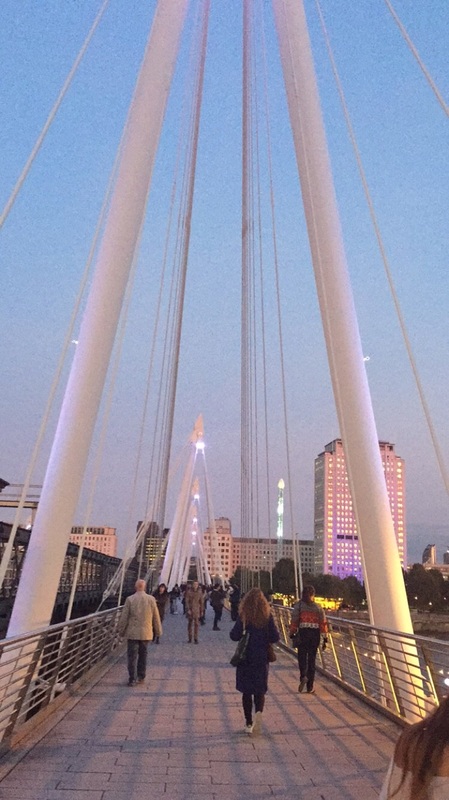
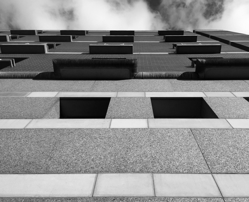
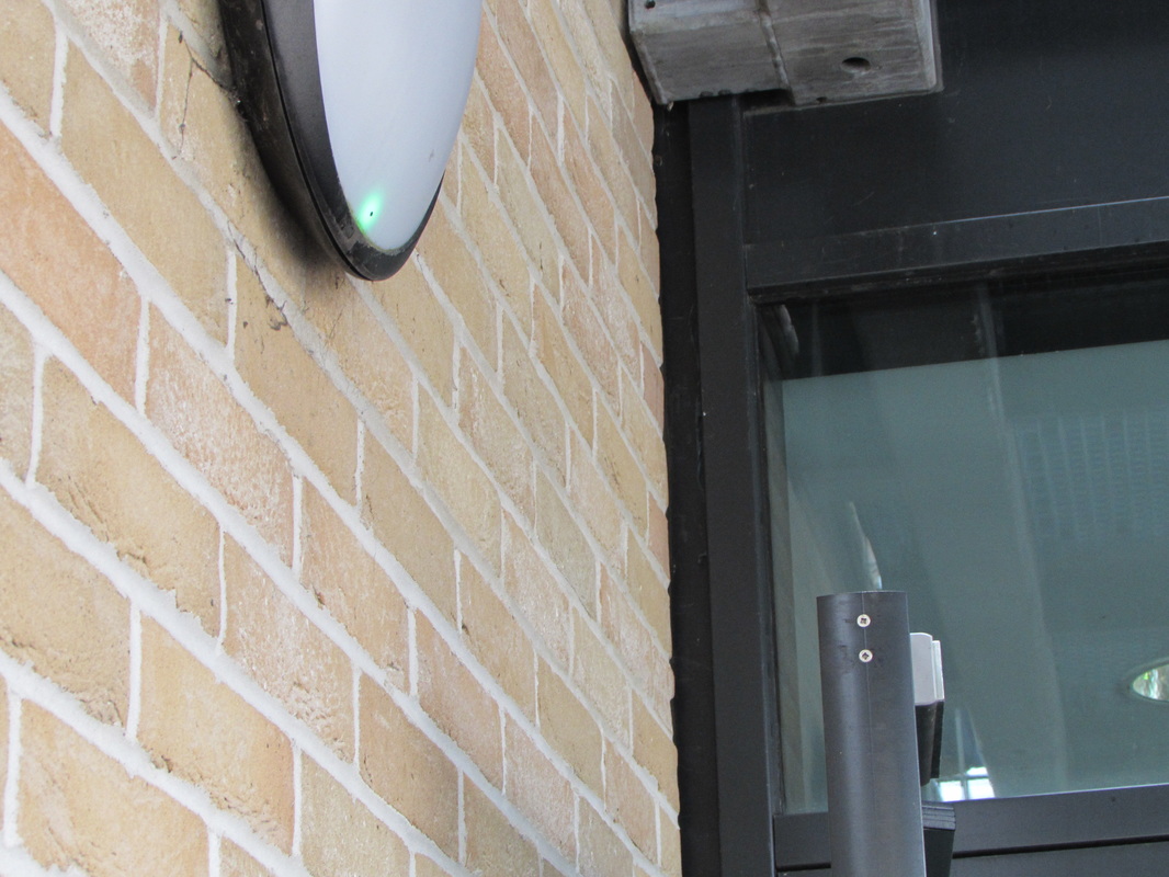
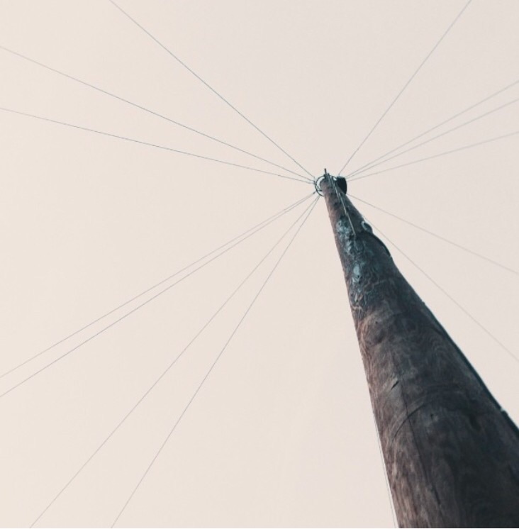
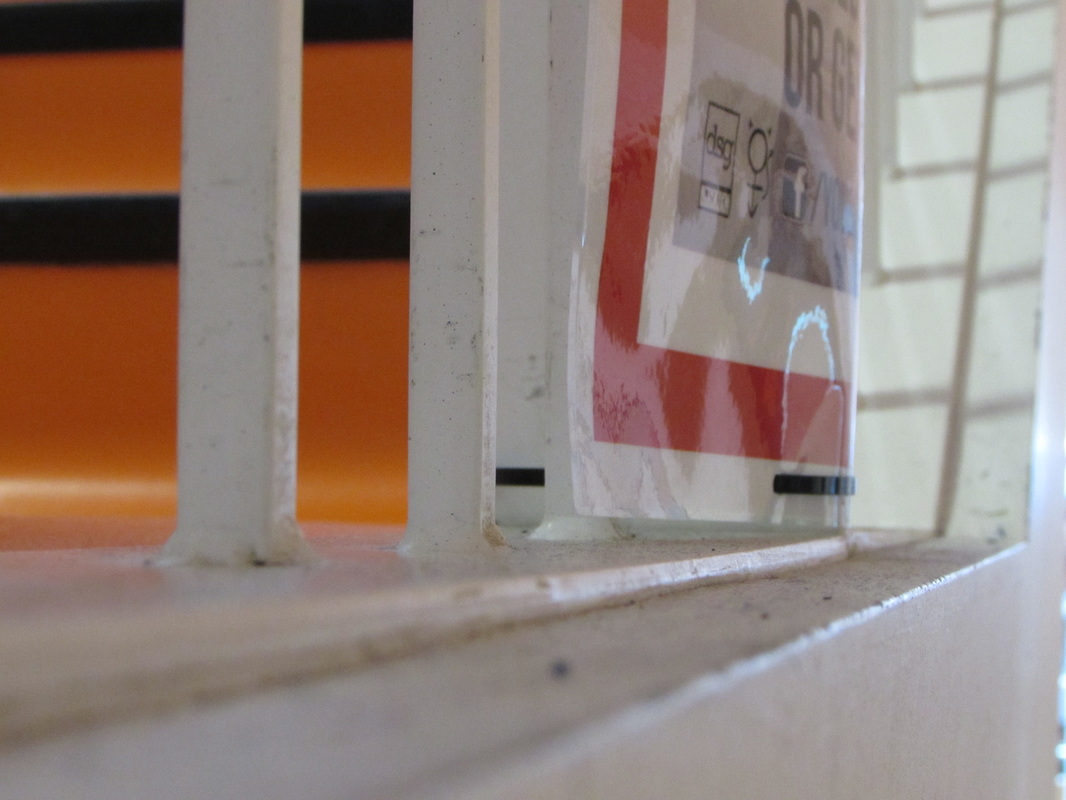
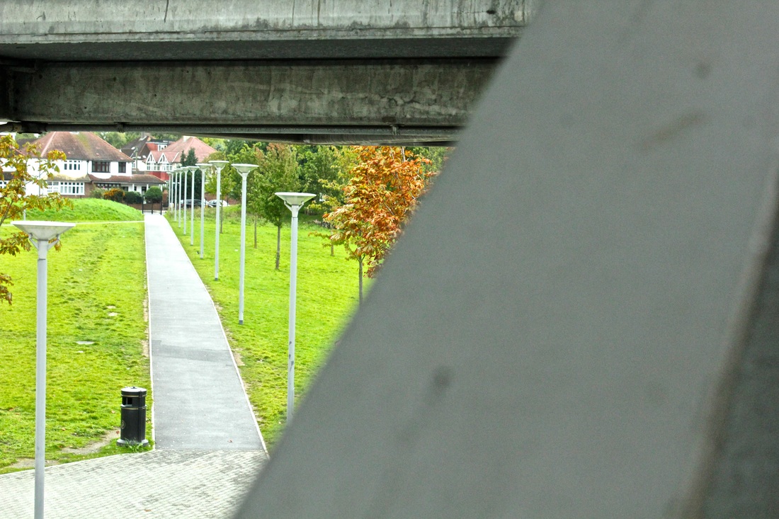
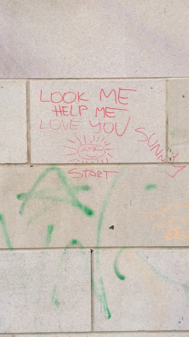
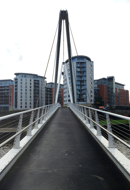
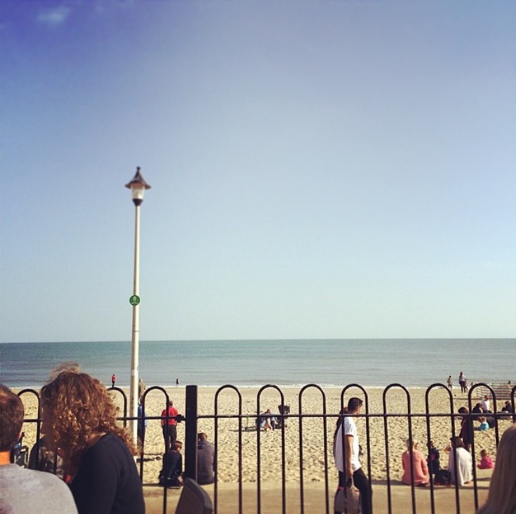
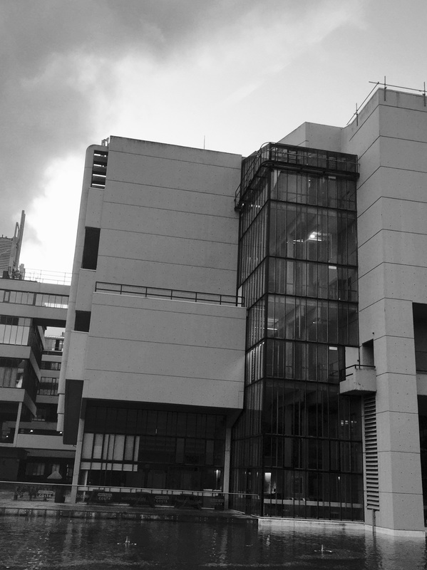
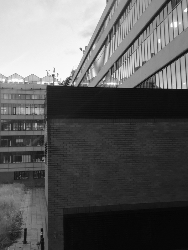

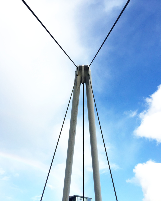
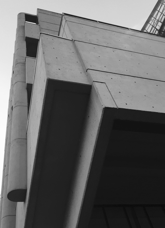
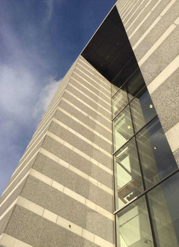
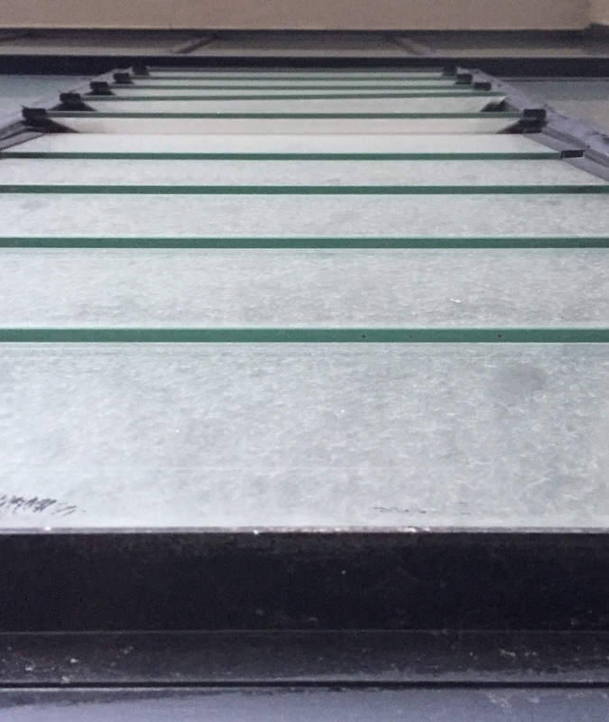
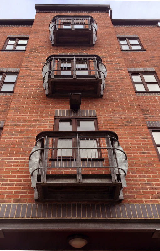
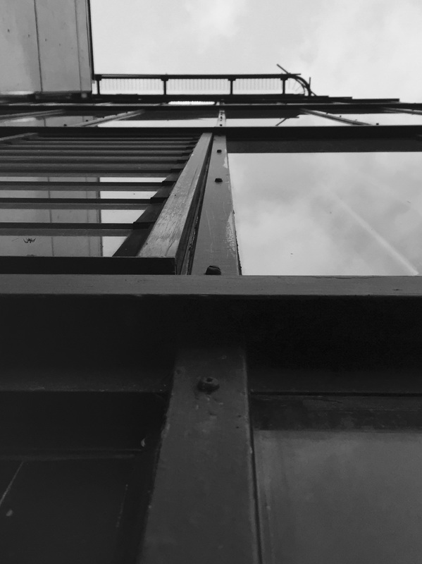
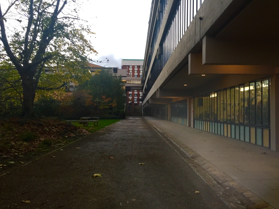
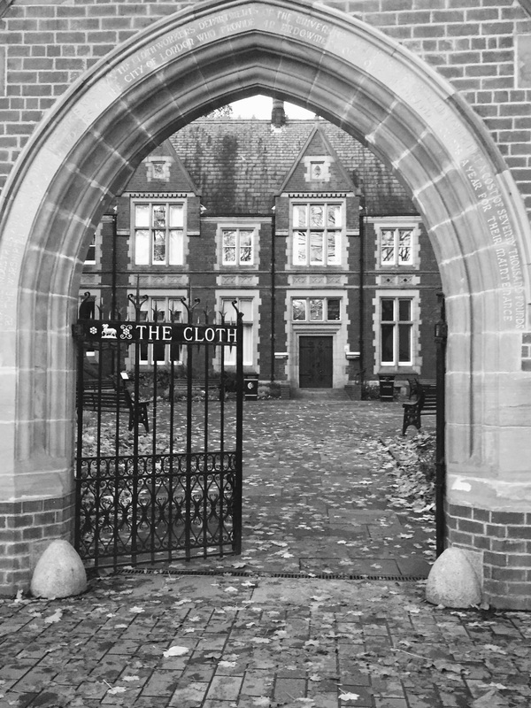
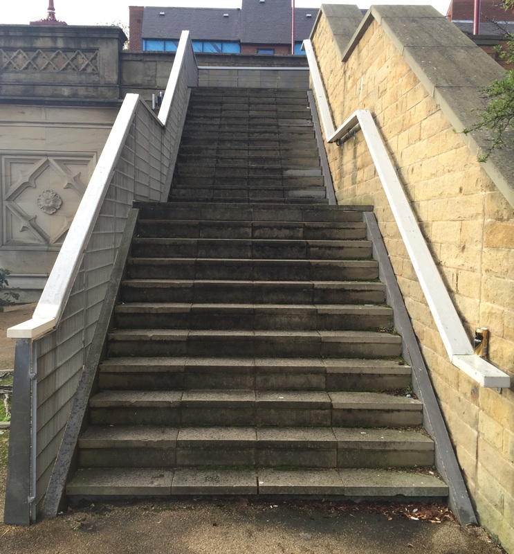
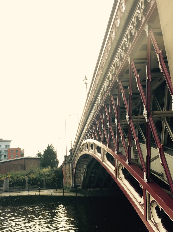
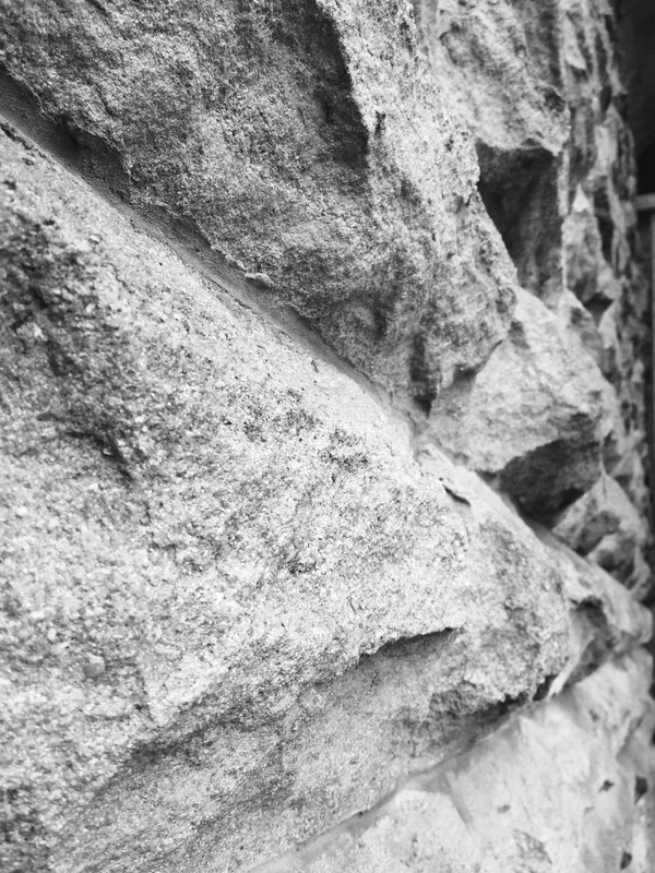
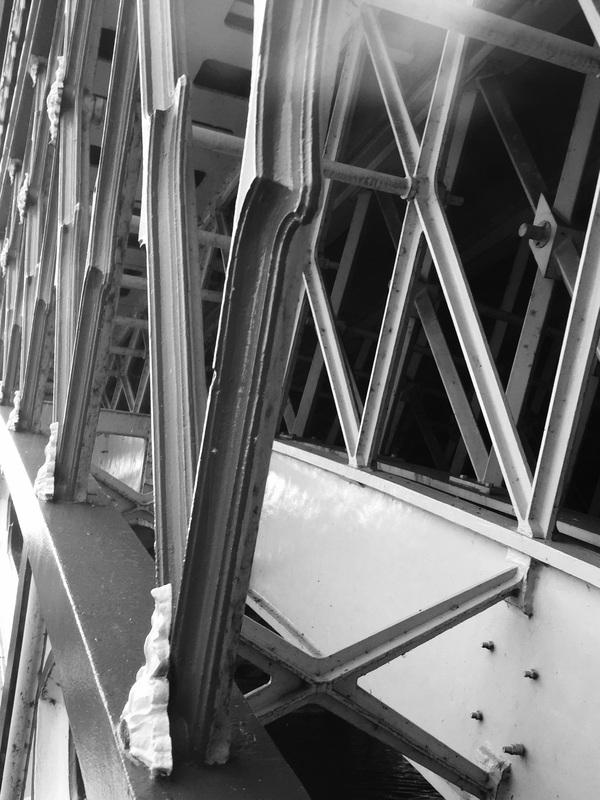
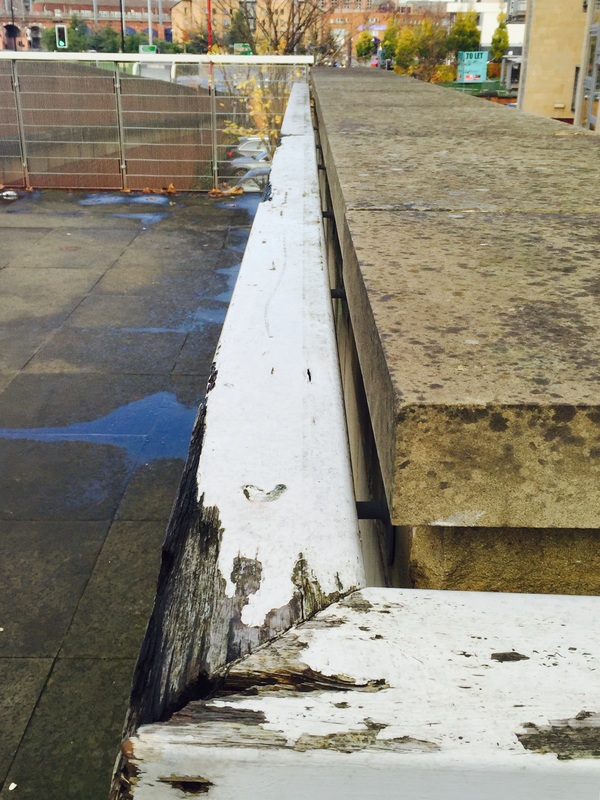
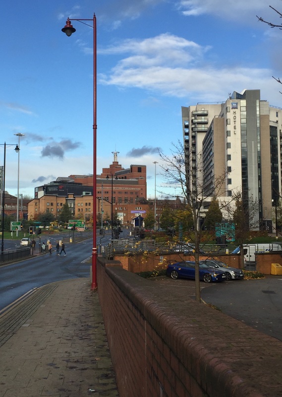
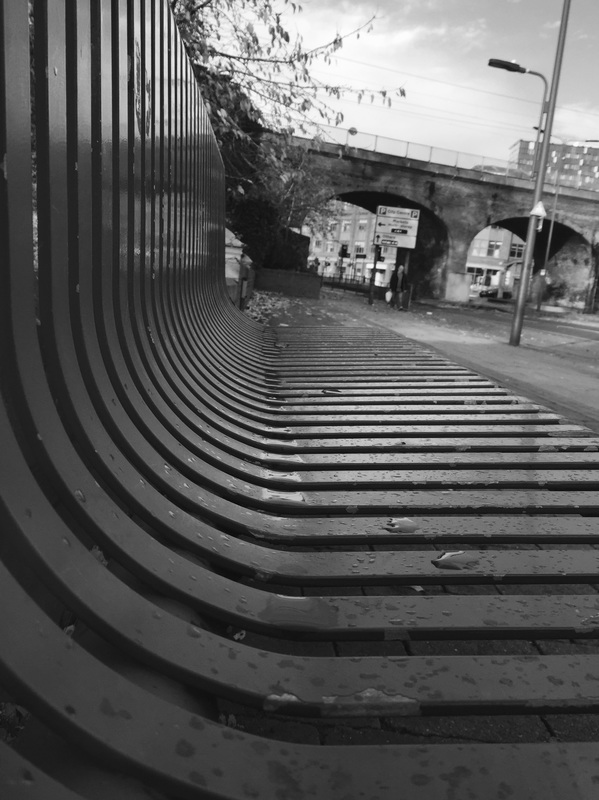
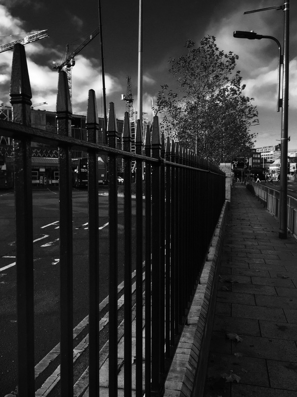
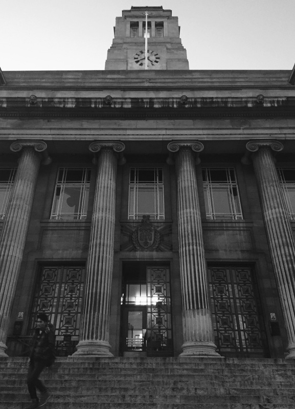
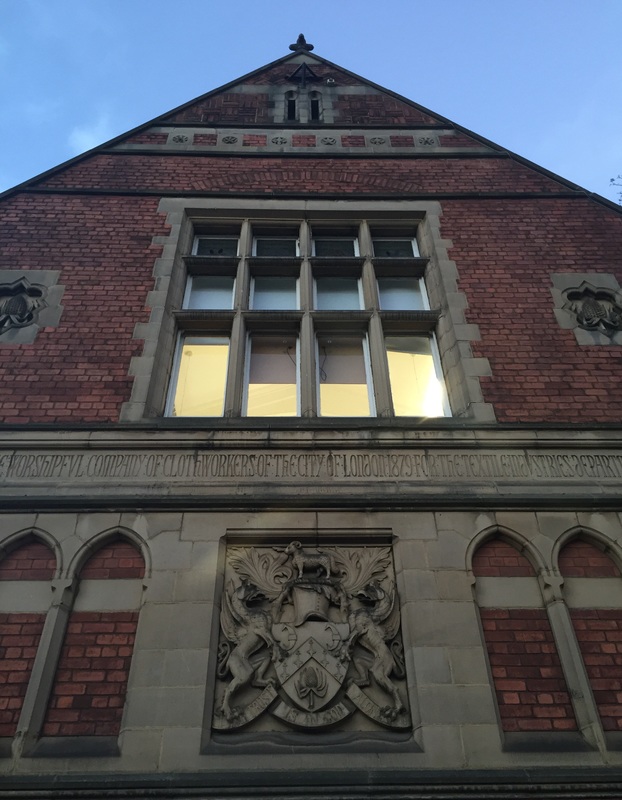
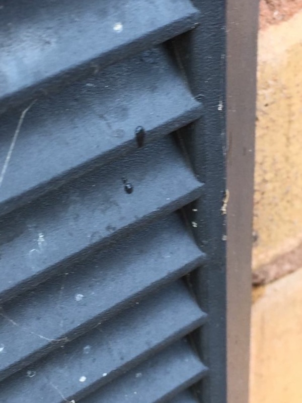

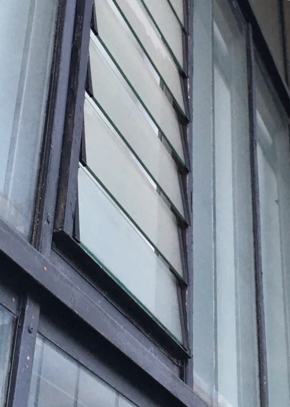
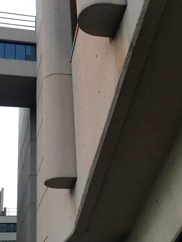
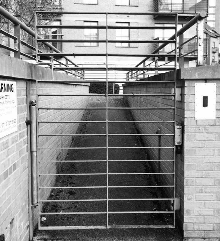
The images above are mostly inspired by Alfred Renger-Patzsch's photographs entitled 'the world is beautiful'. I looked largely at the Formal Elements, such light, shape, colour, form, line, tone, and texture, I tried to incorporate at least one of these elements in each of the photographs and keep the photos simple but still revealing the element i felt interesting.
Alfred Renger-Patzsch's photos are very minimalist but also quite empowering, hes really communicates the relevant factors of each image. I tried to mimic this effect by specifying one or two objects per photograph and have various comparisons within them. When selecting and taking each photo i carefully studied the factors i thought relevant to Renger-Patzch.
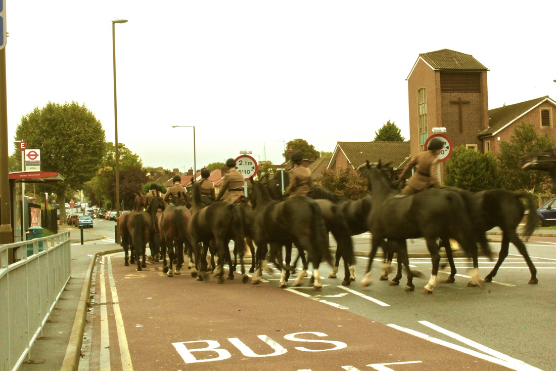
As a result of this most of the images follow a pattern, i also chose to incorporate some images not totally inspired by Renger-Patzch as i thought they were a clear representation of the formal elements and clearly demonstrate identification of specific elements.
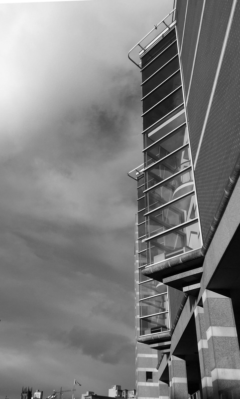
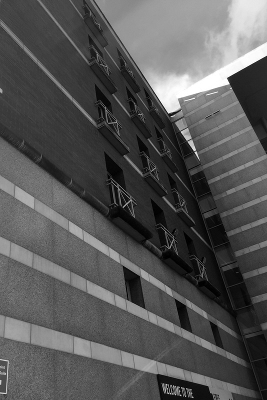
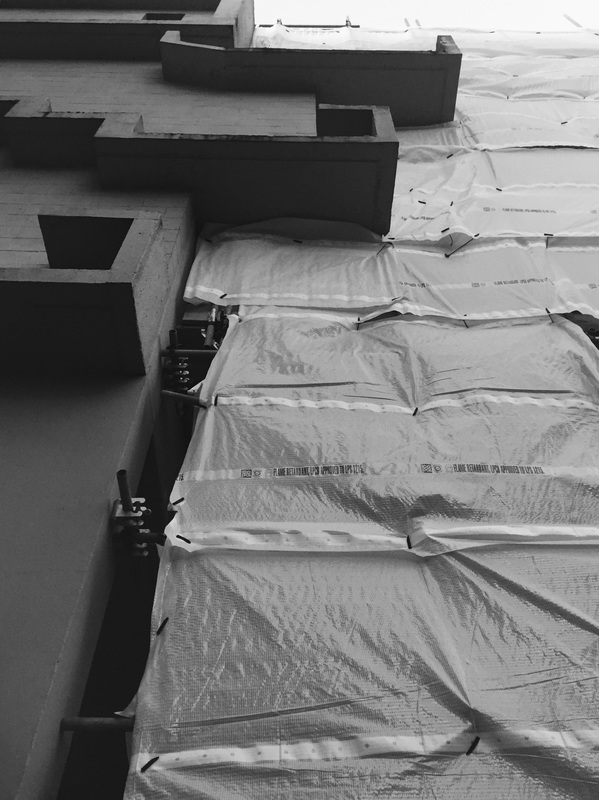
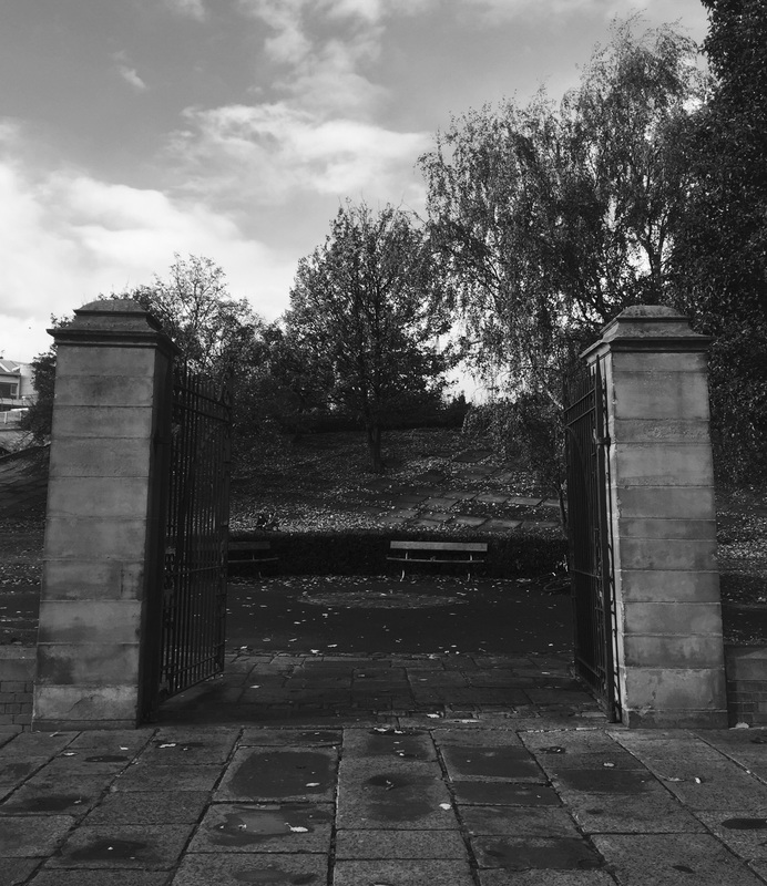
Although some photos have, not many have been edited. I did this as I am of the opinion that the elements should be refined from the moment the photograph is taken - so the refinement is the process of the image going from the eye to the lens - and within reason they shouldn't have to be refined further. I feel these images control the elements well and clearly portray the qualities intended - this makes each image specific. Although this contradicts the fact that Alfred Renger-Patzsch has all of his images in back and white, i disagree with his reasoning for this in coordination to what he is trying to portray through his images.
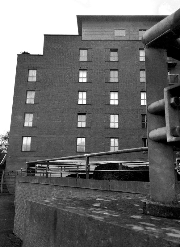
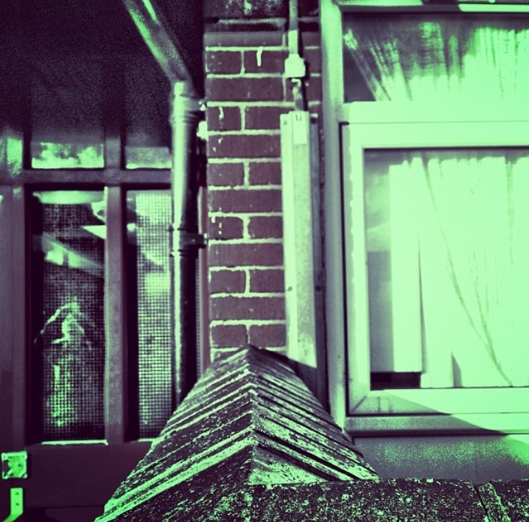
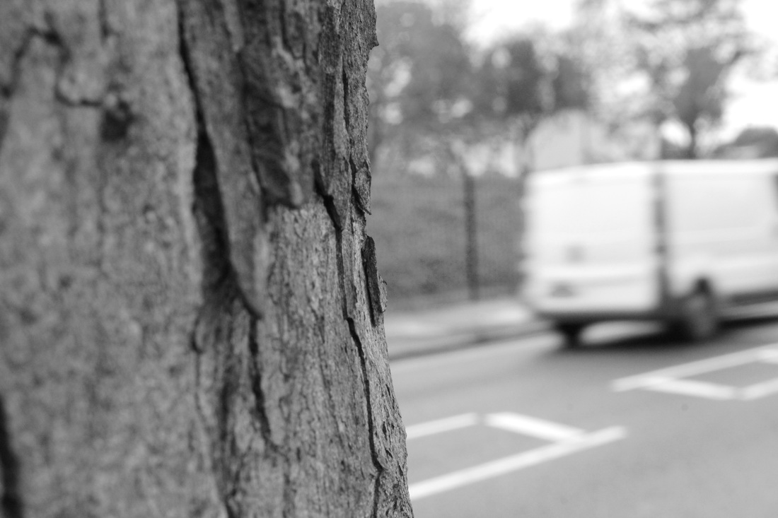
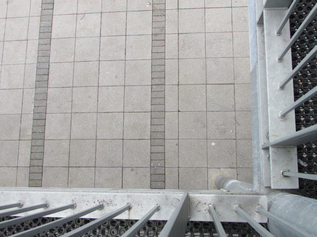
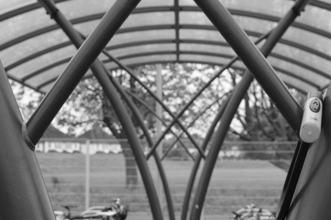
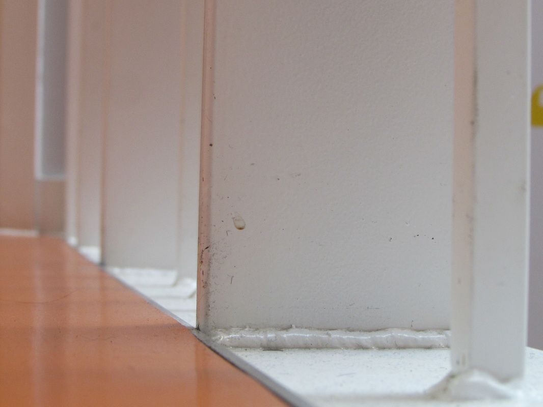
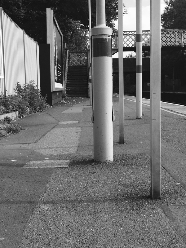
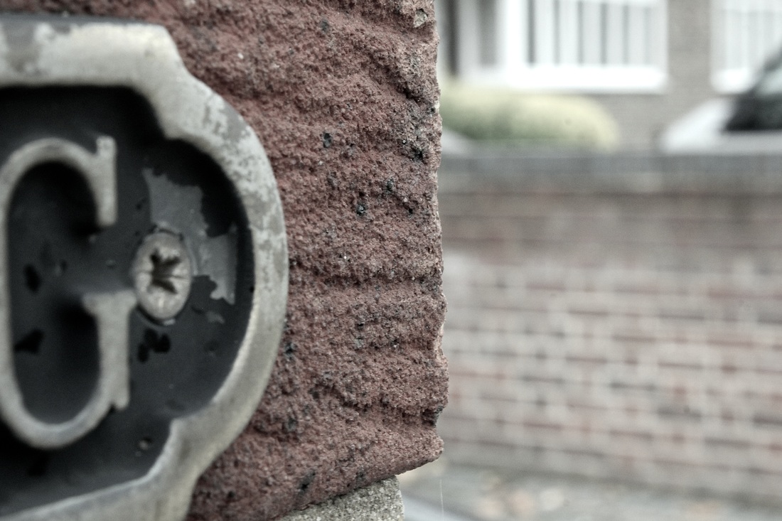
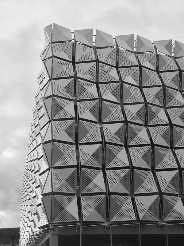
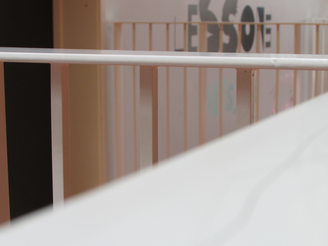
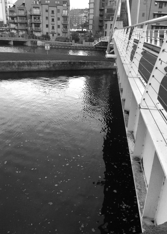
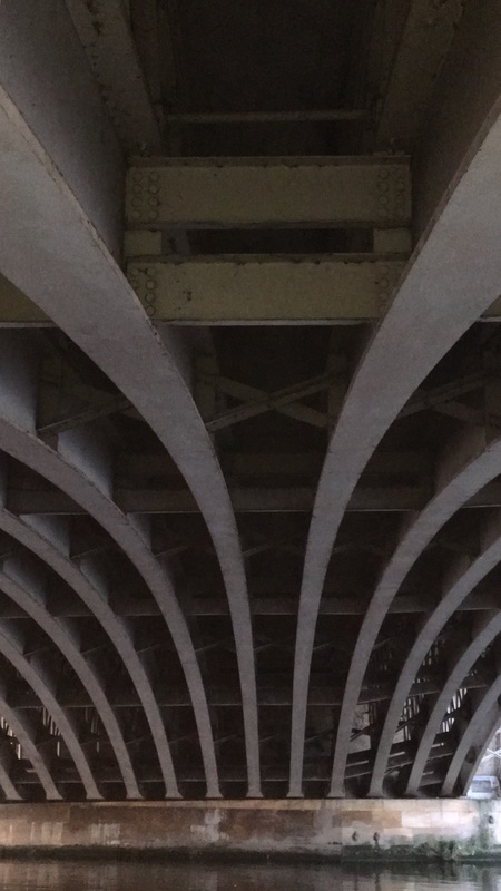
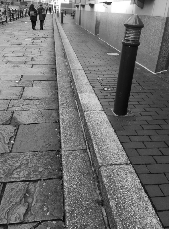
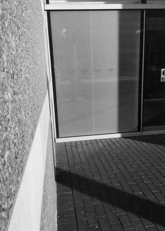
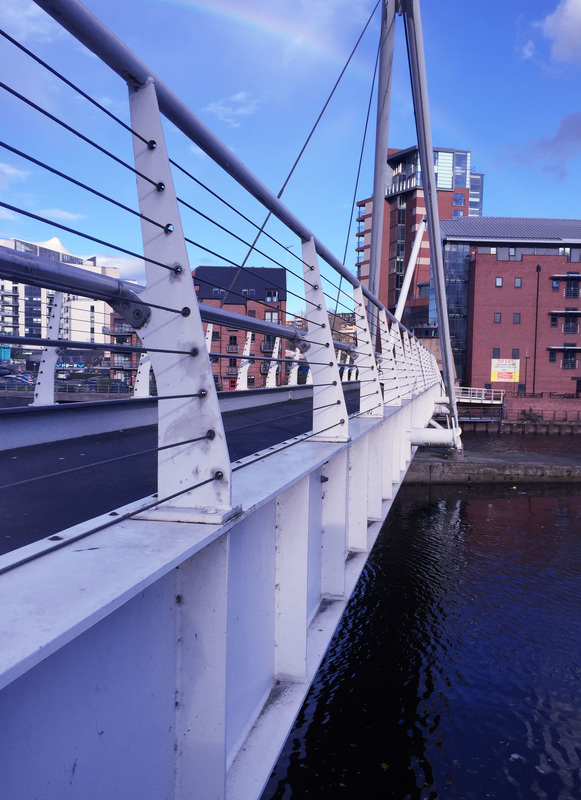
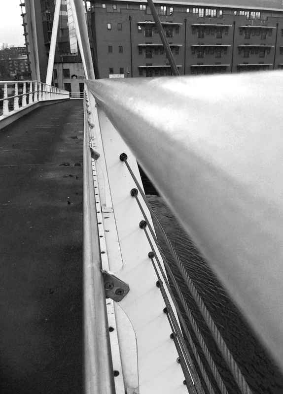
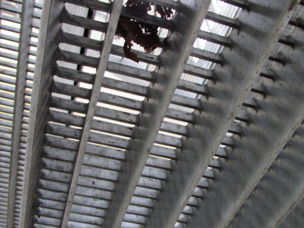
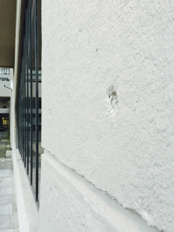
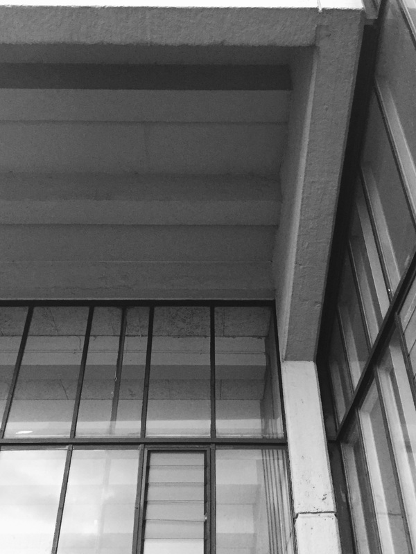
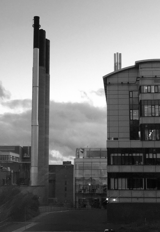
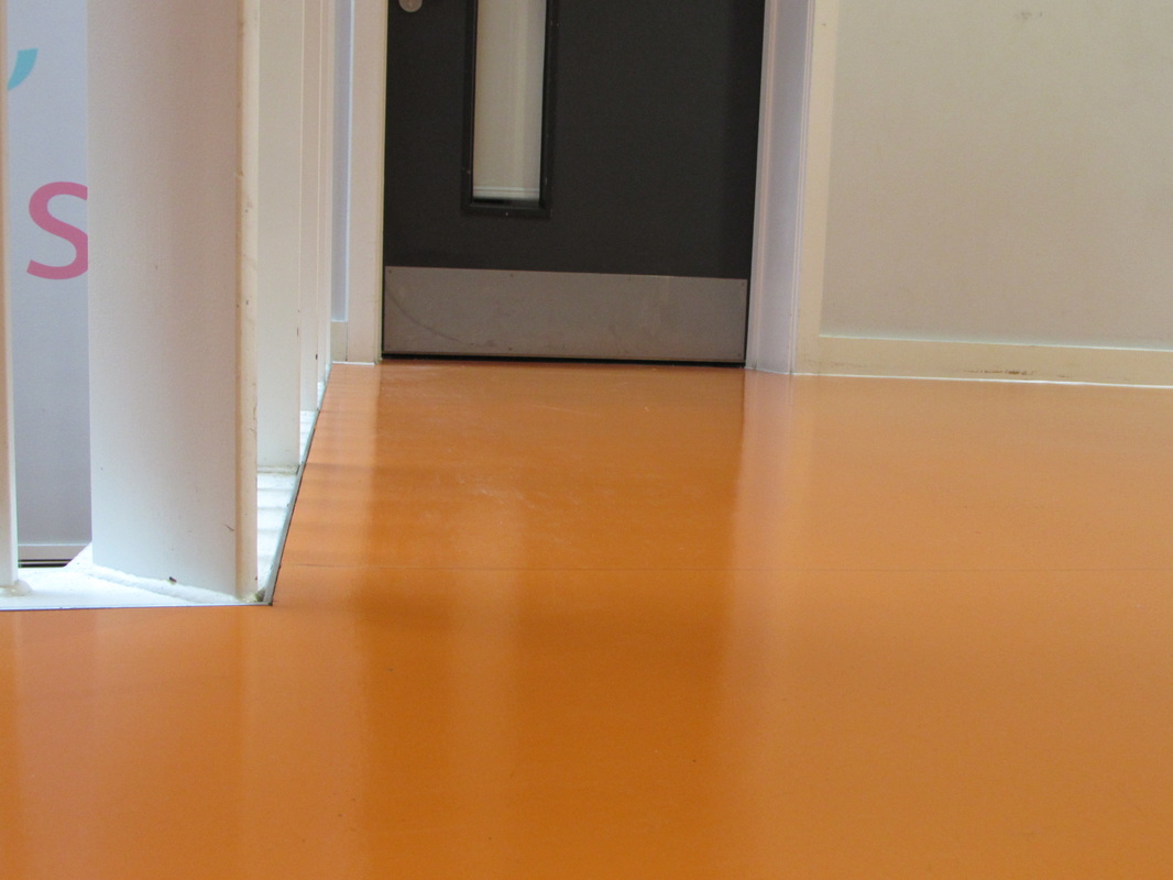
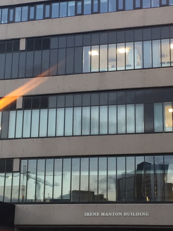
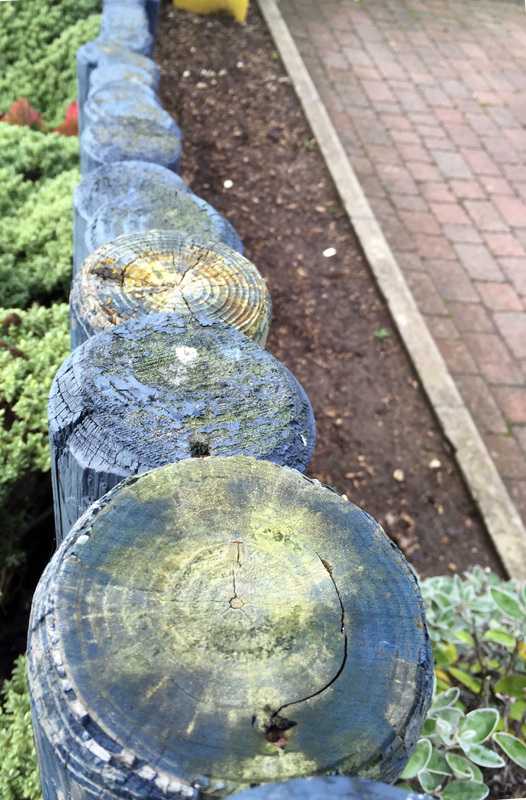
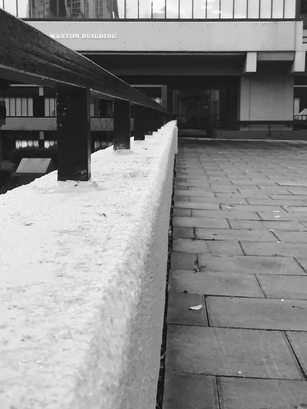
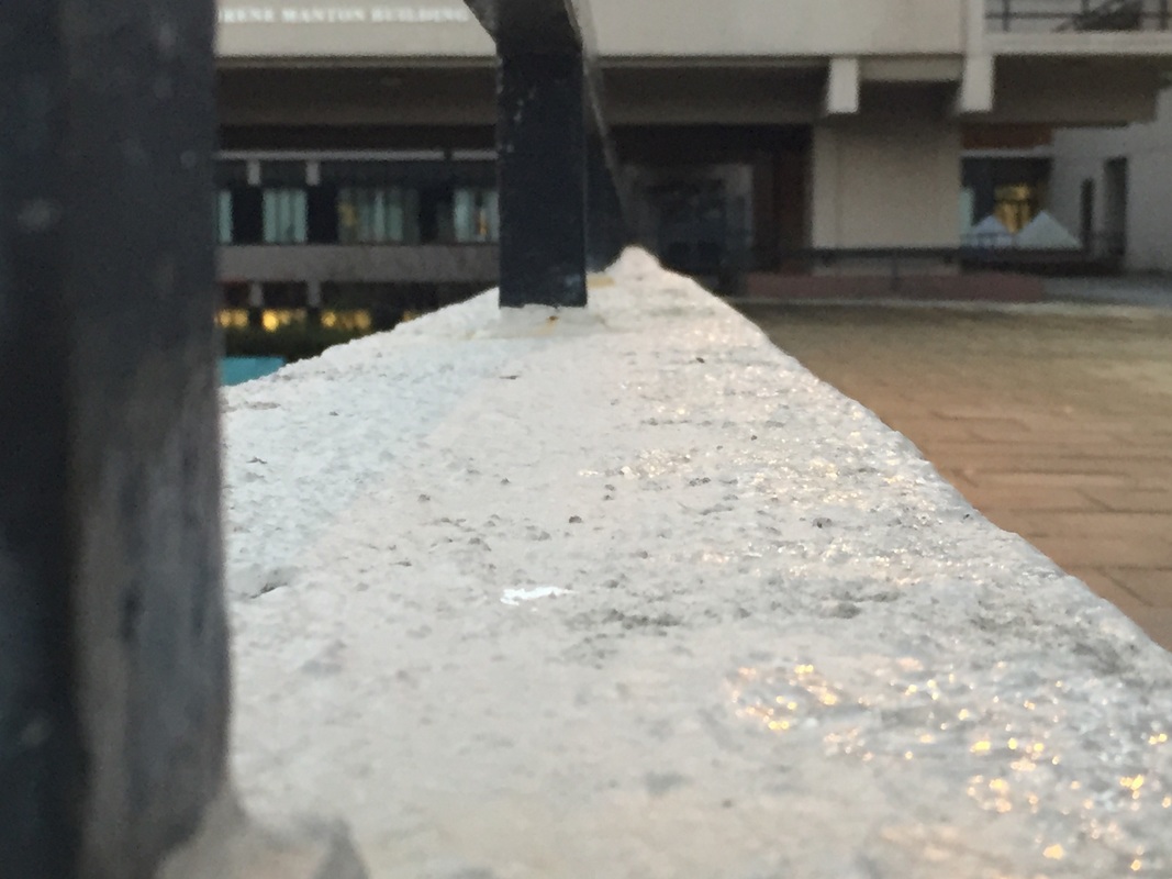
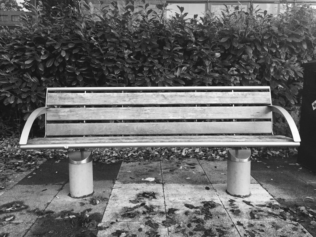
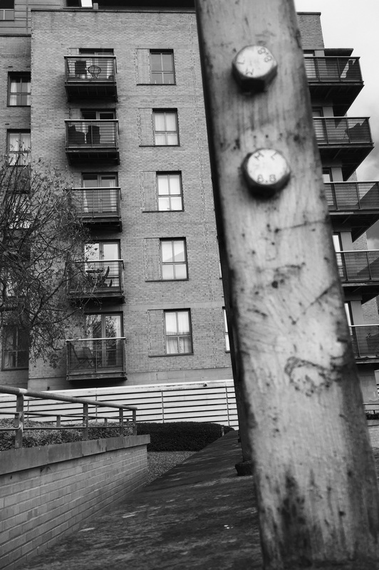
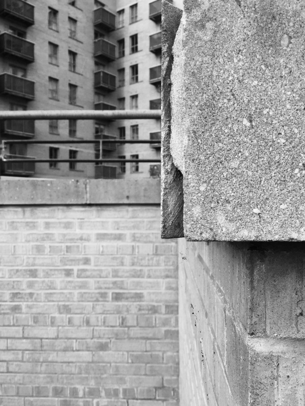
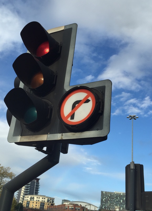
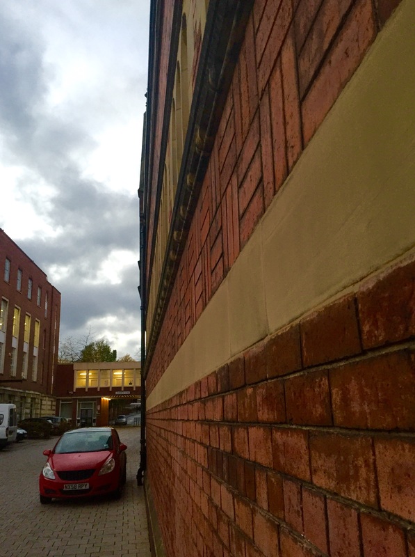
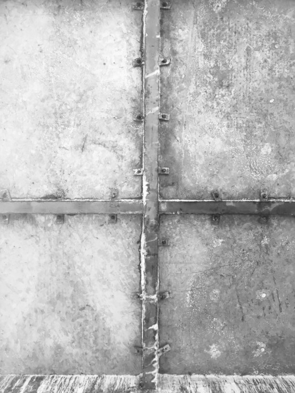
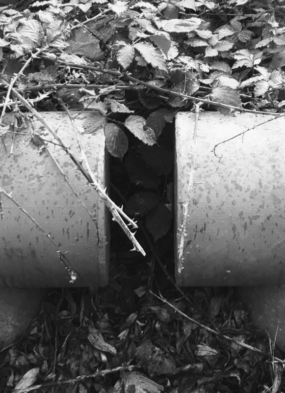
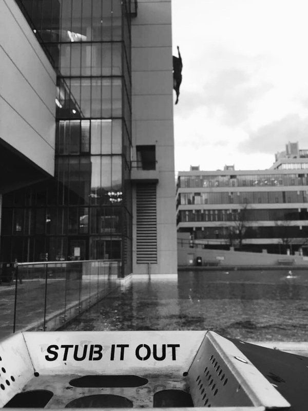
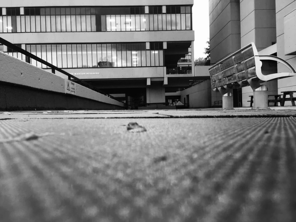
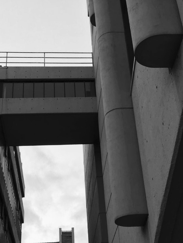
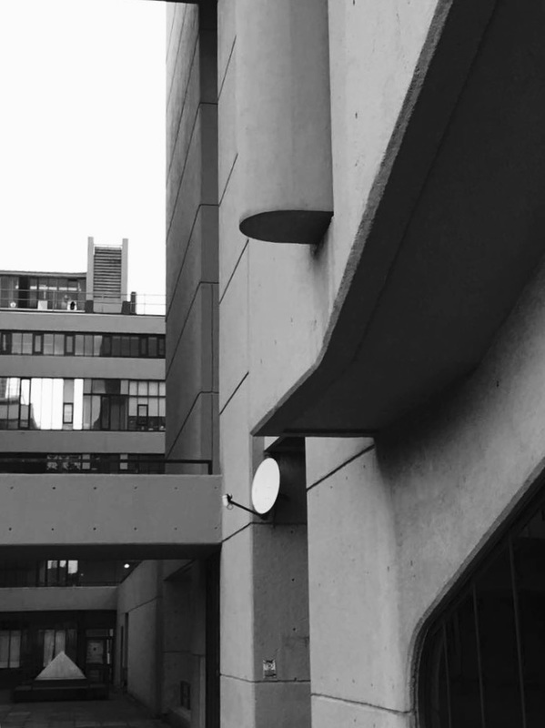
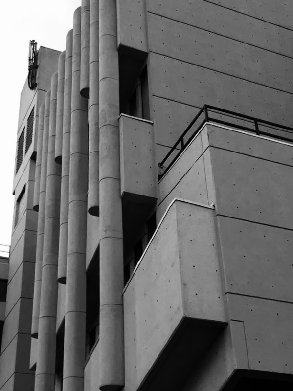
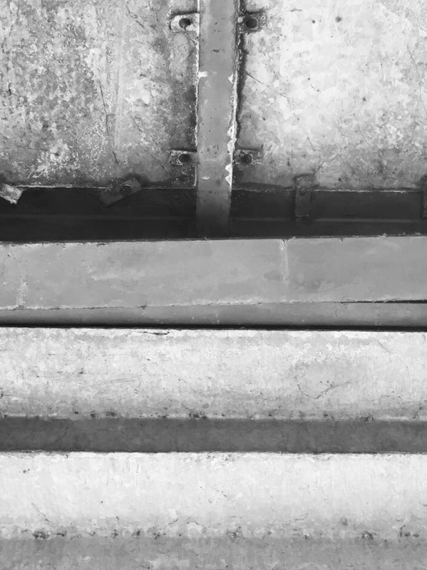
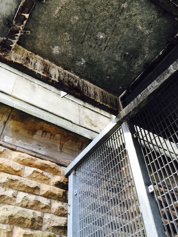
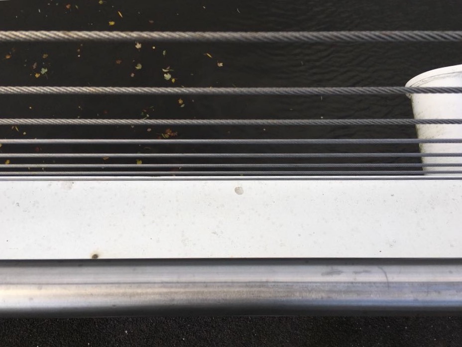
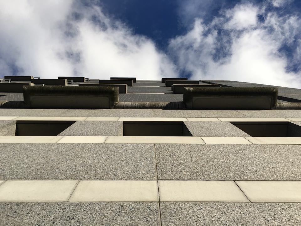
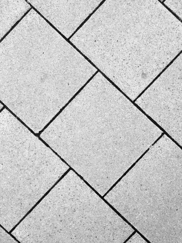
The images above are of various textures but the is a general feel of the images are similar. The photos vary in terms of natural light and light coming from a man made light. I have mainly focused on line and contrasting shapes as an overall feel to the images. I think an important part of capturing light is colour - even if those colours are manipulated. The images i have changed to black and white are ones where colour wasn't an overwhelming factor.
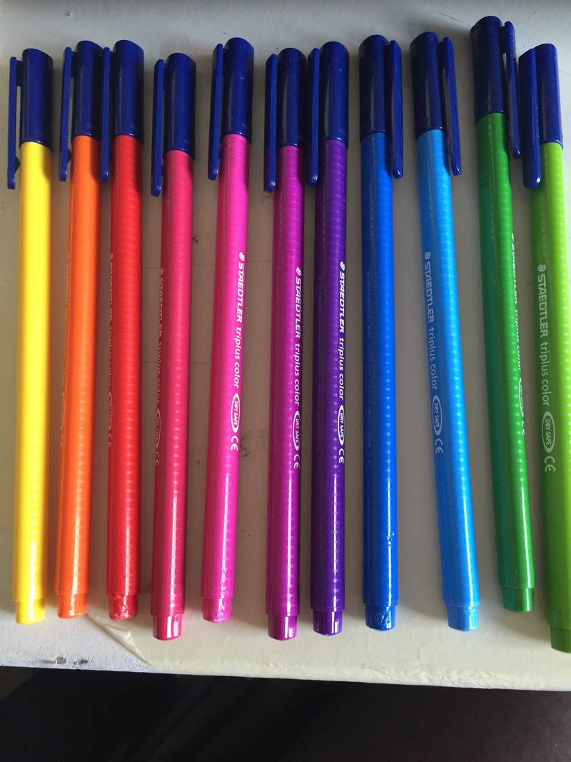
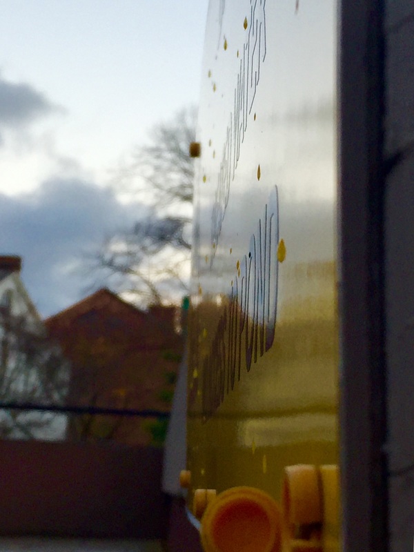
I don't believe in having images in black and white for the sake of the effect. An example of use of colour is the thread of yellow in the bottom left image - the photo wouldn't be nearly as effective in black and white as the contrasting surfaces wouldn't show. Another example is the image of the coloured pens, the colours are vibrant and you can see the shadow of each colour on each individual pen; this is rather effective yet simple, as Alfred Renger-Patzsch's images are.
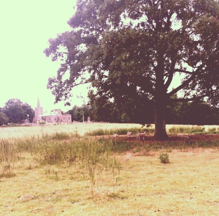
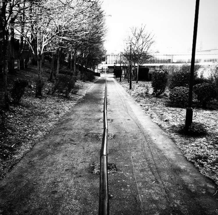
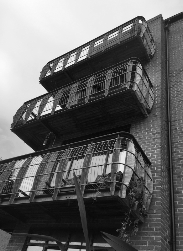
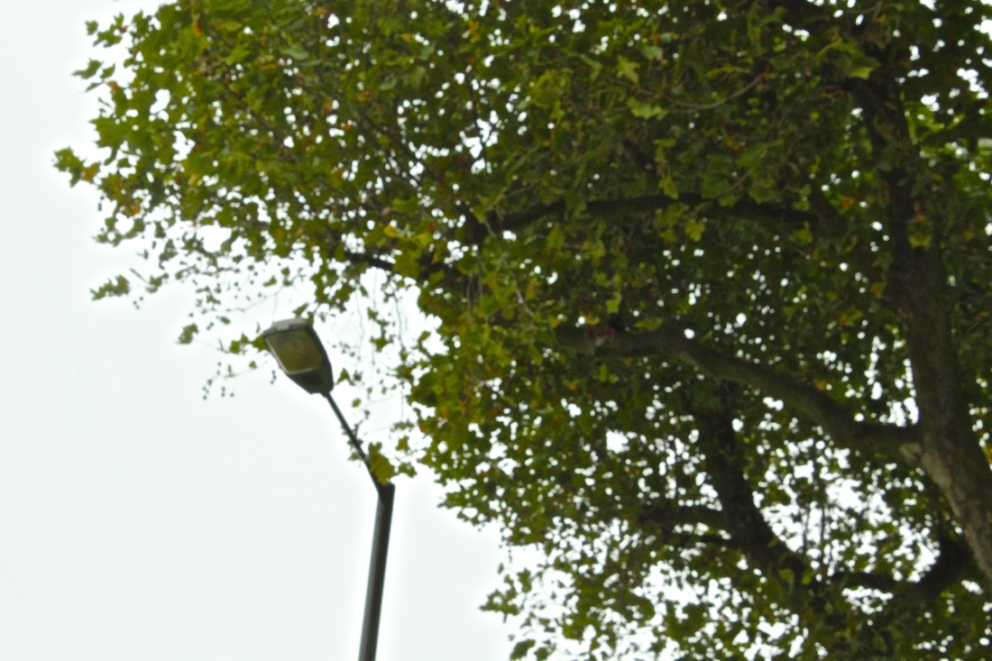
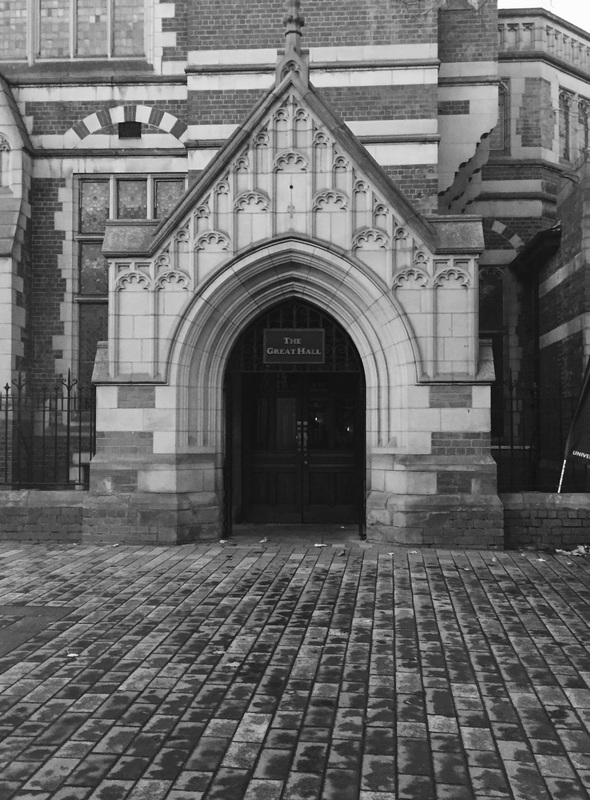
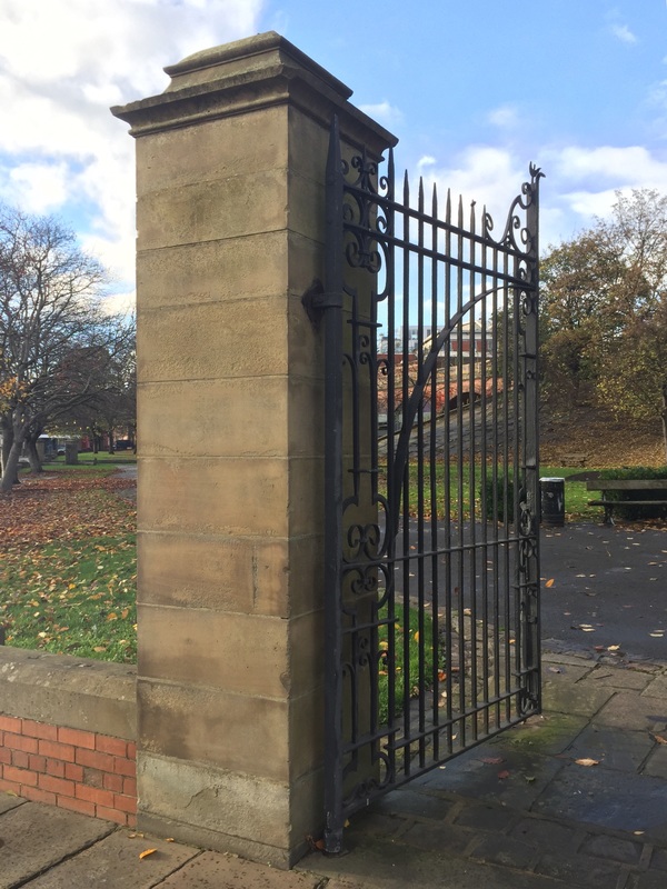
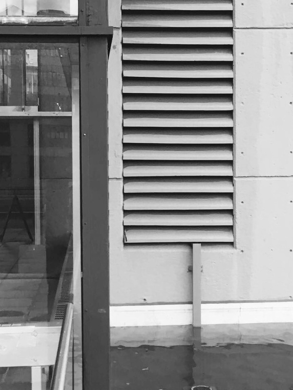
An example of opting to change an image to black and white is the image of a tree in the left hand column. i did this as the colours in the background were drawing the eye to that section when as a matter of fact the image was taken to amplify the detailed texture of the tree. The colour was simply not a relevant factor.
Alfred Renger-Patzsch's photos are very minimalist but also quite empowering, hes really communicates the relevant factors of each image. I tried to mimic this effect by specifying one or two objects per photograph and have various comparisons within them. When selecting and taking each photo i carefully studied the factors i thought relevant to Renger-Patzch.
As a result of this most of the images follow a pattern, i also chose to incorporate some images not totally inspired by Renger-Patzch as i thought they were a clear representation of the formal elements and clearly demonstrate identification of specific elements.
Although some photos have, not many have been edited. I did this as I am of the opinion that the elements should be refined from the moment the photograph is taken - so the refinement is the process of the image going from the eye to the lens - and within reason they shouldn't have to be refined further. I feel these images control the elements well and clearly portray the qualities intended - this makes each image specific. Although this contradicts the fact that Alfred Renger-Patzsch has all of his images in back and white, i disagree with his reasoning for this in coordination to what he is trying to portray through his images.
The images above are of various textures but the is a general feel of the images are similar. The photos vary in terms of natural light and light coming from a man made light. I have mainly focused on line and contrasting shapes as an overall feel to the images. I think an important part of capturing light is colour - even if those colours are manipulated. The images i have changed to black and white are ones where colour wasn't an overwhelming factor.
I don't believe in having images in black and white for the sake of the effect. An example of use of colour is the thread of yellow in the bottom left image - the photo wouldn't be nearly as effective in black and white as the contrasting surfaces wouldn't show. Another example is the image of the coloured pens, the colours are vibrant and you can see the shadow of each colour on each individual pen; this is rather effective yet simple, as Alfred Renger-Patzsch's images are.
An example of opting to change an image to black and white is the image of a tree in the left hand column. i did this as the colours in the background were drawing the eye to that section when as a matter of fact the image was taken to amplify the detailed texture of the tree. The colour was simply not a relevant factor.
