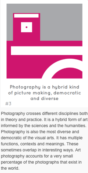
Psychology behind photography
I intend to investigate the deeper meanings of both photography, and photography as an art form. I've chosen to look at the effects various techniques and elements can have on the viewer, and how these can be manipulated to create purposeful feelings and meanings to a photograph/selection of photographs. In addition to this, I will investigate how different subjects alter perception in a psychological way.
Sensation: the unprocessed experience associated with the stimulation of a sense organ eg. eyes, ears or skin.
Perception: basic operations of how the brain organizes, interprets, and makes sense of that sensory stimulation.
Both are part of one continuous process. Some aspects of the process are innate, and others are learned through experience. This determines how we experience photographs.
Perception: basic operations of how the brain organizes, interprets, and makes sense of that sensory stimulation.
Both are part of one continuous process. Some aspects of the process are innate, and others are learned through experience. This determines how we experience photographs.
VISUALISING AND VERBALISING
Language and visualisations are described as two basic ways our mind manages memories and processes information; often referred to as “verbal” and “mental imagery” systems. We think with both words/conversations, and visualise with images in our minds. Language resides on the left side of your brain, and complex visual imagining takes place on the right side of the brain. The verbal system involves thinking that is more conceptual, linear, conscious, and factual; whereas the mental imagery system is more sensory, holistic, fantasy-based, emotional, and personal. Words are abstractions of concepts, compared to images which more easily stimulate the senses. Most people rely on both systems for cognitive functions, but some people may be better visualisers while others are better verbalisers, which could easily affect the way they perceive a photograph. Whilst it is argued ‘one picture is worth a thousand words’, and so attempting to describe the impact of an image in fact causes us to lose sight of the visual experience, amazing work can go on unnoticed until people begin discussing, and describing their work. This creates an idea of understanding the impact of verbalising versus simply visualising an image.
Line
Line is a basic visual element. The first thing a person draws is a line, a line makes up the basics of everyday experience. We use phrases such as “stand in line” and “don’t cross the line”. These show two functions of the line, a sense of direction, and a boundary. It’s biologically programmed in both human and animals to want to follow a visible line. For animals, a line creates a territory, and a boundary to another space. This idea manifests itself in photography, as an idea of separation between areas, and also two or more lines interacting to form a shape; the outline of the shape tends to be more important to the eye than the lines themselves. When a line in photography does attain substantial width, it starts to have character. That line can have various tones, colour, and textures. A line can be vertical, horizontal, diagonal, curved, broken, or zig-zagged; eacg line has its own characteristics.
SYNESTHESIA
This is when the stimulation of one sensory system leads to an experience in another. For example, some people see colours when they listen to music. This is commonly reported when using psychedelic drugs, but can also occur naturally in some people. This idea thought to reveal the potential for the mind to process a sensation in various ways. Colours can also often be associated with physical sensations, such as touch; some may seem dry or wet for example. Sometimes the influence of these sensations on creation is unconscious. There’s a photographer who noticed a pattern emerging in his images, a visual repetition of three elements, and then a fourth distinctly below the other three. He then realised he’d been listening to Beethoven’s Fith Symphony. The music had been shaping his visual experience. In photography, you could think about visual experience as more than what we see; you could develop awareness of all the senses in an image.
EYE CONTACT
Eye contact is very powerful to people, it can often be classed as communion (the exchange of intimacy). Eye-contact immediately amplifies any emotion, from affection to fear. In acting, when an actor wants to convey as much emotion as possible, when they want to draw the viewers into a scene, they look directly as the camera. The same applies with photographs, those where the subject is looking directly into the lense seem somewhat more intimate and compelling, as if being pulled into the photograph. It can be classed as breaking the fourth wall. The luxury of photographs is that you can hold eye-contact with the subject, with the knowledge that they aren’t actually present, and isn’t really looking at you. Although there is a primitive and emotional part of us that reacts as if the person is looking at us; which creates a mental conflict.
Abstract portraiture
Intention:
I want to use the idea of colour from synesthesia, portraiture from eye contact, and line to create an outcome. I thought about different ways of combining these elements and after investigating various artists I chose to respond to the video 'I fink u freeky' by Die Antwoord and create a series of abstract portraiture photographs. I intend to make these images provocative and sinister as well as incorporate the above elements, and see how they make the veiwer feel.
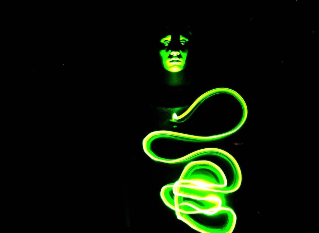
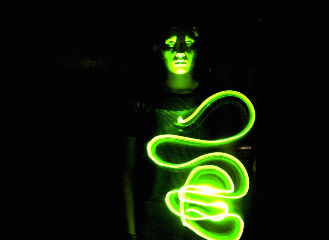
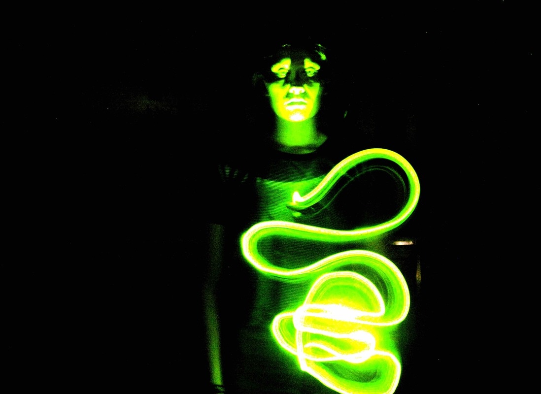
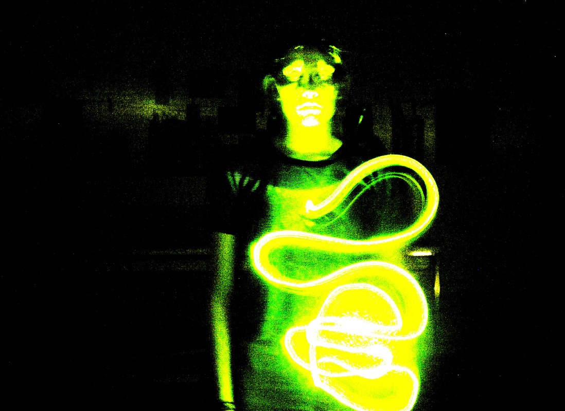


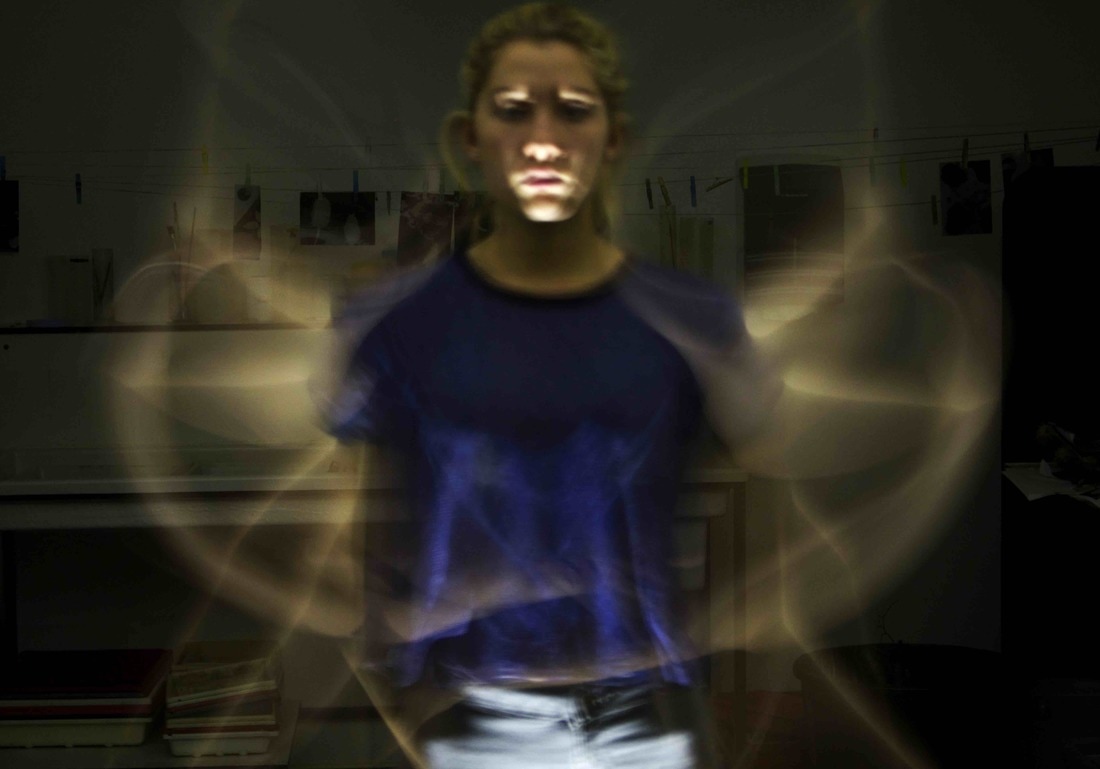
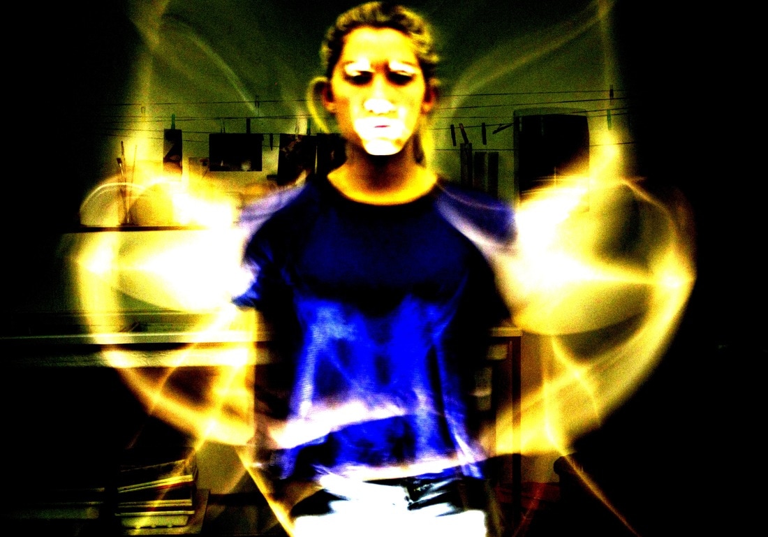
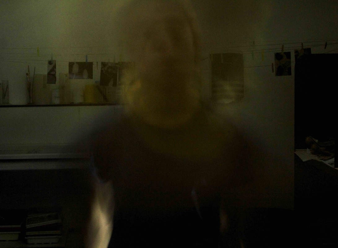
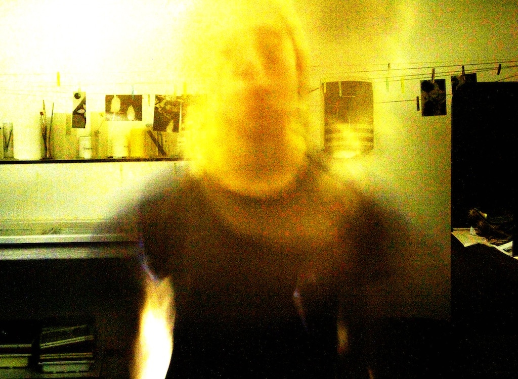
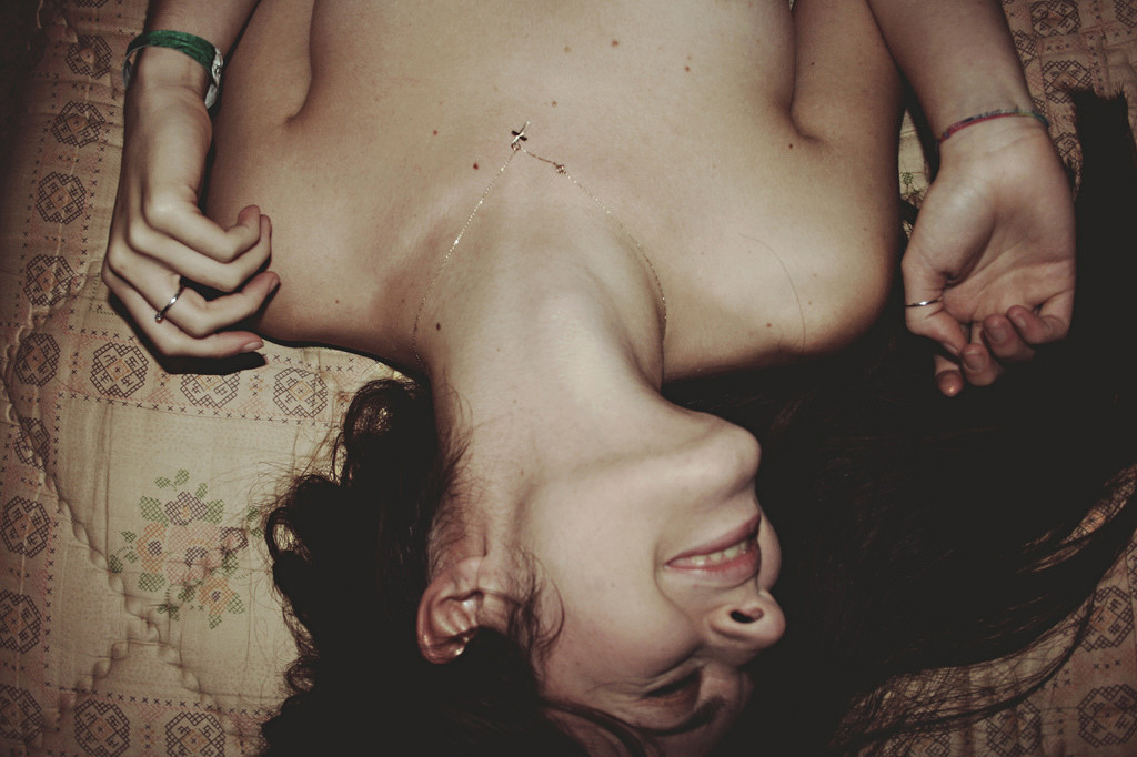
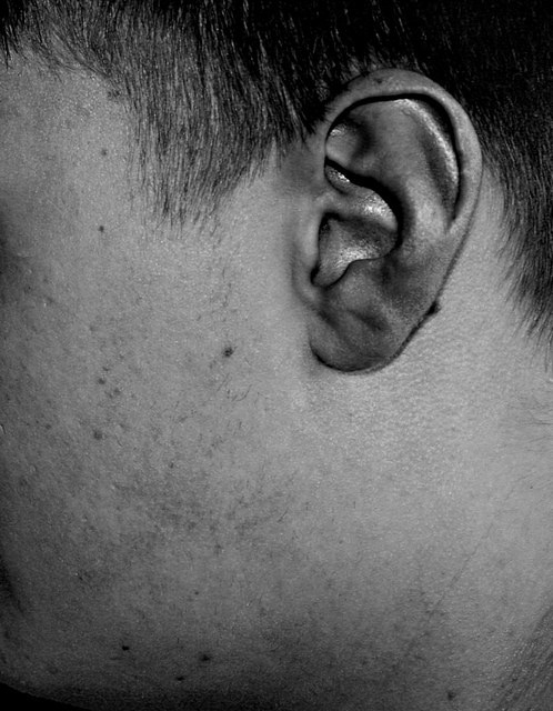
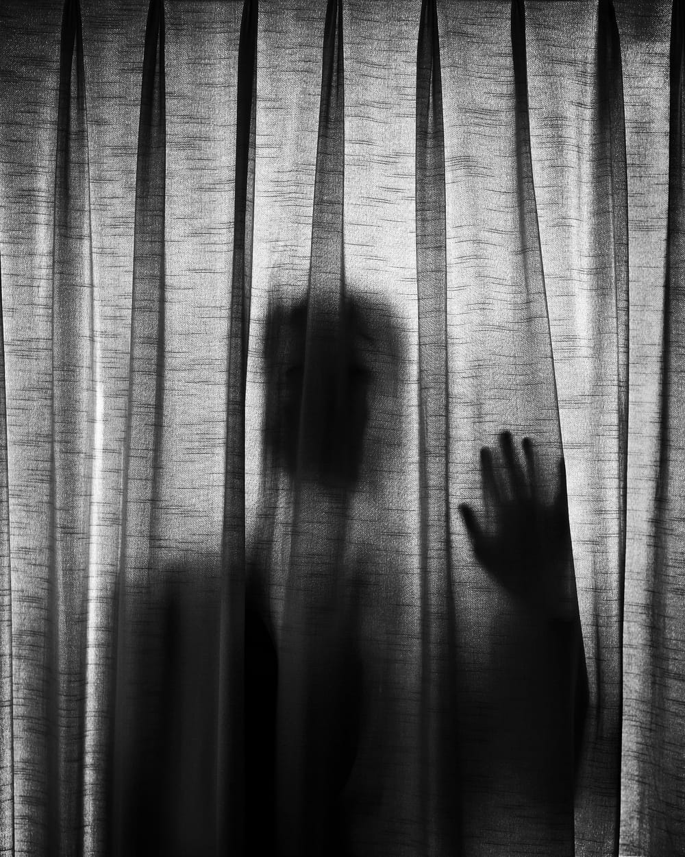
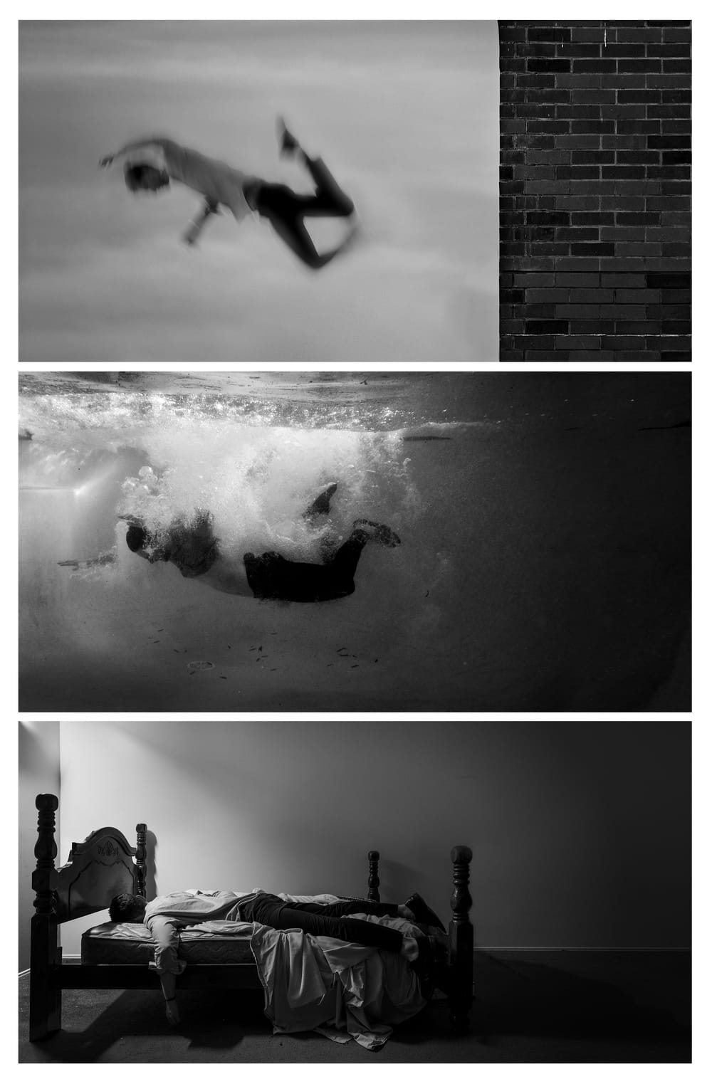
Initially I went outside and began thinking of ways to create original portraiture, I took pictures of sections of peoples faces and body's. I looked at the images I had taken and didn't think they were particularly abstract or interesting, and they didn't clearly incorporate the intended elements. I then chose to use the dark room as I thought being outside wouldn't help make the images abstract. I took time to plan out the images I was going to take as decided that though the images are portraits, the focus of the image shouldn't be the person. I experimented with effects of shutter speed, and aperture, and decided to use an led light. I took a series of images on a timed camera on a tripod, with a slow shutter speed, staying still, but moving my arms and the led light. The led light lit my body very slightly, so the images are still clearly portraiture, but the effect of the moving led light made my body a secondary focus point.
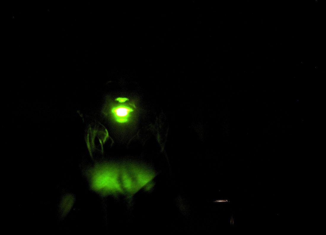
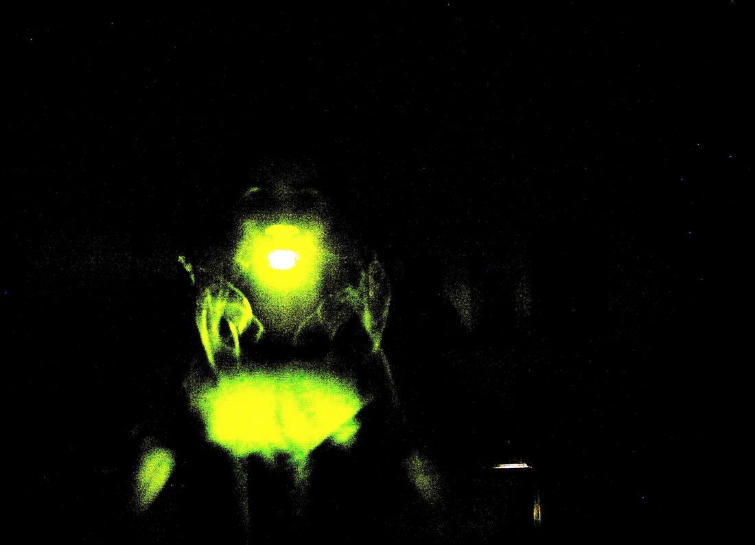
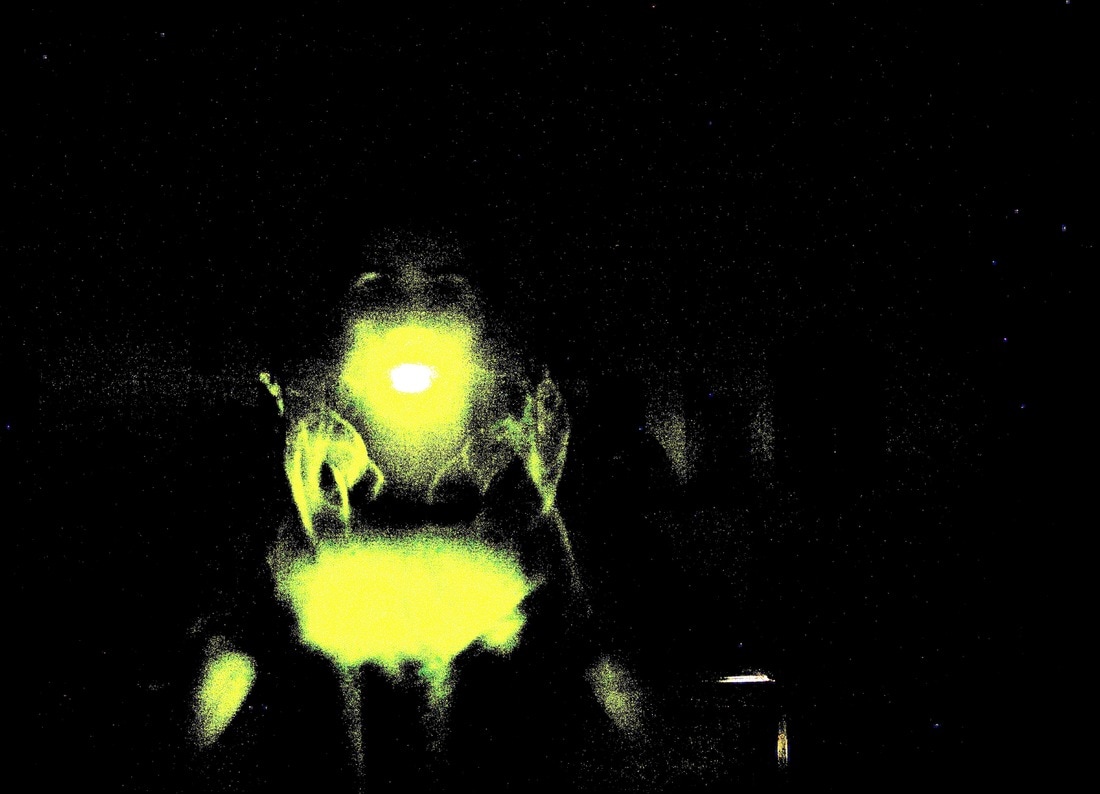
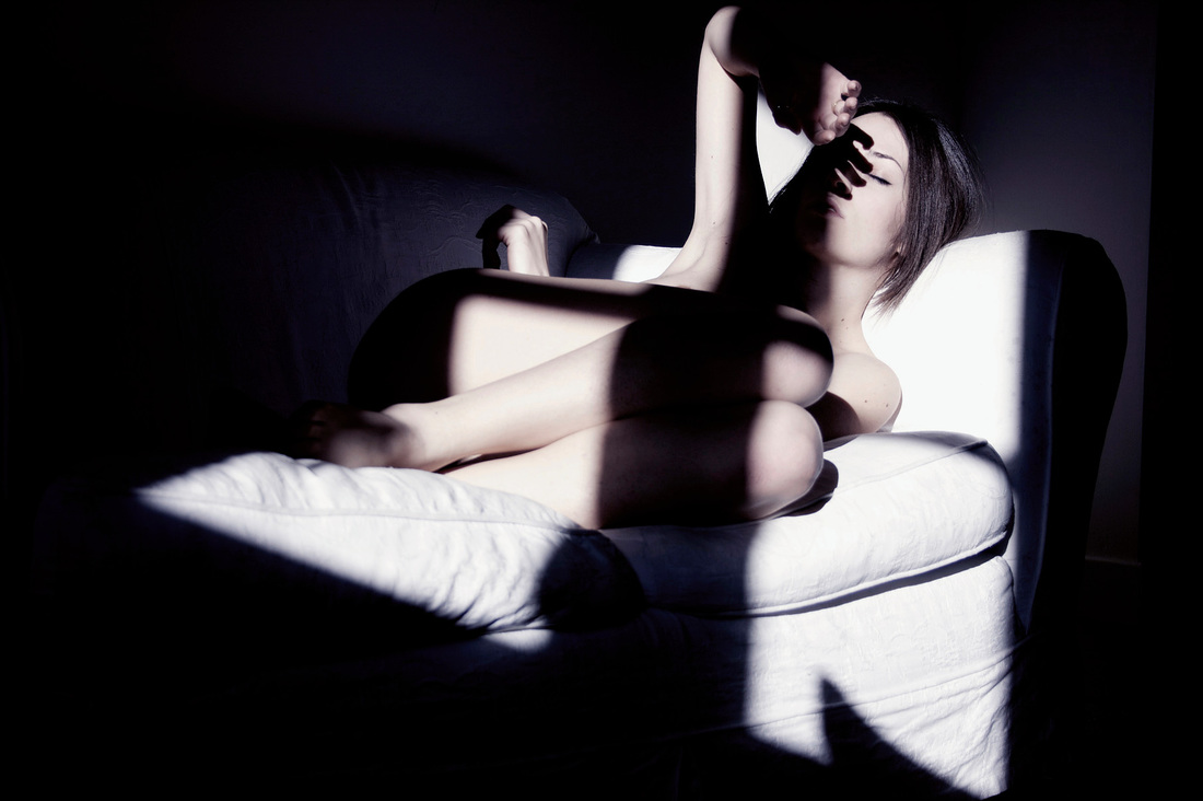
I then decided to take the images as self-portraiture, putting a torch on the floor in front of me, lighting myself from below. I then once again used a slow shutter speed, and began to slowly move. This created a sinister effect, and interesting blurred shapes and soft textures. Once a had a small series of final images I then began to look at the effects levels had on them when editing. I opened the images in photoshop and started to play around with levels. As the images are highly contrasting - as the room was very dark, and the led light was very bright - the levels created a grainy texture, and dispersed the light into small rigid sections, totally changing the soft textures in the original photograph. I then thought i could create a series of images based on shifting the textures in each image, changing the entire tone of each image.
Creating these images linked to the idea of synthesthesia as your eyes are drawn to the coloured light in the image, which alerts the senses due to the darkness of the rest in the background. This light further misdirects your vision from the fact the image is portraiture, creating a deeper abstraction to the photographs. The LED also created interesting lines within the images. Another aspect I incorporated into the portraiture is eye contact. Seeing as I intended to create a sinister tone to these images, looking directly into the camera amplified this feeling, and further drew the viewer into each image making them somewhat memorable.
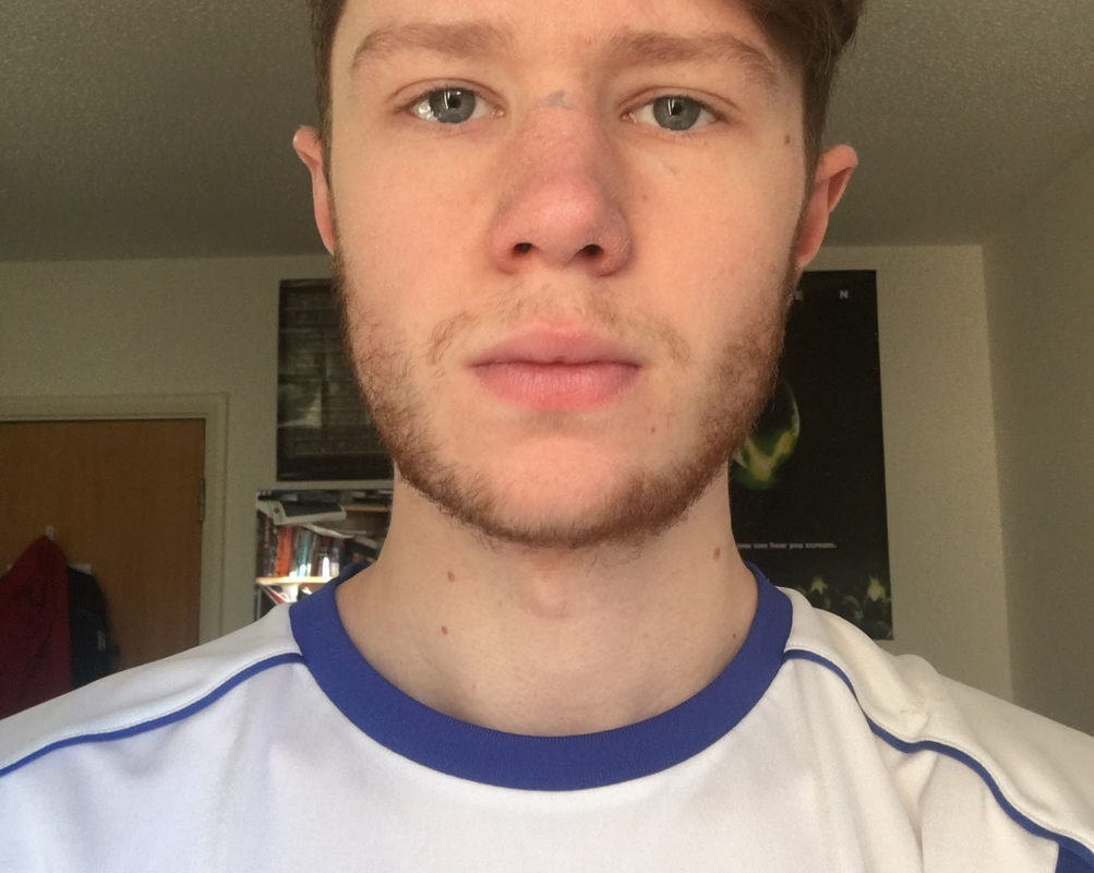
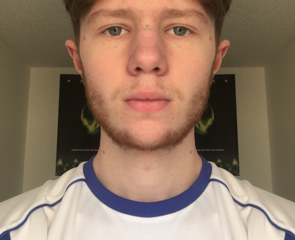
FACIAL ASYMMETRY
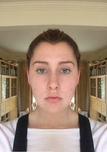
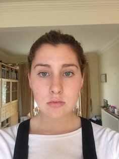
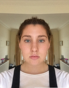
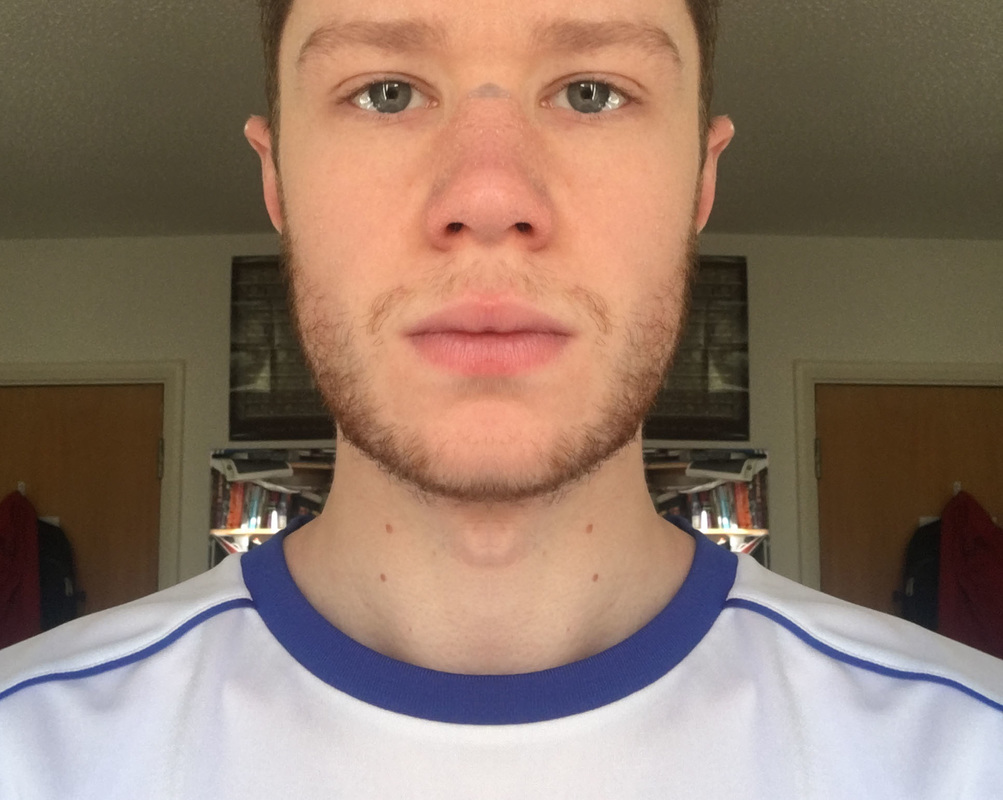
Research has shown the symmetrical faces are perceived as more appealing. Research on brain asymmetry suggests that the right side of the cerebral cortex is associated with the emotional and creative expressiveness, while the left side allows you to think both rationally and logically. The right side of the brain controls the left side of your face, and the left side controls the right side of your face; this suggest the left side may appear more imaginative, intuitive and emotive, while the right side seem more serious and analytical. When a person chooses their “best side”, this preference may be due to how much they value emotional expression versus rationality. The appeal to symmetrical faces could be down to identifying good communication between the creative side, and the logical side of your personality. Below is an experiment I did using both sides of my face, and in photoshop flipping each side and putting them together. On the right is the one made with the left side of my face, in the middle is the original image, and on the left is the one made with the right side of my face. I think the symmetrical images look somewhat sinister, rather than appealing.
|
|
|
|
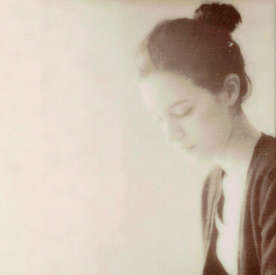
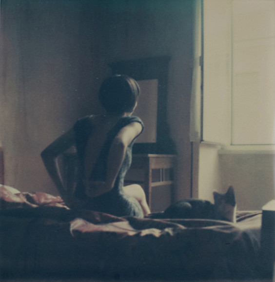
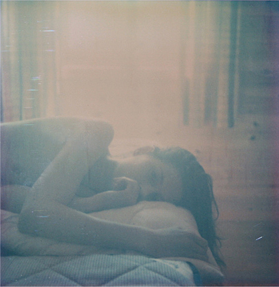
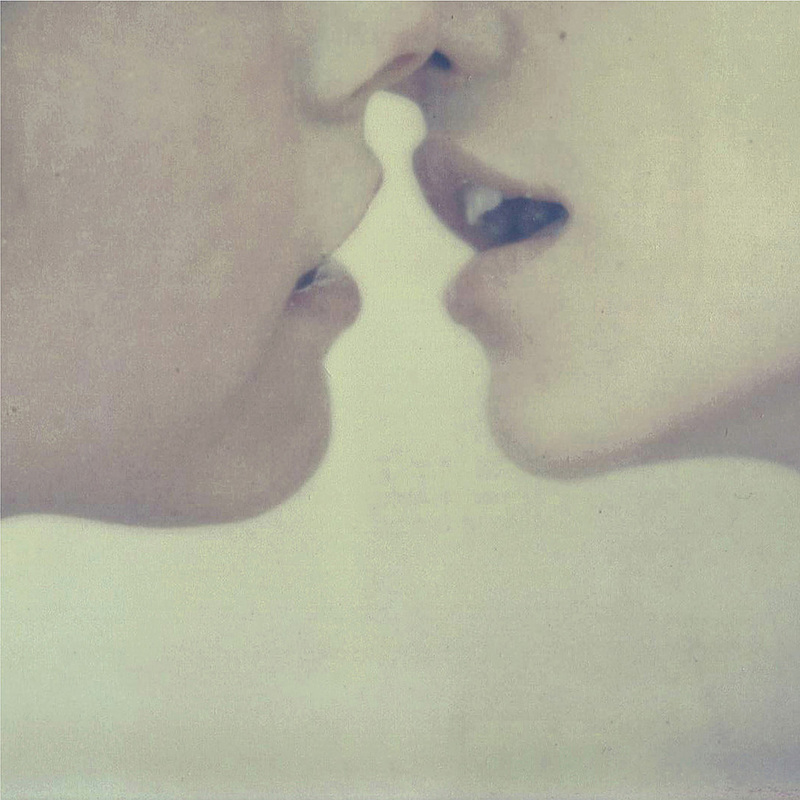
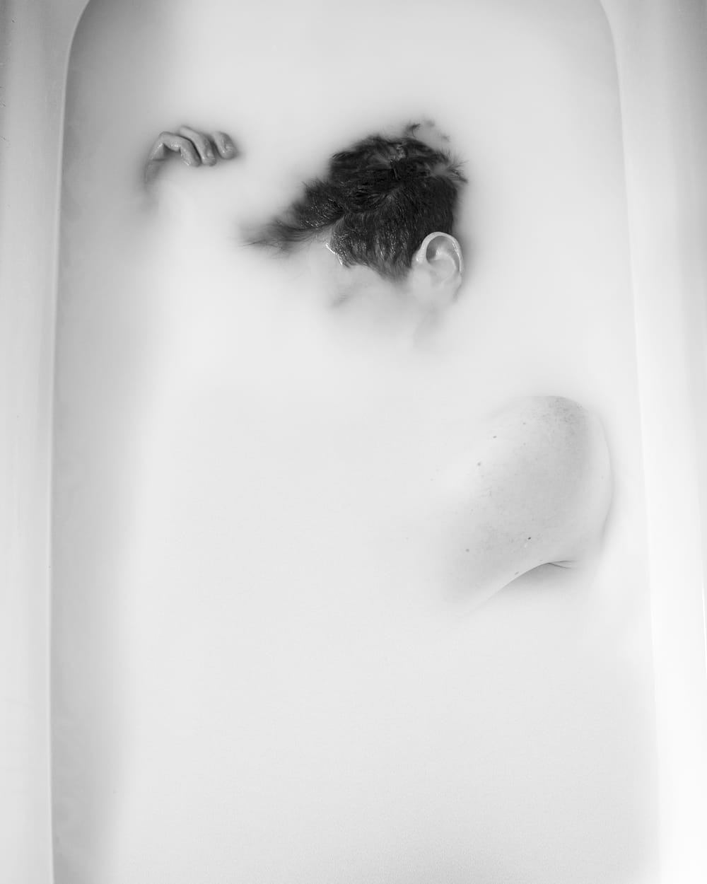
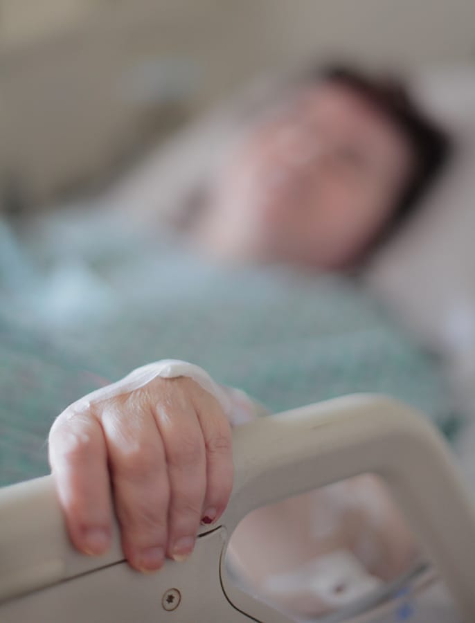
Intimacy
When considering Psychology behind photography I began thinking about how a scientist would view a subject, they'd do this in a far more detached way than a photographer. This lead to to begin considering the relationship between the subject or the photograph and the viewer, which lead me to consider intimacy.
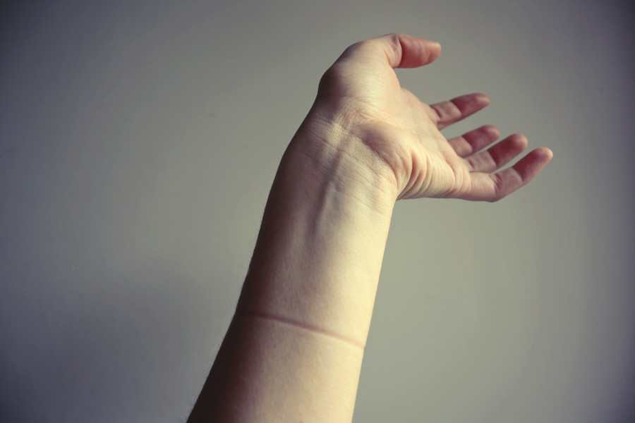
Intimacy is something I find receives the most interesting reactions from viewers. I saw an exhibition at the Tate Modern called 'performing for the camera' and this triggered my interest into the idea of intimacy. After viewing the exhibition I began to look into various images which I felt were somewhat intimate. Images looking into a persons life always have interesting effect on a viewer as you feel almost intrusive, as do close up portraits, or photographs of bare skin. Upon investigation, I came across a photographer called Anna Morosini. I looked into her work and found her website (http://annamorosini.wix.com/annamorosini) where she divides her photographs into five distinct categories: portraits, fashion, empty places, the deep surface, and polaroid. Her images involve a lot of nudity and are discretely provocative.
Intimacy is something I find receives the most interesting reactions from viewers. I saw an exhibition at the Tate Modern called 'performing for the camera' and this triggered my interest into the idea of intimacy. After viewing the exhibition I began to look into various images which I felt were somewhat intimate. Images looking into a persons life always have interesting effect on a viewer as you feel almost intrusive, as do close up portraits, or photographs of bare skin. Upon investigation, I came across a photographer called Anna Morosini. I looked into her work and found her website (http://annamorosini.wix.com/annamorosini) where she divides her photographs into five distinct categories: portraits, fashion, empty places, the deep surface, and polaroid. Her images involve a lot of nudity and are discretely provocative.
Anna Morosini
portraits of life. a mess. (selection)
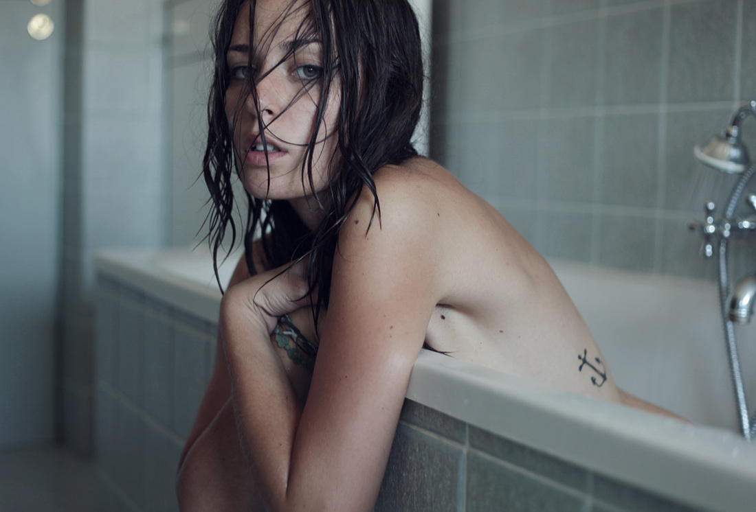
oprovocative
bare
emotional
personal
touching
compsure
simplicity
bare
emotional
personal
touching
compsure
simplicity
Empty places (selection)
focused
subjective
close
lighting
dark
colour
subjective
close
lighting
dark
colour
The deep surface (selection)
abstract angles
compositionally simple yet effective
shape, natural, curves
simple, bare
striking, provocative
interpretive
compositionally simple yet effective
shape, natural, curves
simple, bare
striking, provocative
interpretive
Polaroid (selection)
basic, simple
meaningful
carefully composed
natural
personal
low contrast
meaningful
carefully composed
natural
personal
low contrast
You can't simply put a camera in front of something without altering the emotion behind it, or breaking the moment. It isn't necessarily always appropriate to photograph something, like if a moment is too intimate. For example, if you were to photograph someone in poverty or someone who had been stabbed, the camera can't necessarily demean the suffering of those involved, no matter what light the photograph is presented in. There comes a point where documenting something can be intrusive or even hurtful. Although, asking for permission to take a picture can ruin the moment further, and make the image seem staged and subsequently far less personal. All photographs are perceived in a million different ways. The photographer can manipulate the image to a point, to try and convey a message, but at some point that ends and viewer interpretation begins. A lot of photography, including the majority of Anna Morosini's images, can be interpreted as voyeurism, but that is all that is - an interpretation. Morosini doesn't intend for them to be viewed in that light, her images are intended to be far more innocent; they can however be taken out of context. This can make all photography hurtful in ways, but that is the same with most things in life - there's always a critic. This makes me question how responsible a photographer is if a subject is viewed or misperceived in a negative light. This interpretation can make a photograph dishonest.
Rear window - hitchcock
Rear window - hitchcock
Primary Response:
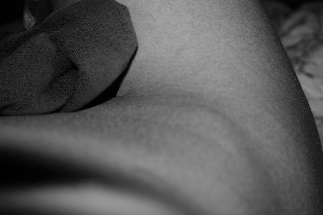
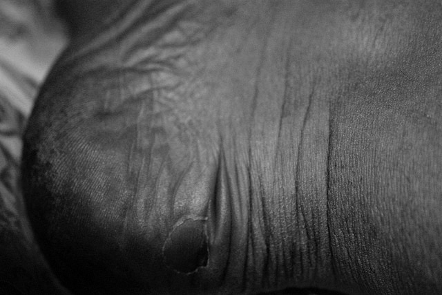
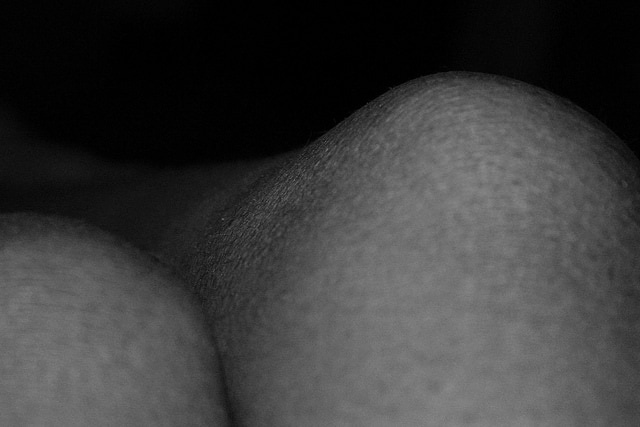
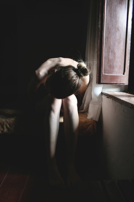
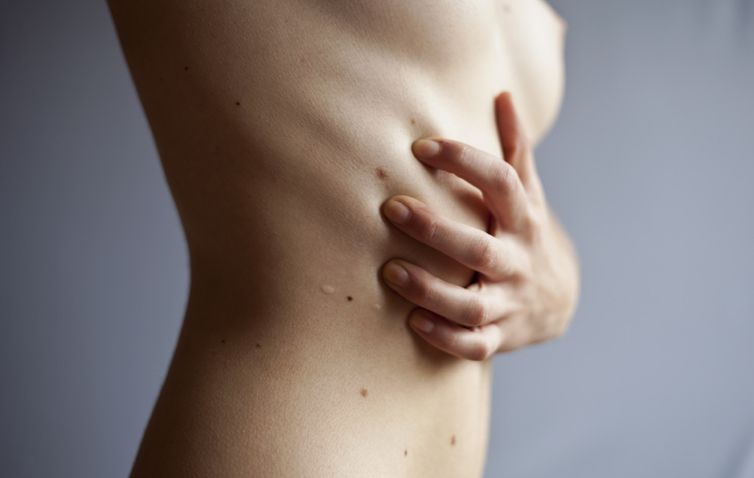
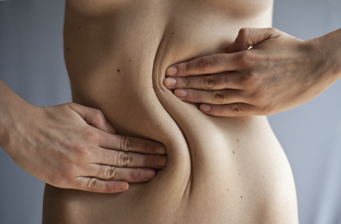
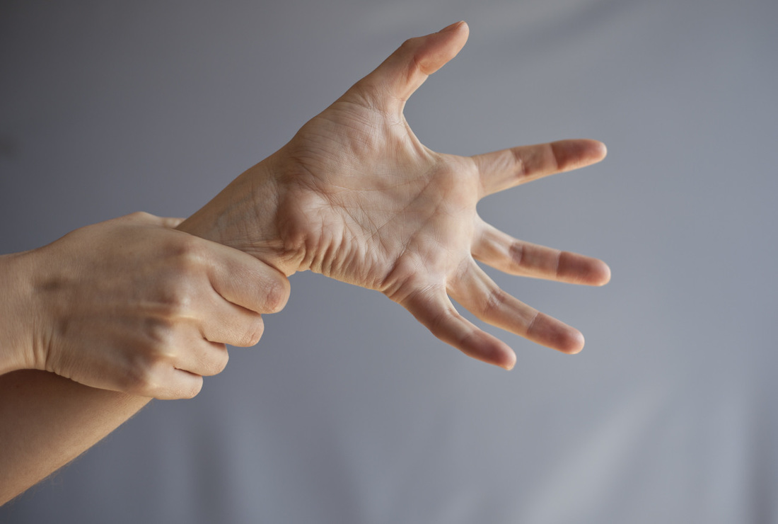
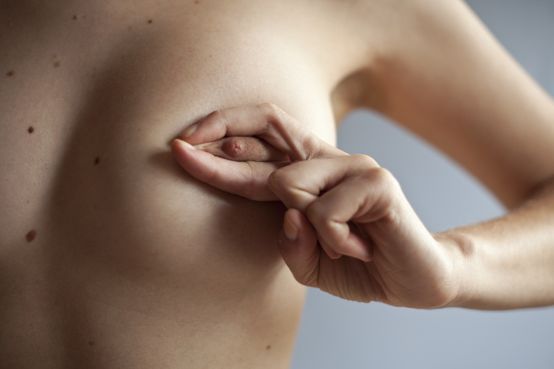
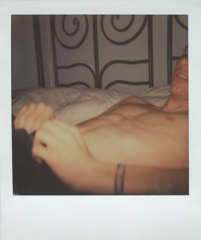
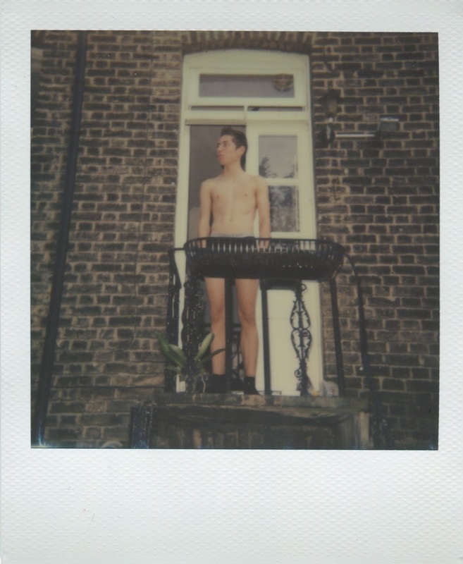
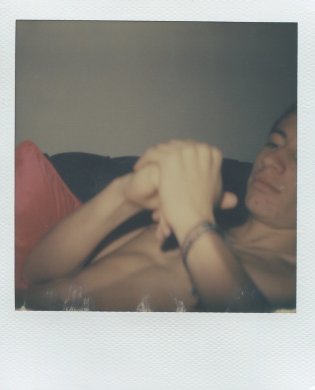
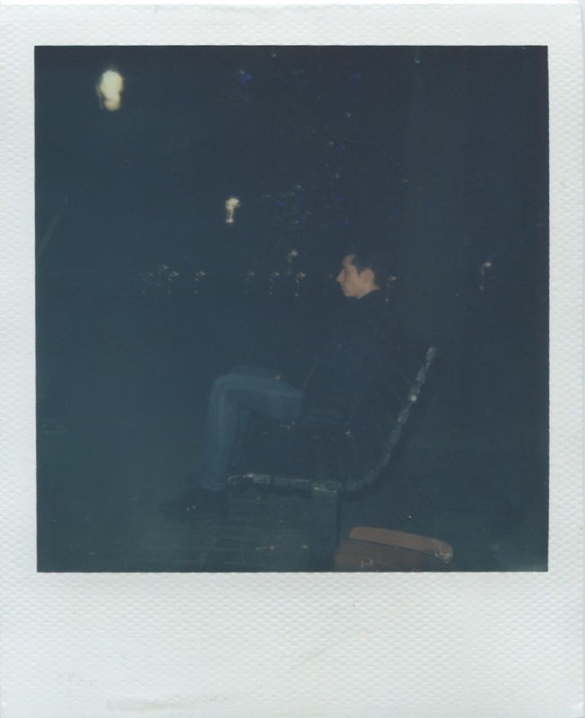
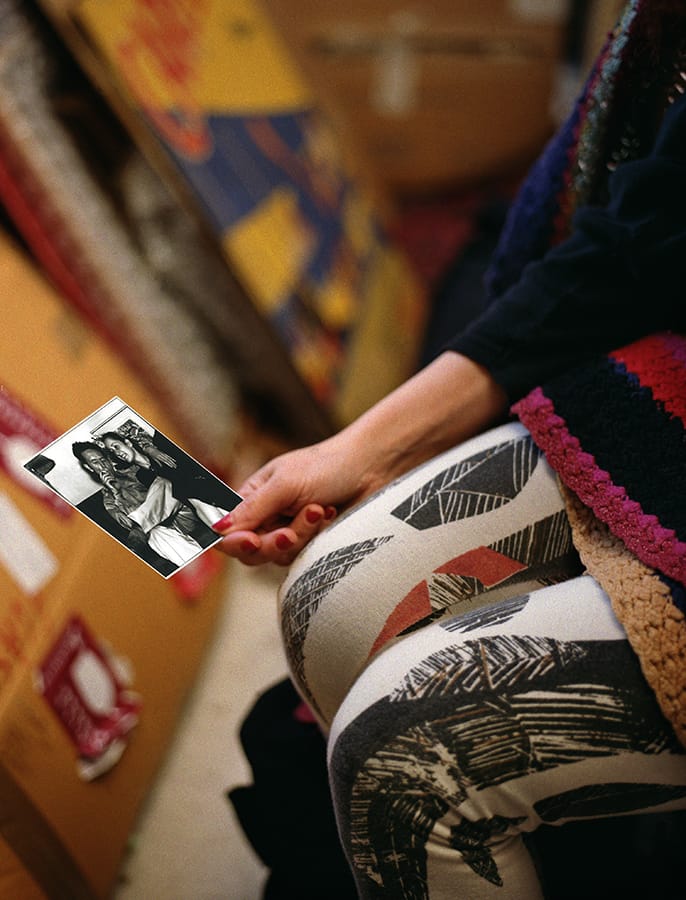
I like the idea of the permanence of polaroid images. I think this permanence makes a photograph far more personal as it captures a moment exactly how it is, so the photographer can't manipulate the image to distort the way it is viewed. Although these images are not polaroids, when next responding to this work i will use polaroids to really capture each intimate moment as it is, rather than edited images as the ones above are. I chose to take these images in a slightly abstract way, as rather than generic portraiture, I focused each image on a persons body part. I did this as I thought it would be an effective way to engage the viewer and force them to look and consider each image more closely. I felt that these images work well as a series, as well as individually, which I feel is important as each photograph is an individual moment as well as a unitary response. When developing this response I will consider the subject of the images more carefully, so the subject is purposely chosen, rather than just being a random person, as that will make the images more personal and in a way conveying a journey or story of the subjects life.
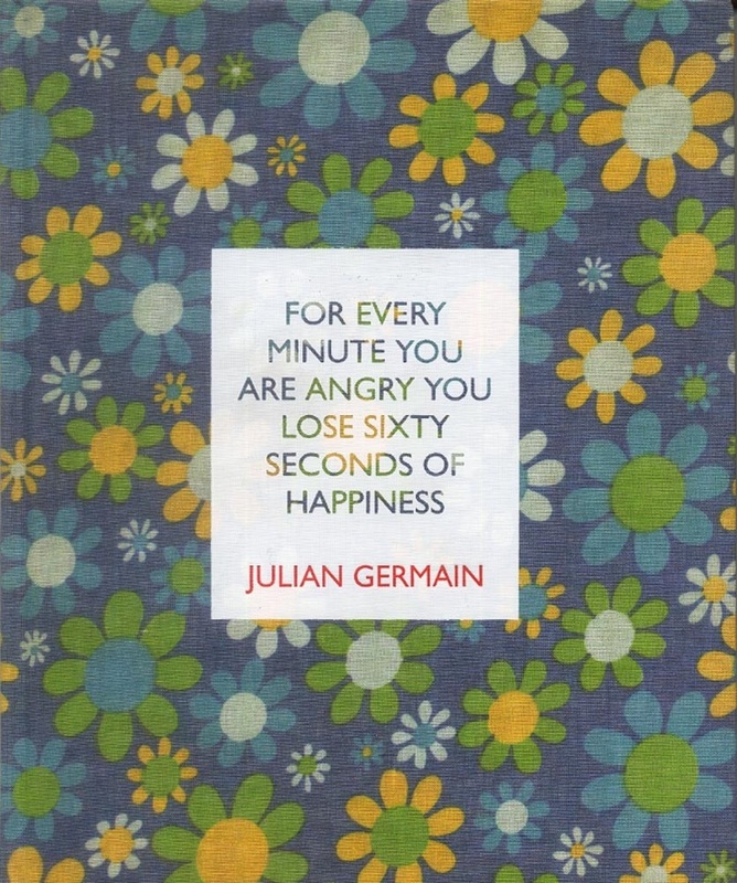
julian germain - For every minute you are angry you lose sixty seconds of happiness
After looking at Anna Morosini's photographs, I began to investigate further artists who have a personal, intimate feel to their photos. In the hunt for these images I came across Julian Germains' photo book 'for every minute you are angry you lose sixty seconds of happiness', and felt Germain's images had a similar effect on the viewer to the effect I am aiming to convey. Whilst Anna Morosini's images were personal, I felt they were overly provocative to create the kind of intimacy I'm aiming for.
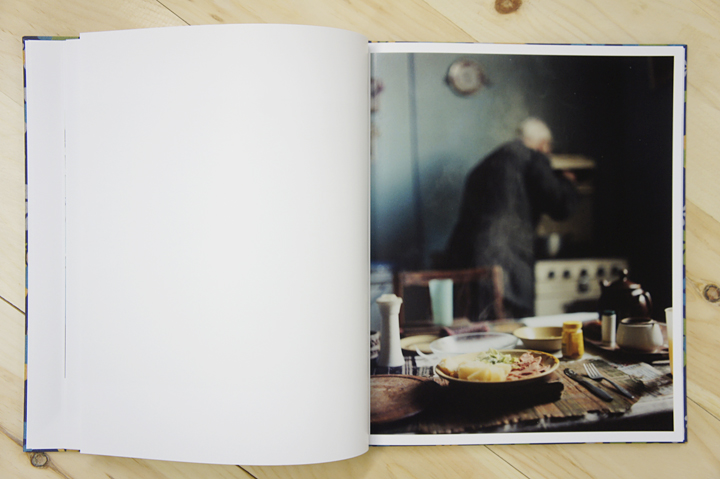
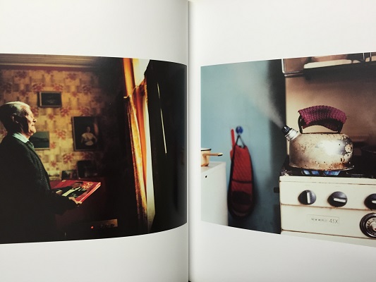
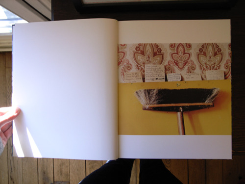
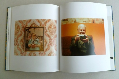
In this book there are a series of photographs that were made over 8 years showing the 'quiet, contemplative existence of Charles Snelling'. Charles Snelling is an elderly man living in a small house in Portsmouth, alone. These images are presented with pages from the mans own photo albums.
I like the idea of focusing on the life of a single subject, as this focuses the viewer on that one subject, in the same way as audience would get to know a character as a play progresses.
Polaroids
- Joan Fontcuberta, Pandora's camera
Joan Fontcuberta briefly discusses polaroids in her book, describing them as a step forward in documentary photography. She speaks about film about a man, Leonard Shelby, who is unable to store new memories. He uses polaroids to 'remember' the events in his life. He establishes a protocol on the basis of snapshots, which provide a searchable register of people who he can/ can't trust, people he has a connection with, as well as to remember essentials such as his motel, number plate etc. He uses polaroids as they are immediate, which is useful because they are fast and capture a moment, but also because they can'y be later manipulated, and as the character has set out to avenge the death of his wife, people would likely try and manipulate his images. Joan Fonticuberta also pints out that polaroids are useful if a person is a witness to events due to the fact they have a greater proximity to the truth by eliminating the possibility of 'trickery' resulting from manipulation in the darkroom. She also points out two benefits of polaroids which are from a somewhat interesting perspective. Firstly that polaroid introduced a dimension of fun and made the act of taking a photograph more playful, and secondly that an instant print was a guarantee of privacy and thus ideally suited to intimate situations, as this prevents you from worrying that staff in the photoshop or the dark-room might sneak a furtive look at your pictures. This second point is particularly relevant as I intend to use polaroids exactly in this way, to capture intimacy and intimate moments.
Looking at Joans' view on polaroids really enforced my reasoning for wanting to use them to create an intimate series of photographs, so as well as the image itself, and the concept itself being intimate, the medium in which the images are taken is also in itself intimate which perfectly ties the whole idea together.
Looking at Joans' view on polaroids really enforced my reasoning for wanting to use them to create an intimate series of photographs, so as well as the image itself, and the concept itself being intimate, the medium in which the images are taken is also in itself intimate which perfectly ties the whole idea together.
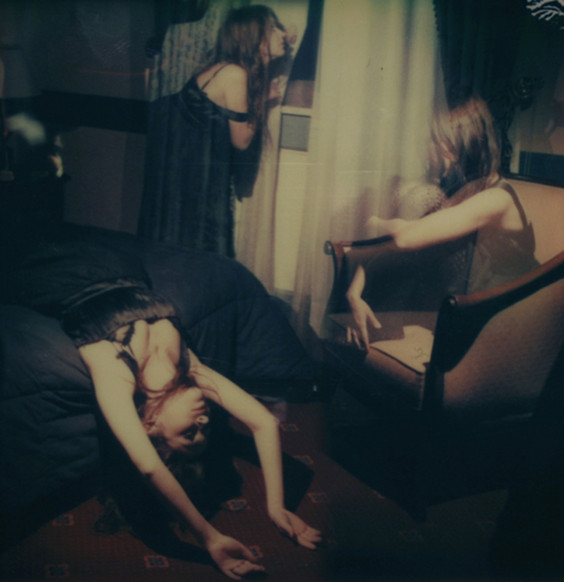
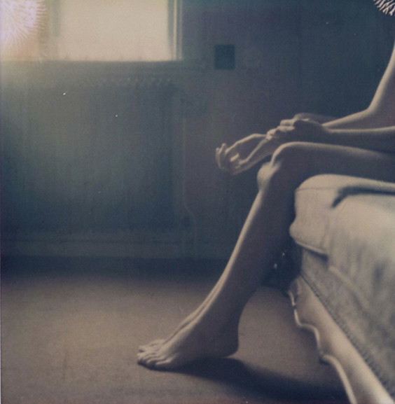
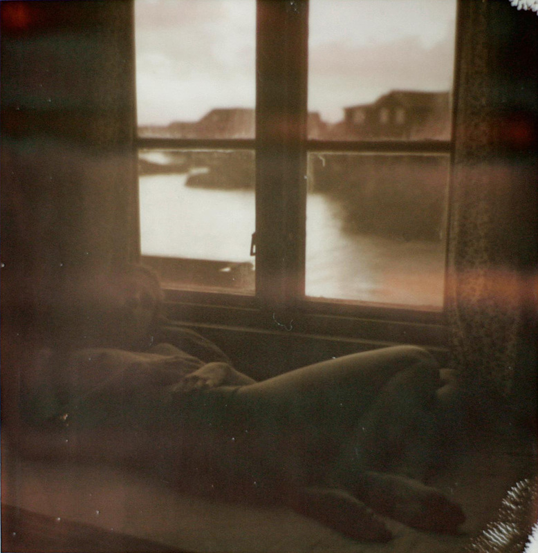
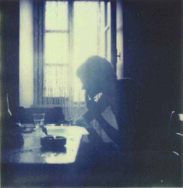
First outcome
Intention:
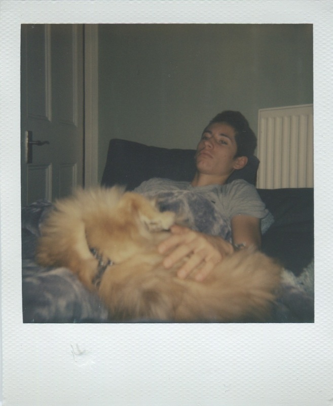
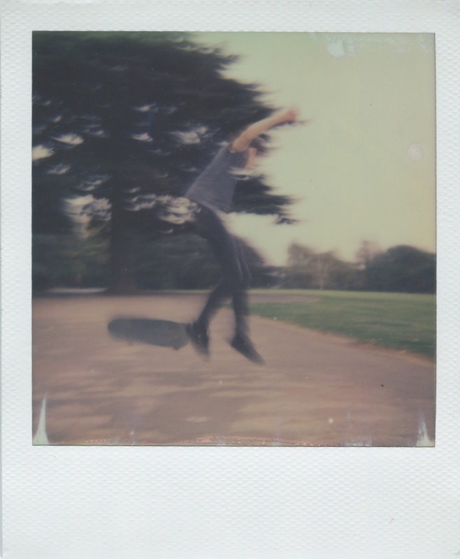
I have chosen to incorporate Anna Morosini's images and concepts, Julian Germain's photobook, and Joan Fonticuberta's views on polaroids to create series of polaroid images based on the concept of intimacy. I have decided to have a subtle, bare tone to the photographs, which I chose to do in response to the tone of Anna Morosini's images. The series of images will be based on one subject, as is in Julian Germain's photobook, and create the images around the subjects everyday life, almost as a window into their world. I chose to have the images as polaroids initially as I was influenced by Anna Morosini's polaroids, this initial intention was then confirmed by Joan Fonticuberta's justifications of why polaroids are used.
Images:
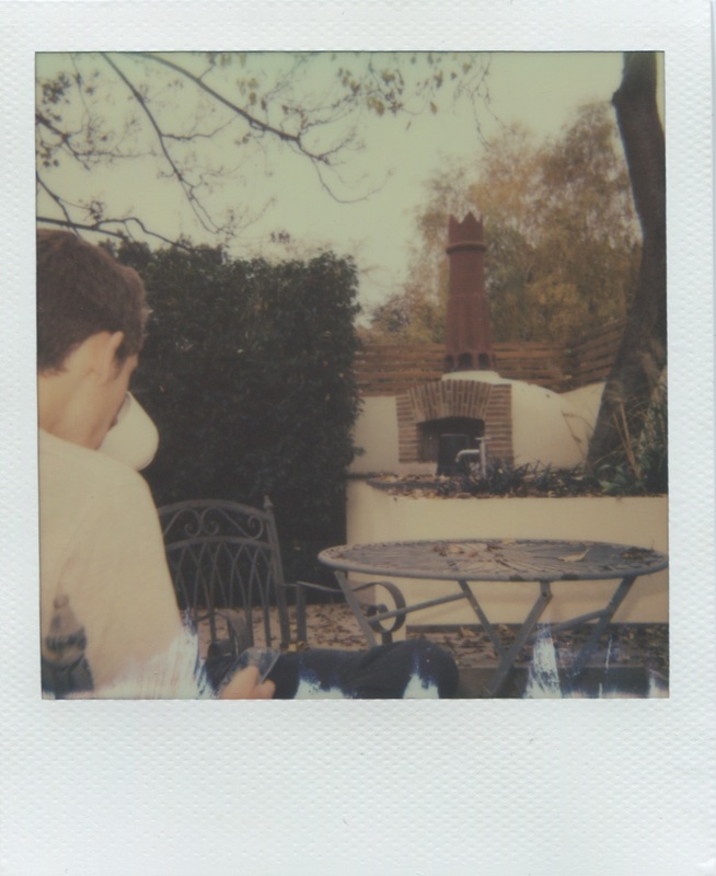
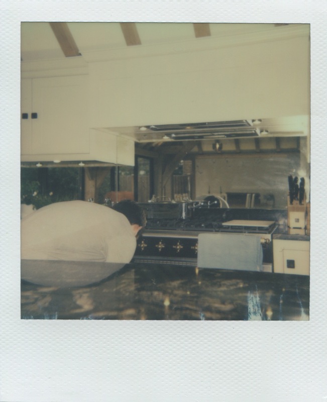
Initial evaluation:
I felt these images perfectly demonstrated my intention - all the images in the series are intimate, some in terms of the subject and some atmospherically. Whilest these images accurately portray the theme of intimacy, I think it would be more interesting to begin to display them in a way to provoke the intimacy within them. You can take an initial image with an initial meaning and easily transfer that message to the veiwer - what's harder to do is use an image with one meaning to create a totally contrasting one. In doing this you provoke the veiwer, the more they are provoked the better the meaning in the initial image has been portrayed. I want to use these photographs to execute this idea so I can really understand the level of intimacy portrayed by the initial images.
Outcome development
intention:
As this outcome was focusing on intimacy I chose the three most intimate polaroids that I felt worked well together as a triptic. I then decided to position these three images in public places where they would not be expected to be placed. Having them in public places contradicts the idea of intimacy giving a new meaning to the images I will take. I want to create this contradictive meaning to make the images more provocative, provocing an entirey different reaction from the veiwer. Ths will be interesting as it will directly show the effect that tone has on the photographs when perceived.
Images:
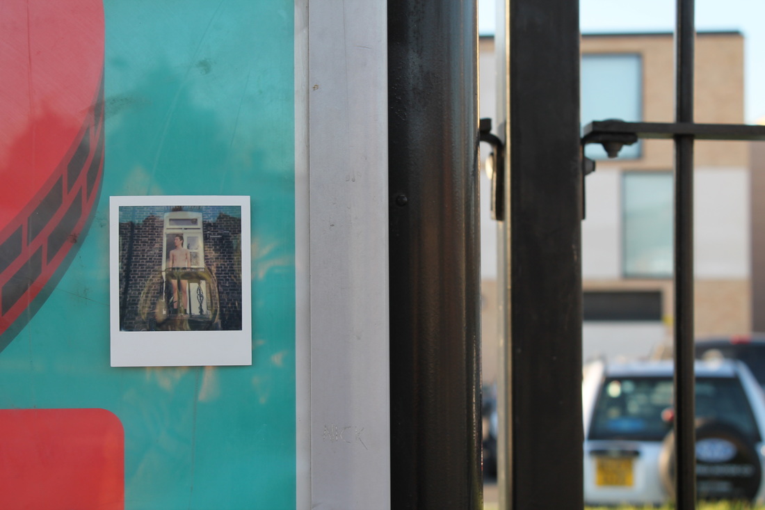
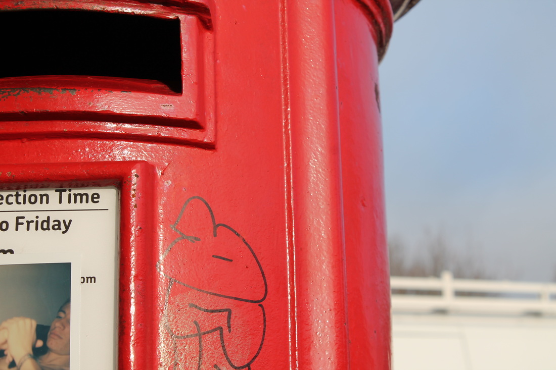
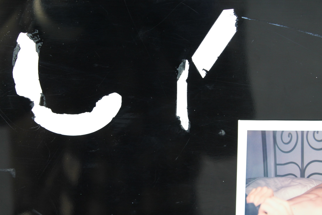
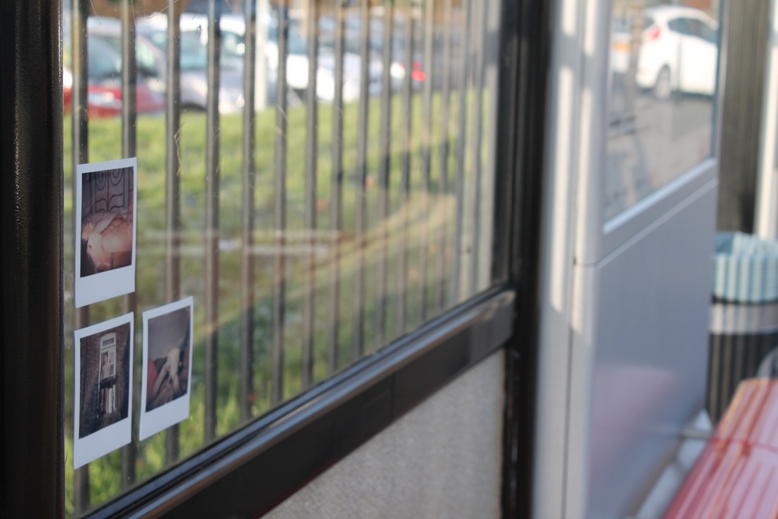
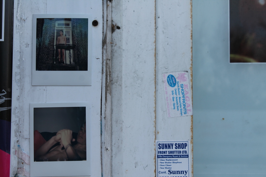
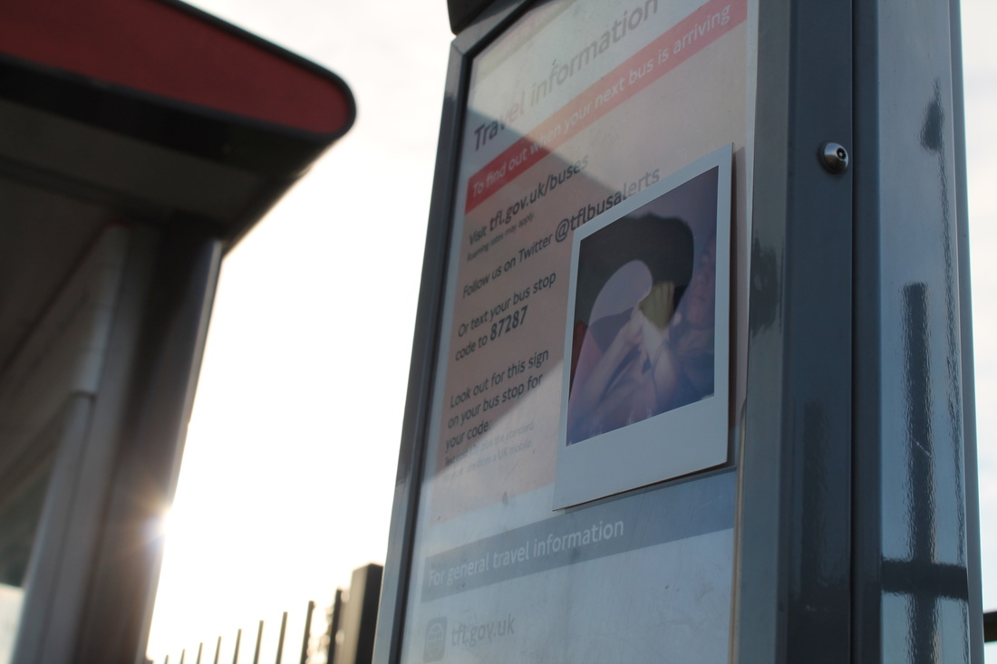
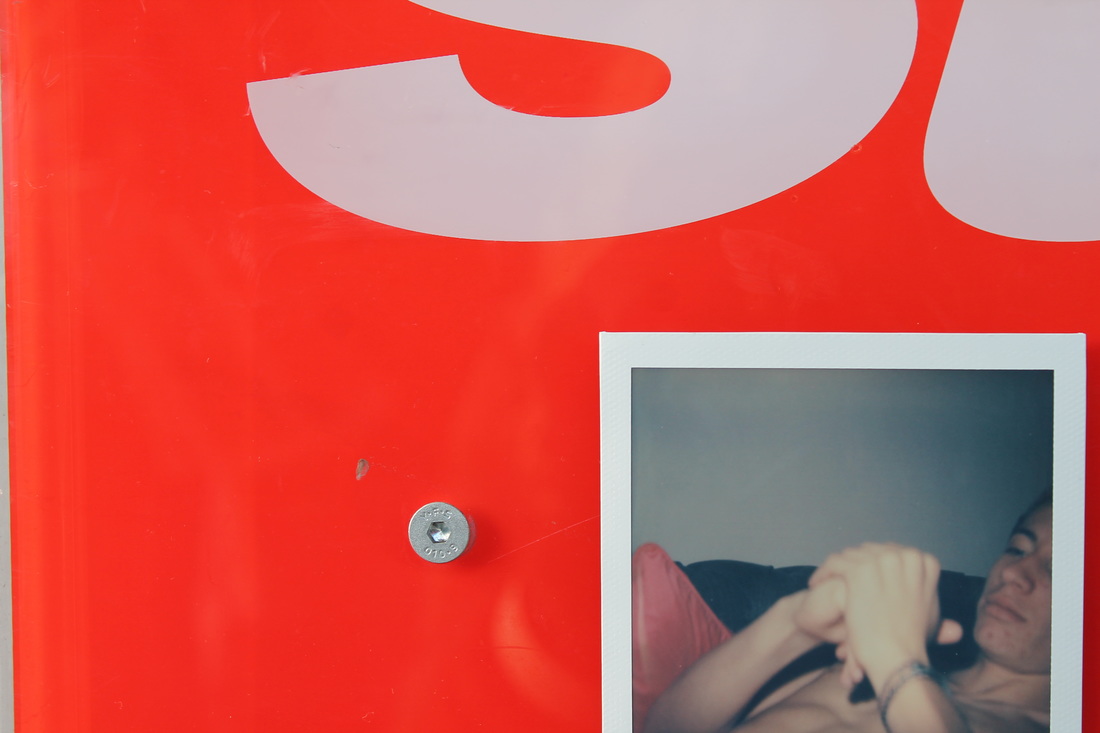
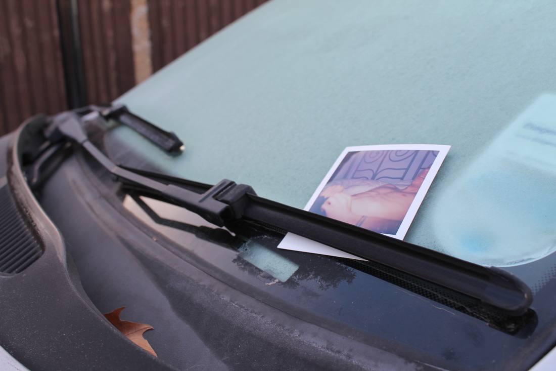
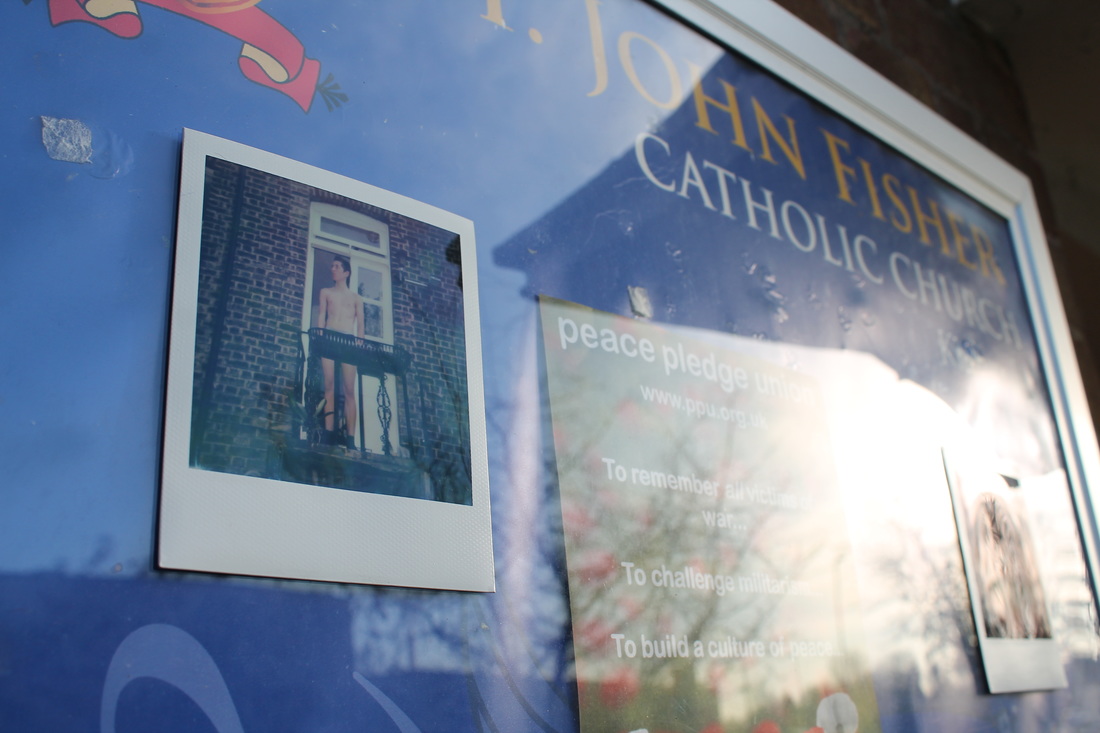
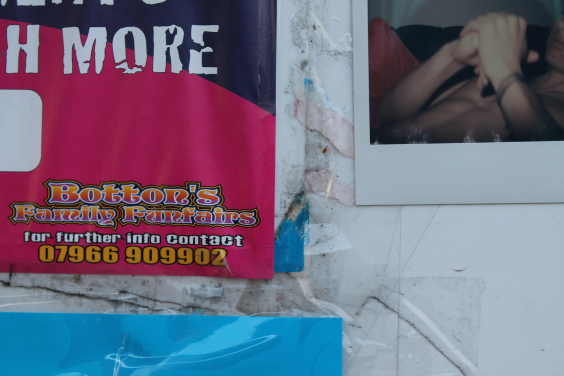
Evaluation:
I feel these images effectively provoked the people seeing them. When photographing them people walking past commented on the images and looked at them. One older man asked what they were, so I explaiened, and he seemed surprised at the content of the images. Putting the triptic in these public environments made the intimate tone amplified, which i found somewhat surprising. I want to next look at a more personal side to intimacy rather than an almost sexual one, as I feel this will provoke a more emotional reaction rather than a surprised one.
James MOllison
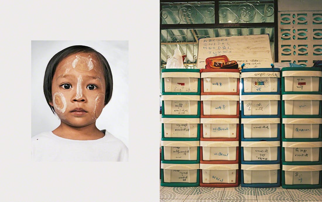
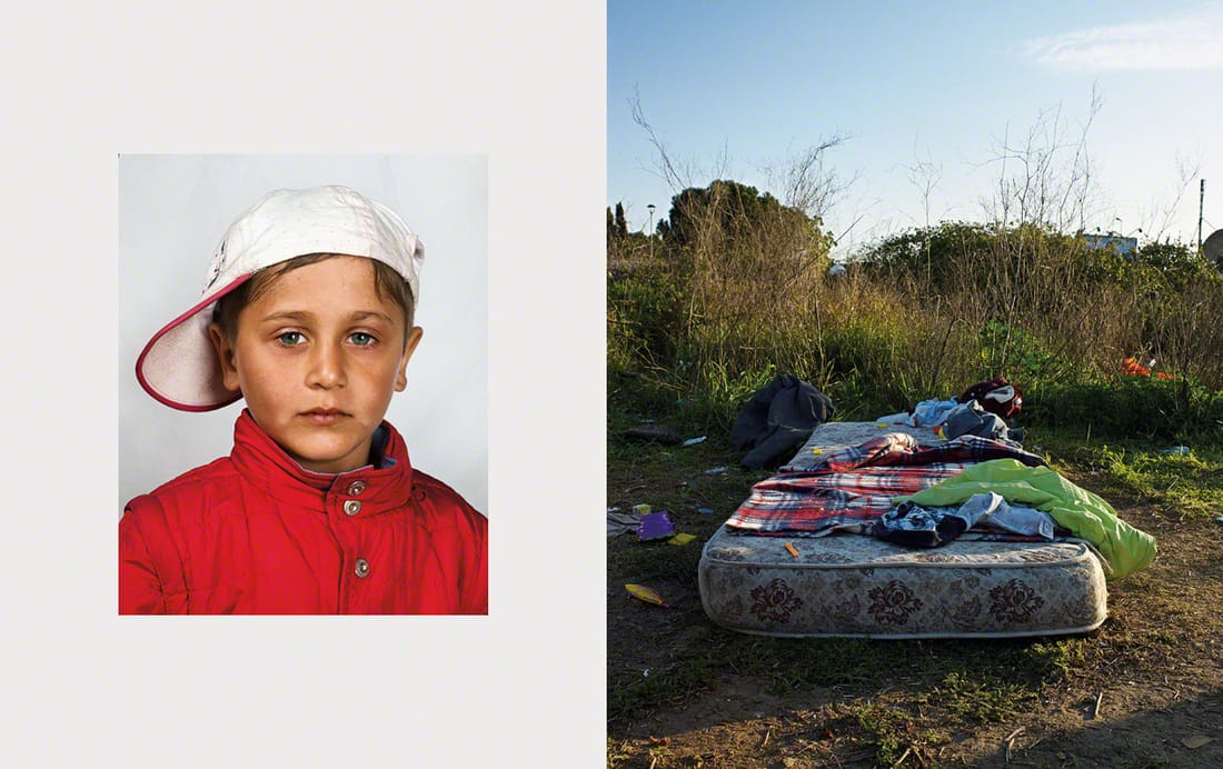
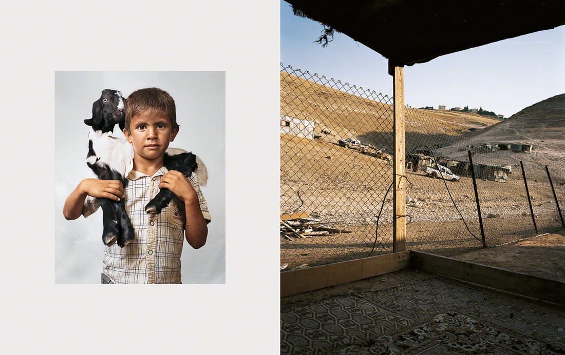
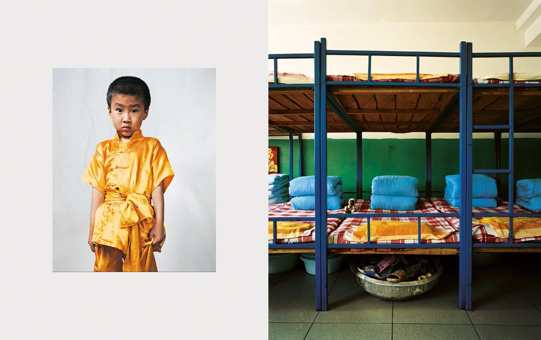
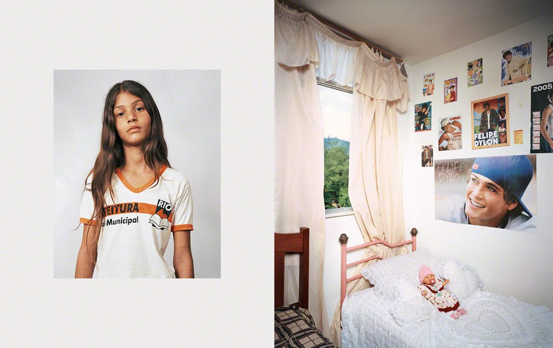
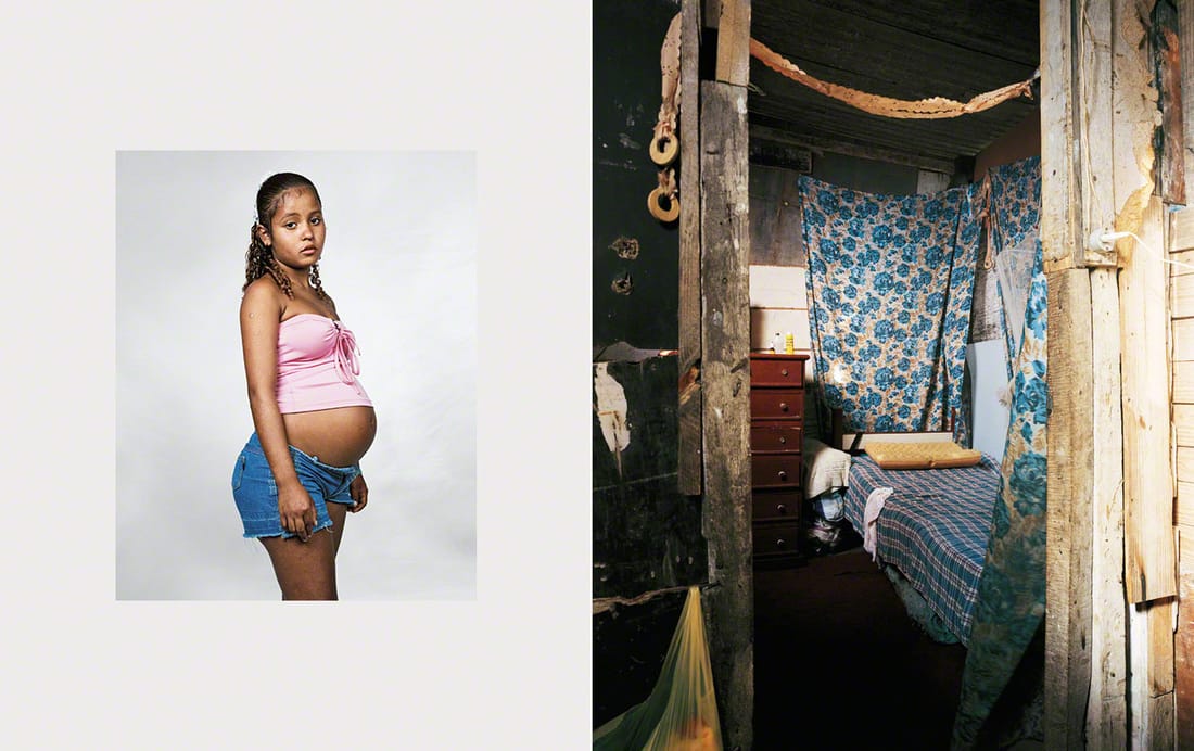
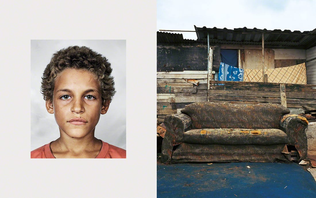
When looking for images that are less provocative and more emotionally intimate, I came across James Mollison's Refugee images.
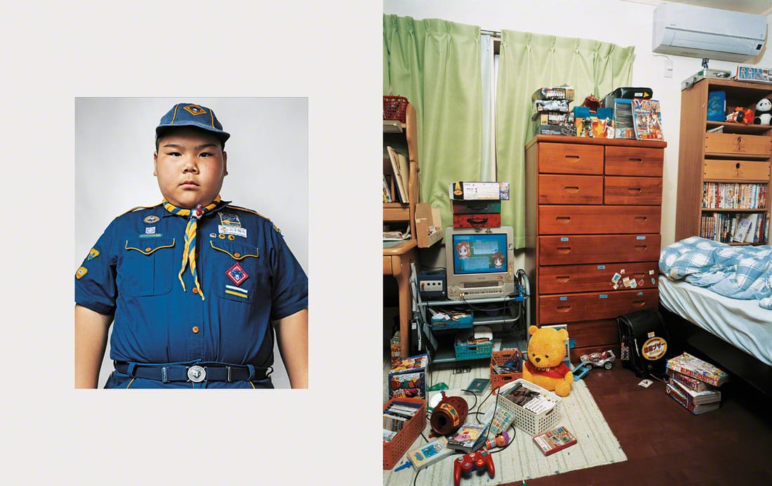
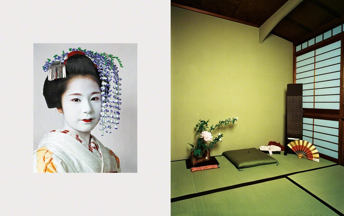
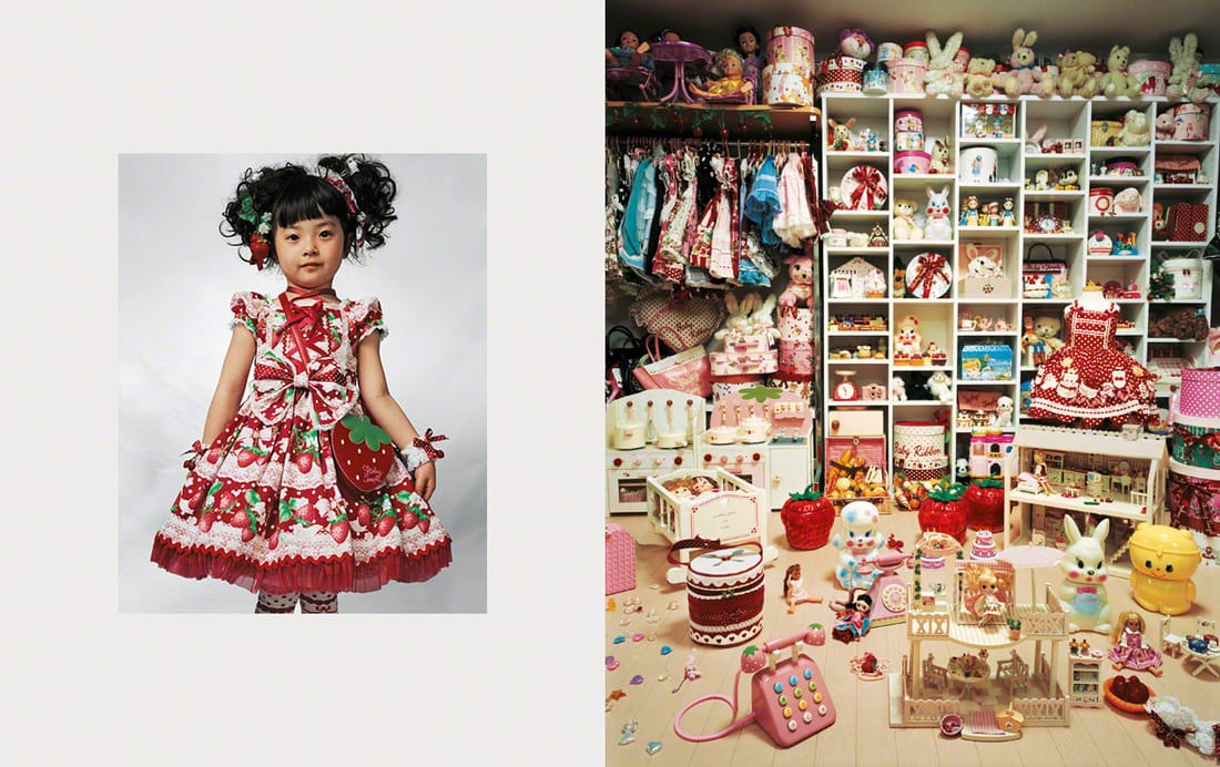
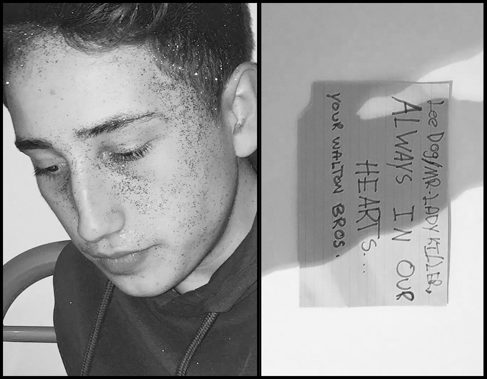
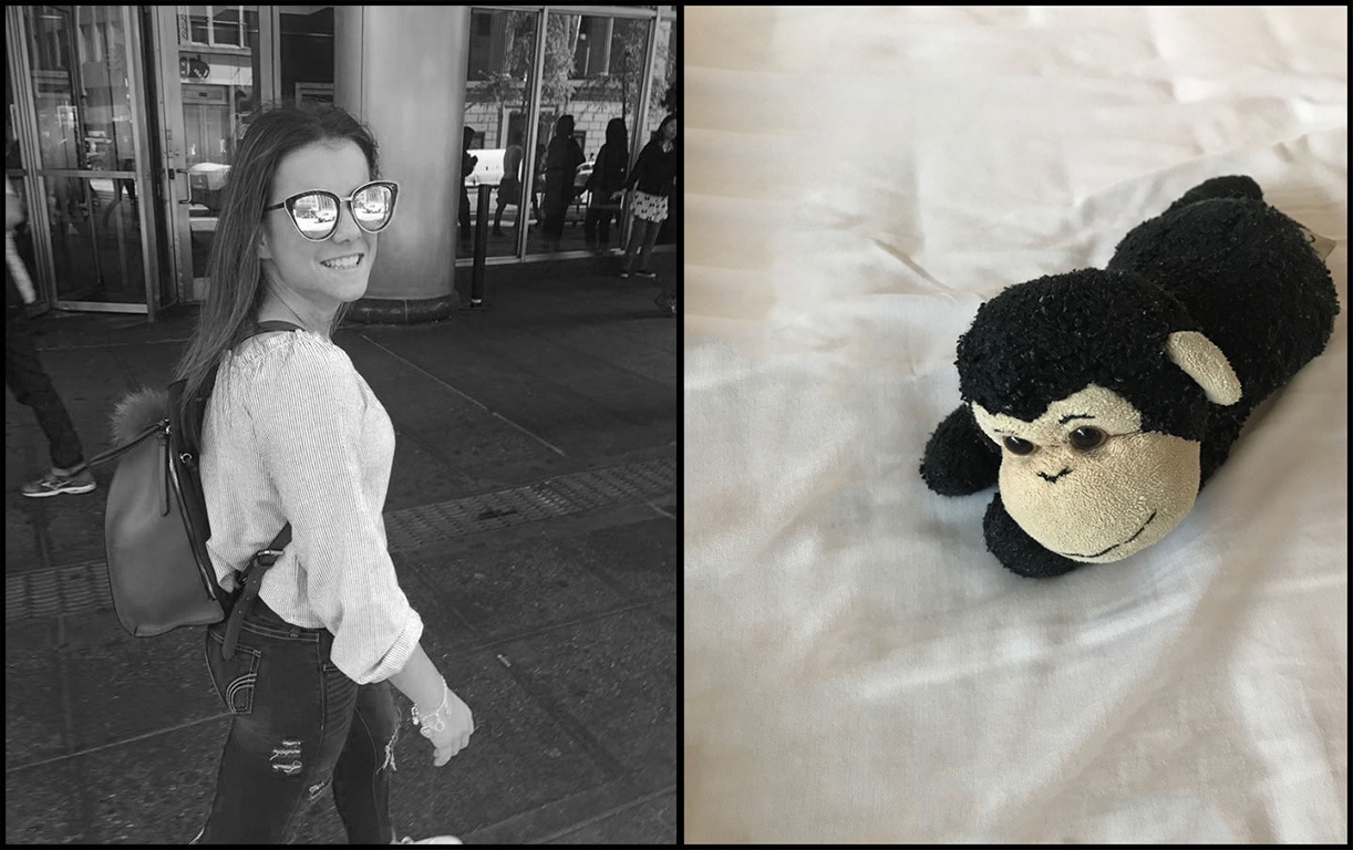
James Mollison was born in Kenya in 1973 and grew up in England. He studied art and design at Oxford Brookes University and also film and photography later in his life at Newport School of Art and Design. His work has been published globally, appearing in The Guardian Magazine, The New York Times Magazine, GQ and The Paris Magazine. He has produced a wide range of photographic books about various topics, some including pictures of children from around the world and images of their bedrooms. This slightly mimics his later work on the refugee crisis from 2015 and 2016 for Times Magazine which is shown below. Mollison took images of refugees and their most precious possession. On an initial viewing some of the items might seem quite synthetic and materialistic, but when you discover their story it can be emotional and reflect the seriousness and harsh environment they are surviving in. Over each photo is an insight to their story.
James Mollison was born in Kenya in 1973 and grew up in England. He studied art and design at Oxford Brookes University and also film and photography later in his life at Newport School of Art and Design. His work has been published globally, appearing in The Guardian Magazine, The New York Times Magazine, GQ and The Paris Magazine. He has produced a wide range of photographic books about various topics, some including pictures of children from around the world and images of their bedrooms. This slightly mimics his later work on the refugee crisis from 2015 and 2016 for Times Magazine which is shown below. Mollison took images of refugees and their most precious possession. On an initial viewing some of the items might seem quite synthetic and materialistic, but when you discover their story it can be emotional and reflect the seriousness and harsh environment they are surviving in. Over each photo is an insight to their story.
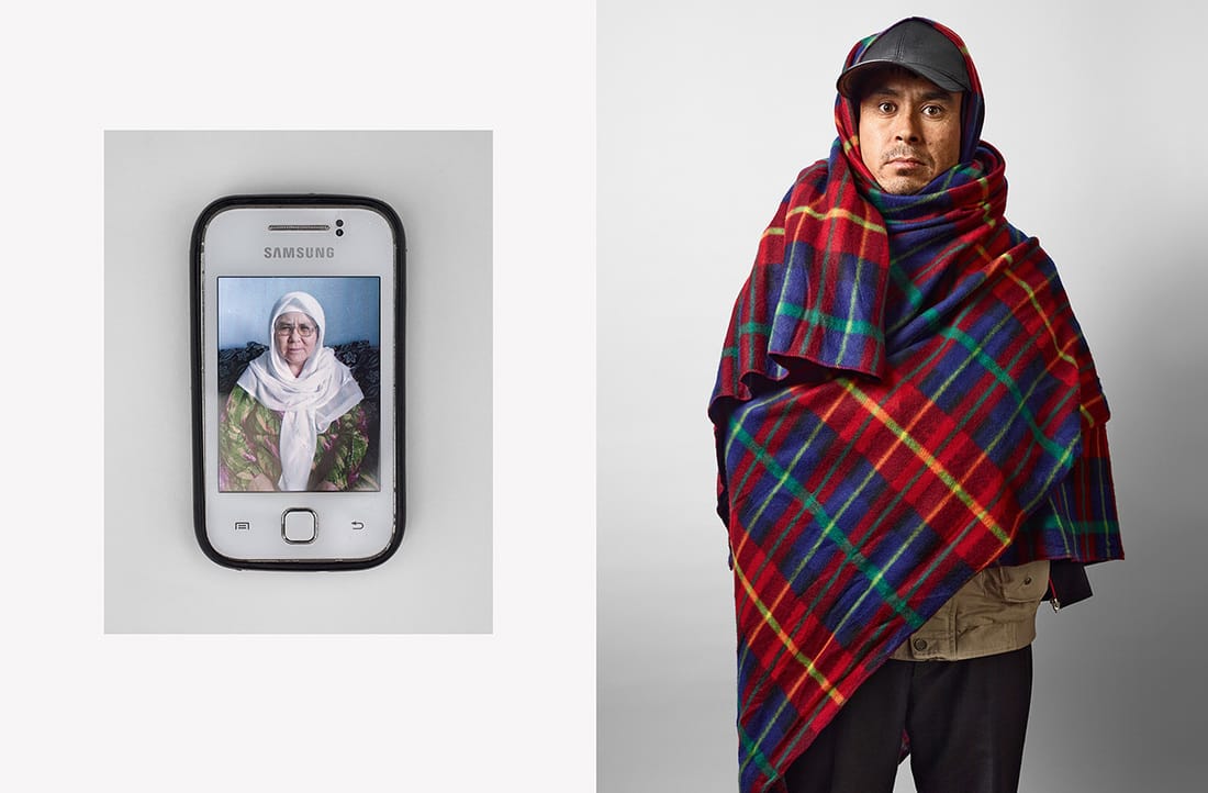
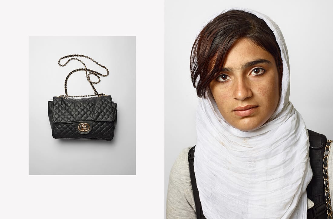
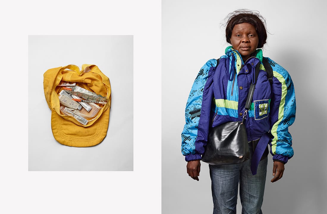
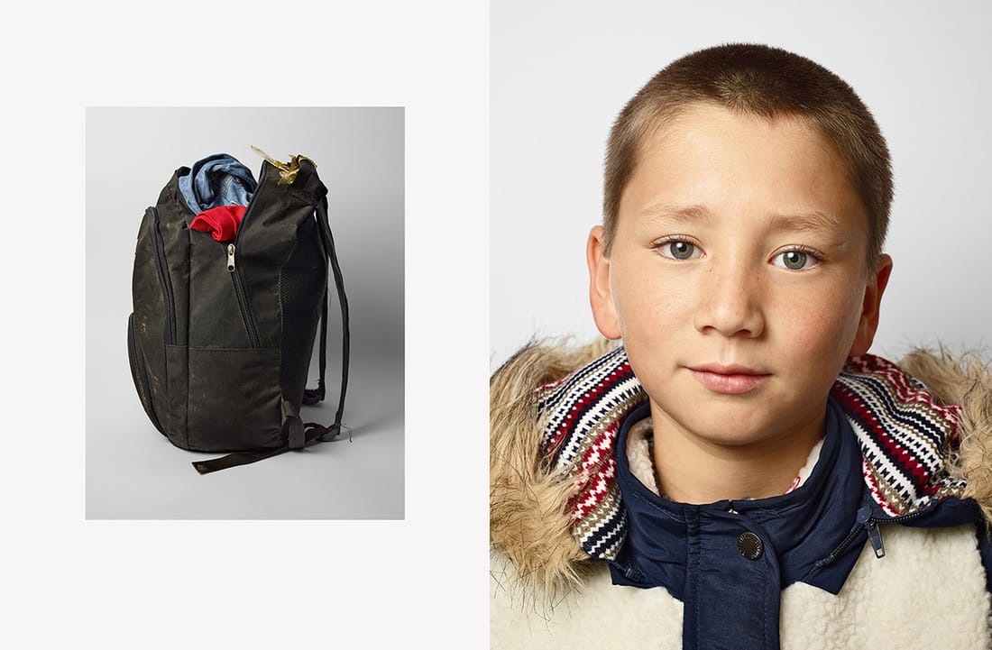
His series Where Children Sleep also reflects the harrowing and completely different lifestyle children have around the world and their attitude towards their possessions differs from what we might expect from a western viewpoint.
Response:
As a result of looking at James Mollisons photographs of refugees i wanted to create a kind of diptych consisting of a person and some sort of possession of theres'. This idea of responding by creating diptychs was also influenced by Luke Fowler, and artist I investigated when looking into photo books.
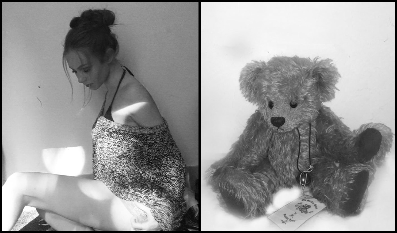
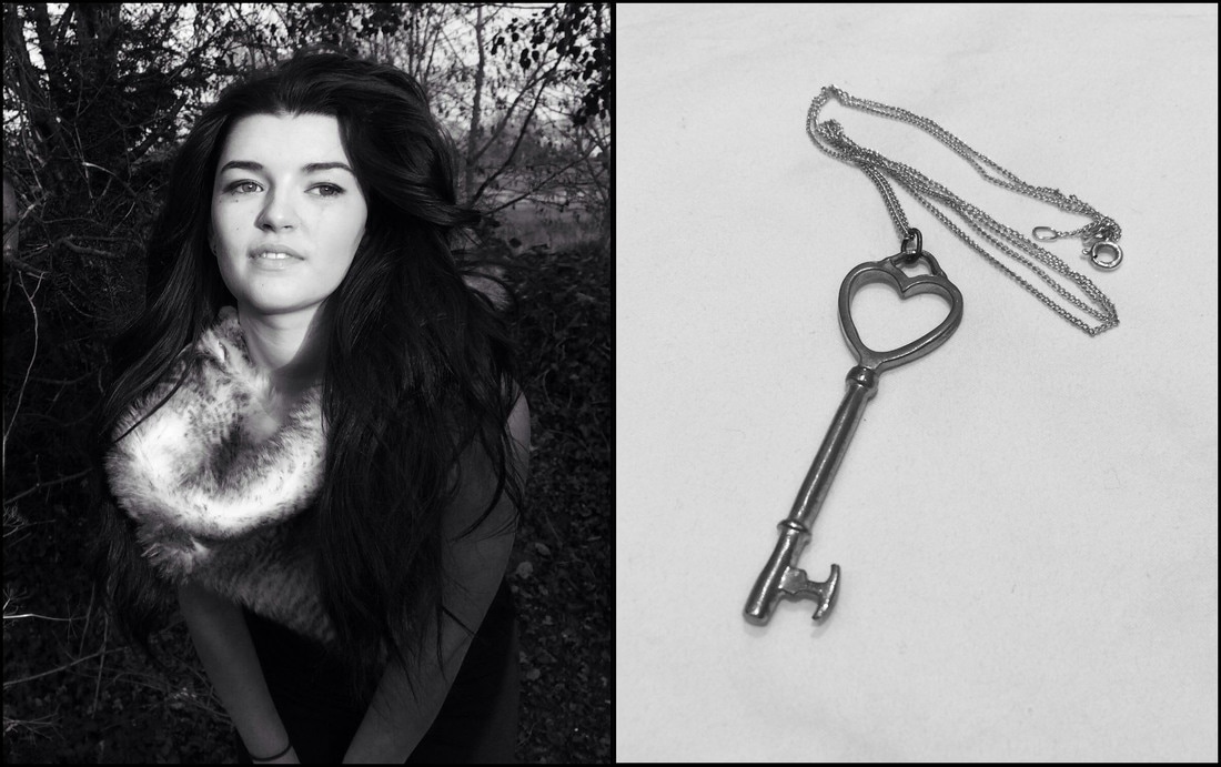
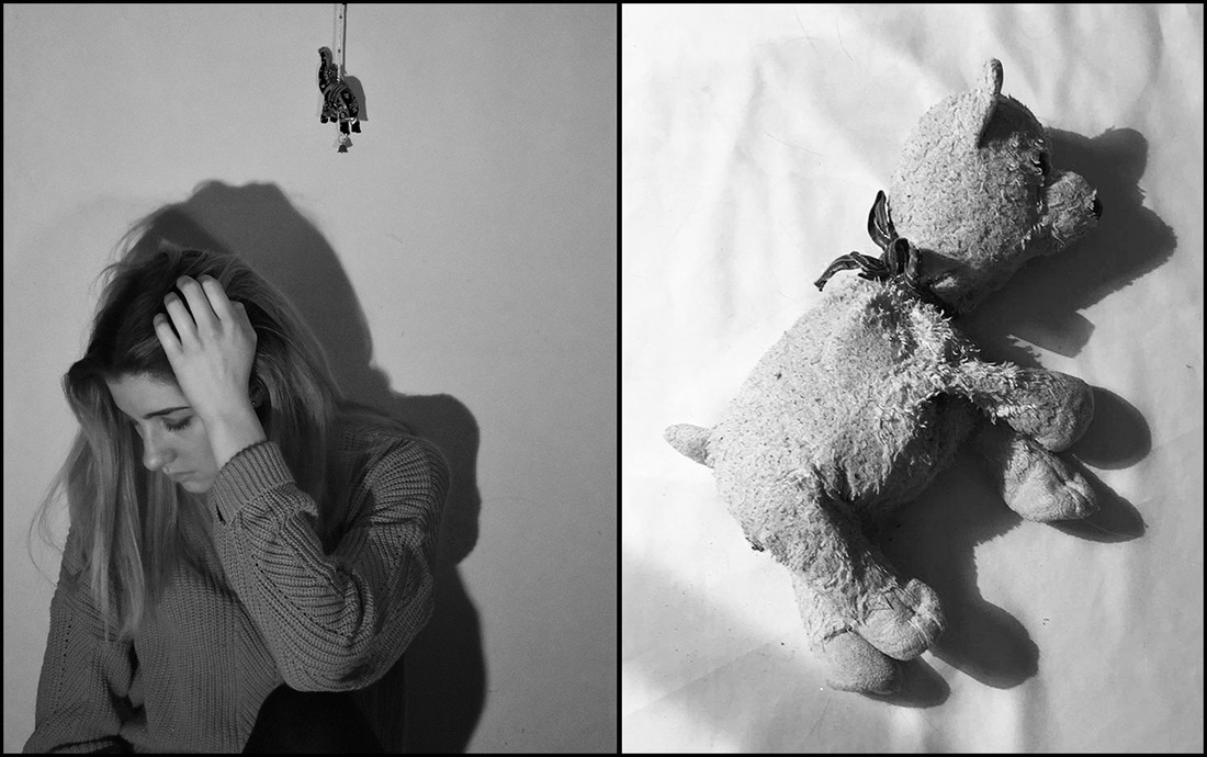
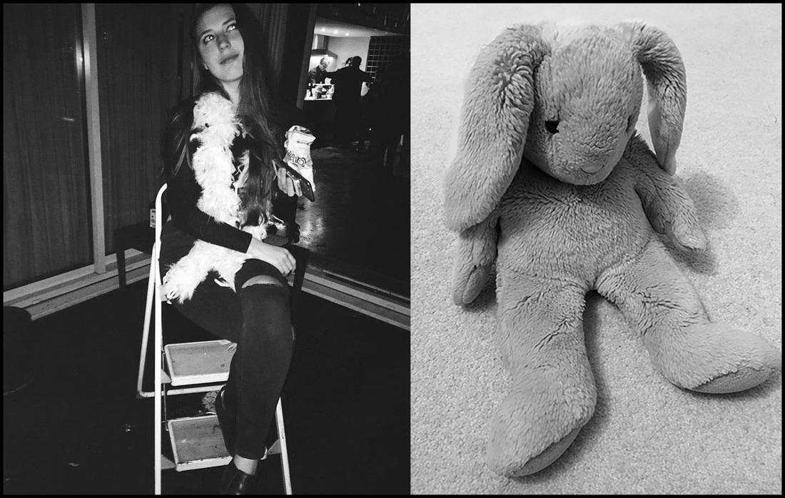
Evaluation:
After making these diptych I began to think about how I put the images in black and white rather than keeping them in colour. I thought that putting an image in black and white would prevent one image from standing out over the other and so the images are recognisably a series within the diptics, but I now think that the item should be more significant that the image. I used a thin black line to seperate the images but also put a thin black like around them to clarify that although the images are seperate they are still connected.
Developed images:
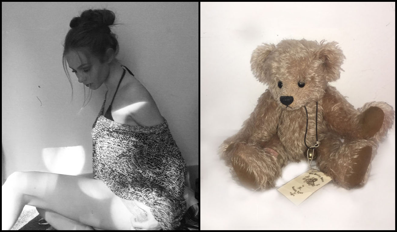
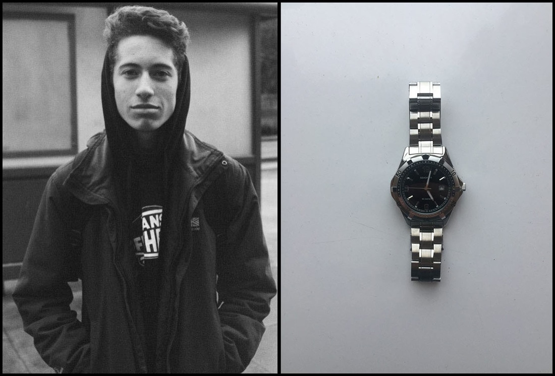
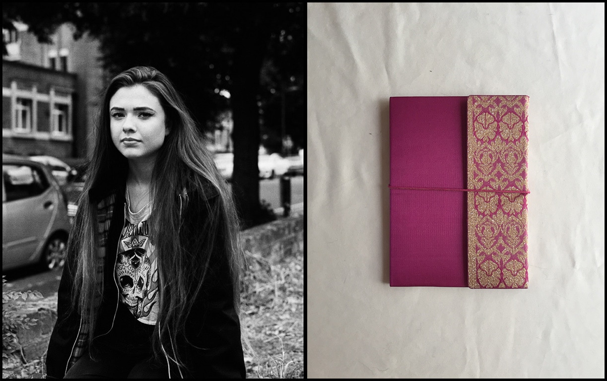
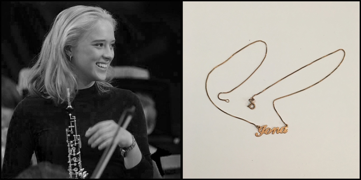
I like these developed images as I think they are far more interesting aesthetically, and the veiwers eye gets drawn to the item (which I intended to be the main focus of the diptych). Having the person in the image in black and white makes that half of the image serve as identification as a passport photo would be. Having the persons sentimental posession in colour makes a more emotional connection to the object, really showing its colour and texture making it more sentimental.
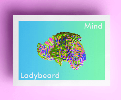
'MInd' - Ladybeard
      |
'We have drawn a strict dividing line between the mad and the sane in our society. Wary of slipping over it, we try to live on the right side of the binary, while really most of us are in flux, or occupying the blurred space in between. The Mind Issue aims to open up our expectations for life by telling stories that celebrate this richness and complexity.'
This is the mind issue of a magazine by Ladybeard, feminists who clsim they are not just for women, they want to play with gender, sexuality and identity, rather than dictate their terms. After buying this book I began reading it and became particularly intrigued by the section ' ways of seeing' where I came across Aneta Grzeszykowska's 'Album' which explores themes of self-awareness and identity. The series 'Album' is a collection of 500 family photographs from which she had erased her own image. By doing this, Aneta overthrows the traditional notions of autobiography associated with the family photo album. This inspired me to further investigate identity, where I came across Edward Honaker who took a series of photographs (a sample of which are to the left) trying to raise awareness to what it is like living with mental illness (as he was diagnosed with depression and anxiety). Seeing his images then lead me to further investigate this idea of capturing and understanding mental illness. |
Joshua Lutz
Joshua Lutz initially documented his Mothers schizophrenia and the affect that had on the relationship they shared, as well as the strain the disease put on their relationship. His project was a way of understanding what his mother was going through, of confronting medical rationality and trying to challenge the stereotypes. He documented this into a book 'Hesitating Beauty'. The following images are those i found most touching.
Lutz says he saw a project in the new york times called 'pictures of mental illness' and thought to himself that these were not pictures of mental illness, but instead pictures of people with mental illness. This lead him to become interested in what it feels like, rather than what it looks like, and subsequently thought: 'How do you, in photography, capture someone else's reality?'. Lutz also described the importance of concentrating on not just intimate photographic works, also asking whether they maintain a certain gravity without being depressive. After seeing the images in 'Hesitating Beauty' i looked further into Joshua Lutz work, and came across another photobook he had made 'Meadowlands'.
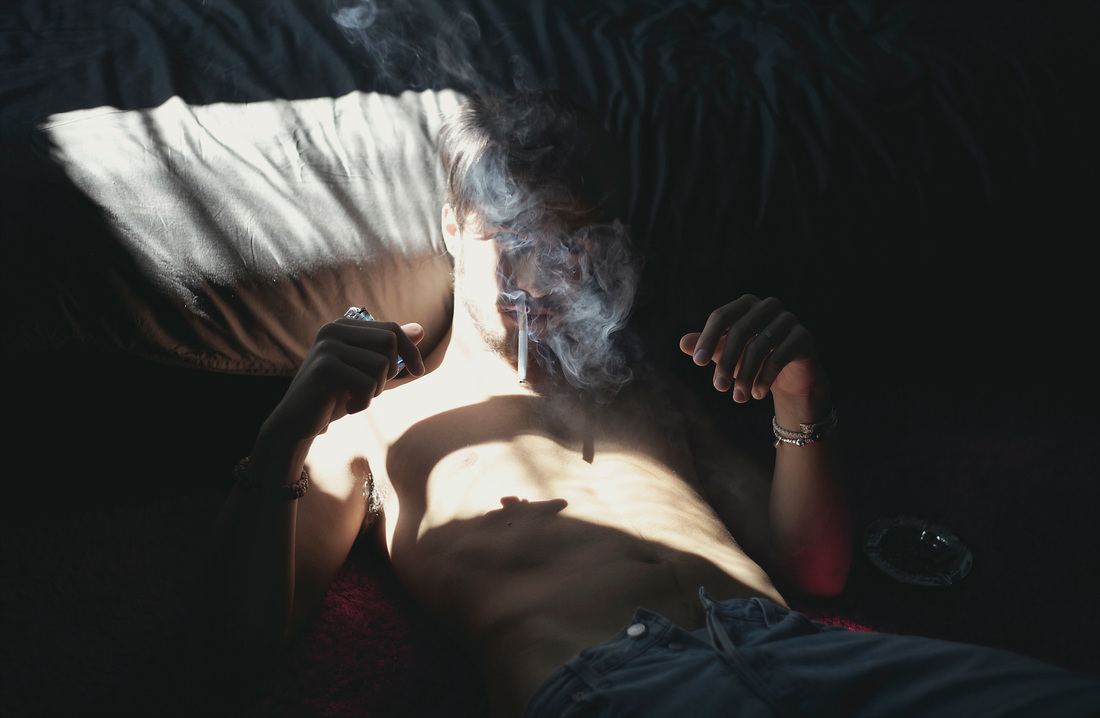
He sticks to a similar theme to 'Hesitating Beauty', describing his book in an alternative way: 'The Meadowlands is a place to pass through and forget on the way to someplace else. Not unlike a neglected child, The Meadowlands has grown up without guidance, constantly unsure of what the future holds. It is this loneliness and solitude that continues to bring me back year after year. These disparate images tell different stories; like songs on an album that build upon each other. Each one may be about something specific. More often than not, the specifics are less important than the feelings conveyed.' . I Like this idea of photographing passing places and showing their meanings, rather than focusing on places that are easily noticed and frequently captured. This can be translated into the split second emotion provoked by a passing person, moment, item. I want to - like Lutz - try capturing these passing moment and the emotions attached, creating a disparate series of images.
Response:
Like Joshua Lutz' photographs I looked at the places you pass on the way to somewhere else that are in themselves beautiful and worth photographing. To accentuate the beauty within bland, unnoticed settings I chose to have the images in high contrast, and also played with the colours in photoshop to make them more vibrant.
photo selection experiments
I next began to consider how i'd select the images for my final piece once I had taken a selection. This lead me to experiment with various photo selection techniques.
I was presented with around 300 random photographs and originally selected 5 related sequential images. Once this sequence was created we reviewed each others sequences before creating one sequence using our five images as well as other peoples - creating a final sequence of roughly 25 photos. Once we had a final progression I started to photograph the images as a sequence. Below are these photographs. Rather than capturing the images as the were, I decided to photograph where the images meet. I feel like doing this shows the relationship between the adjacent images, and also creates an interestingly abstract image in itself.
I was presented with around 300 random photographs and originally selected 5 related sequential images. Once this sequence was created we reviewed each others sequences before creating one sequence using our five images as well as other peoples - creating a final sequence of roughly 25 photos. Once we had a final progression I started to photograph the images as a sequence. Below are these photographs. Rather than capturing the images as the were, I decided to photograph where the images meet. I feel like doing this shows the relationship between the adjacent images, and also creates an interestingly abstract image in itself.
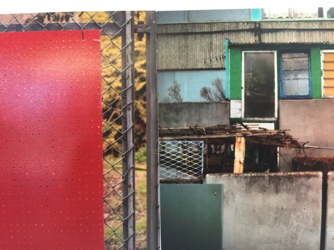
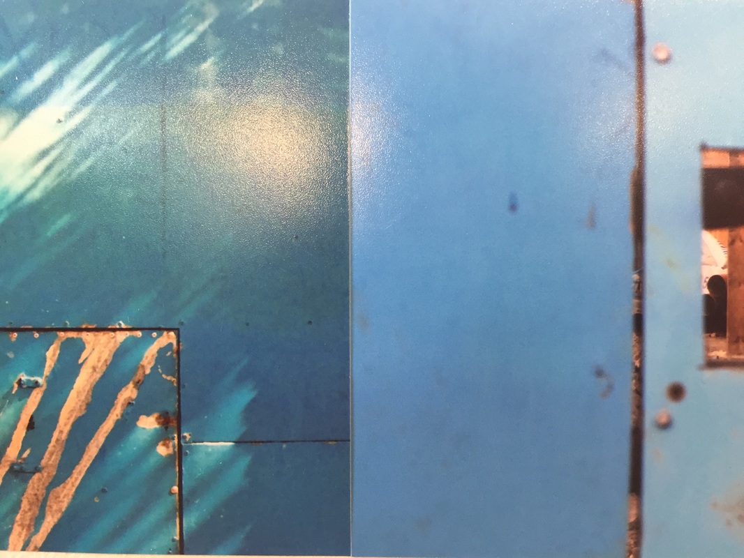
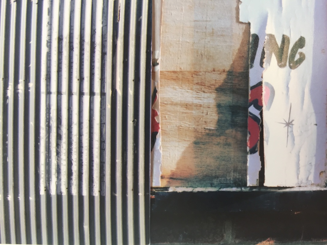
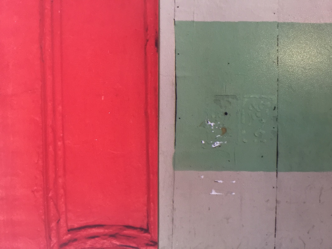
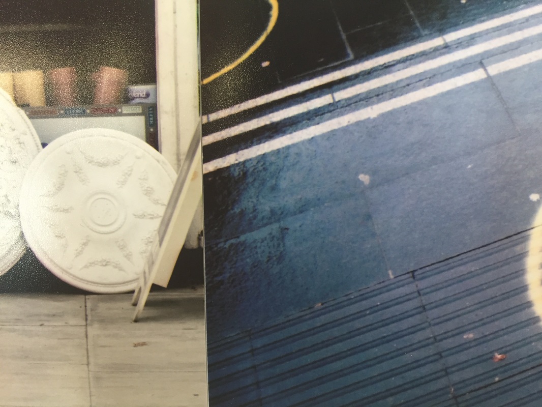
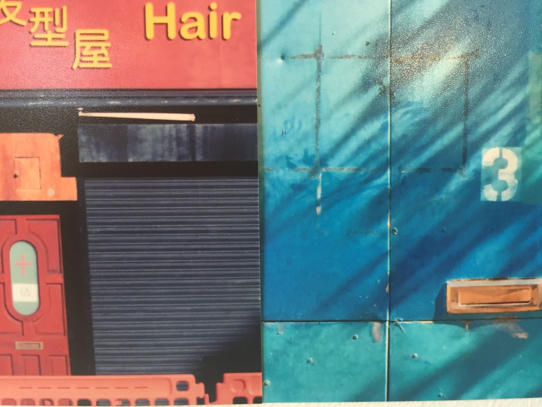
Once this final sequence had been created and documented, we cut a circle of any size out of a piece of card the size of the given photographs, and used it as a view finder. This made me think about each image in a completely different way. Rather that seeing the photograph as and image with a subject, I started to break down each image into its elements - for example, in the far right image I chose to include the right angled yellow line in one image, and the red cracked line in another. Both parts of the image were lines pointed on grey surfaces, but both surfaces have totally contrasting textures, one concrete and the other what looks like white washed metal.
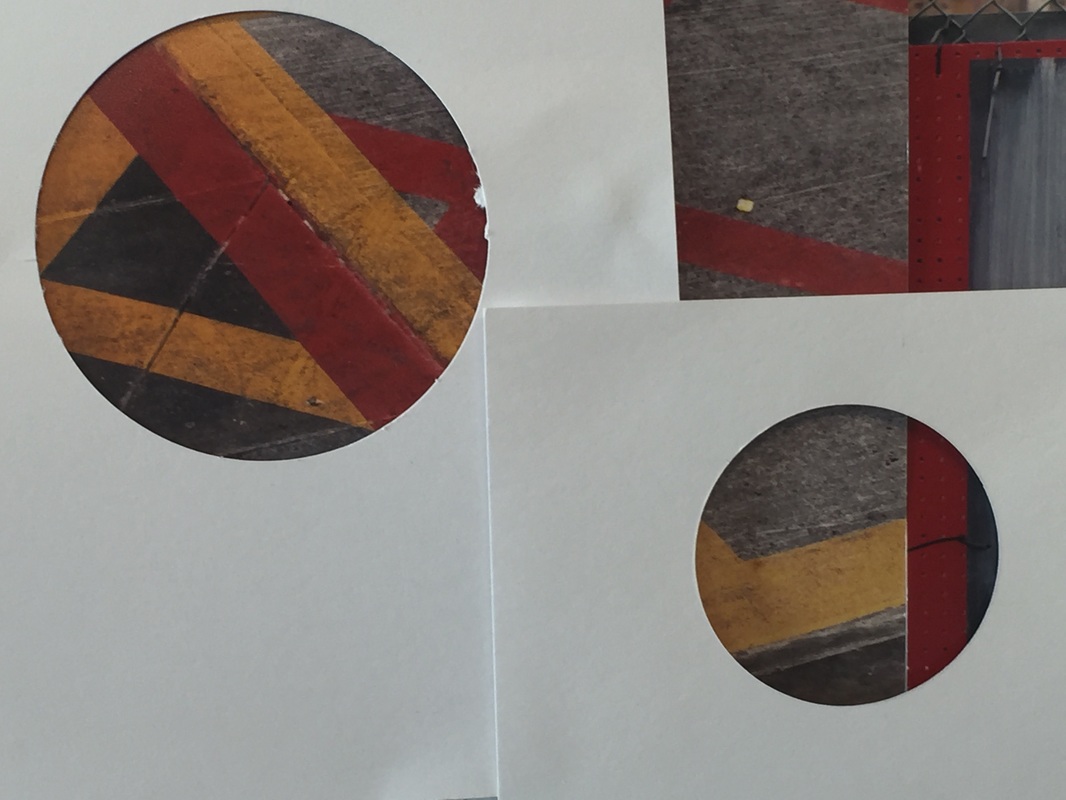
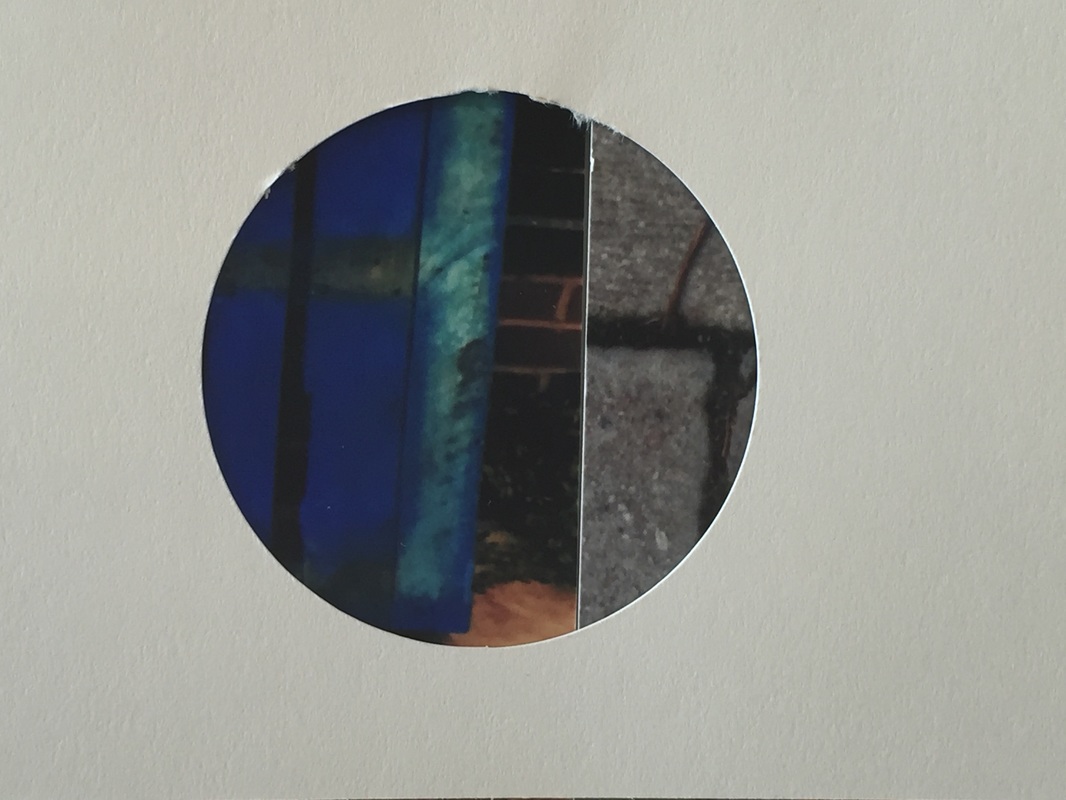
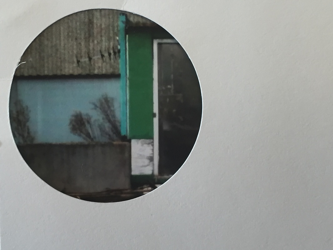
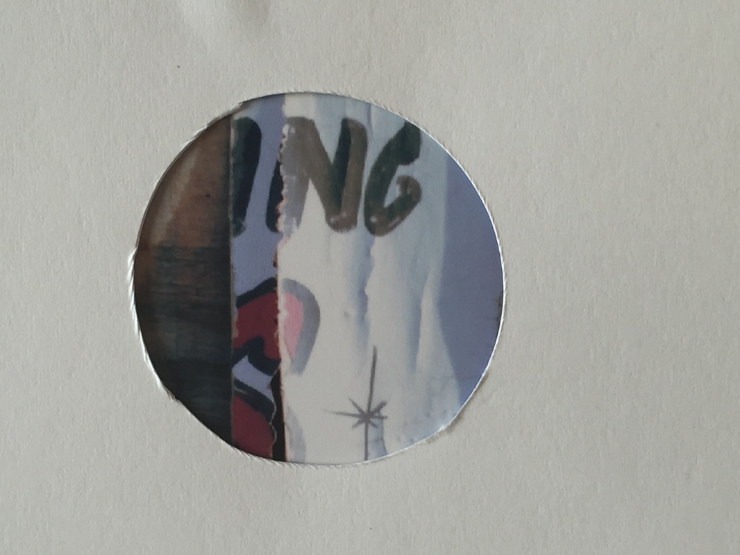
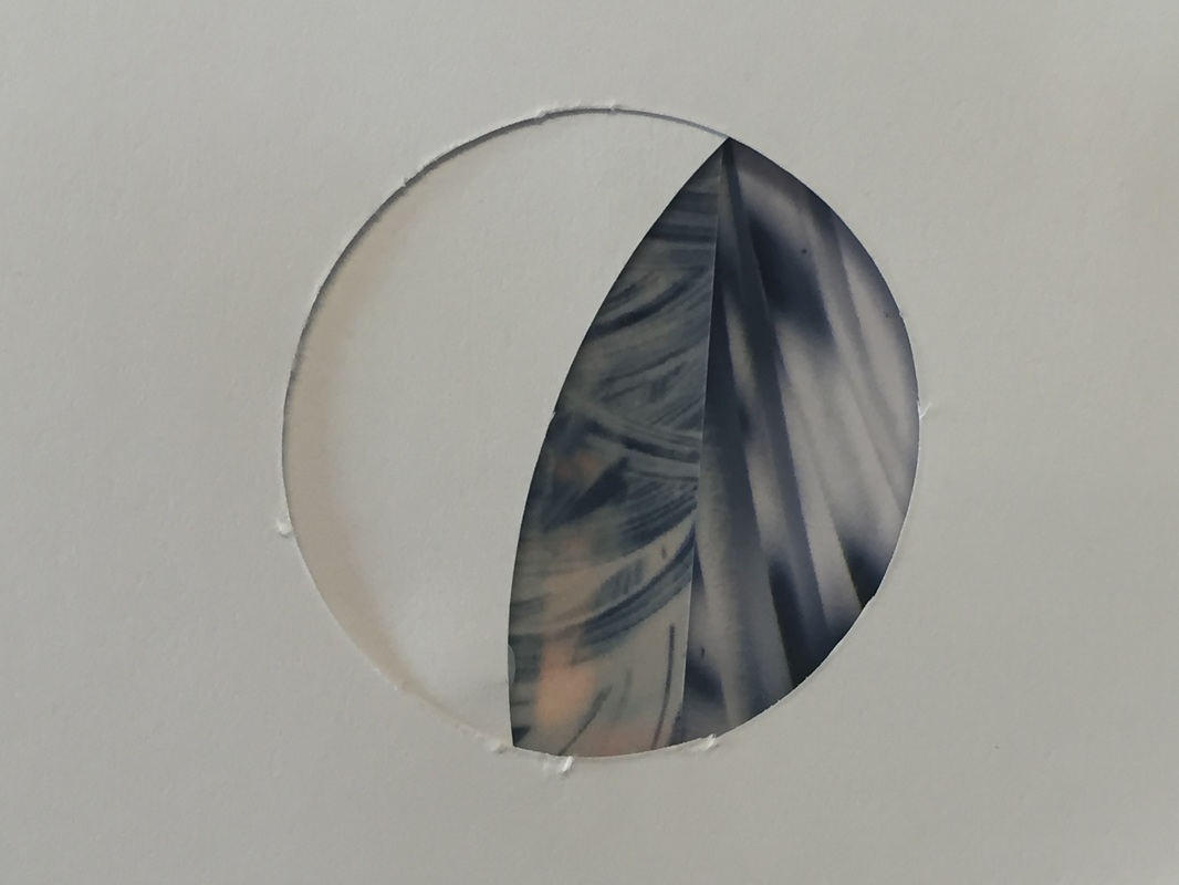
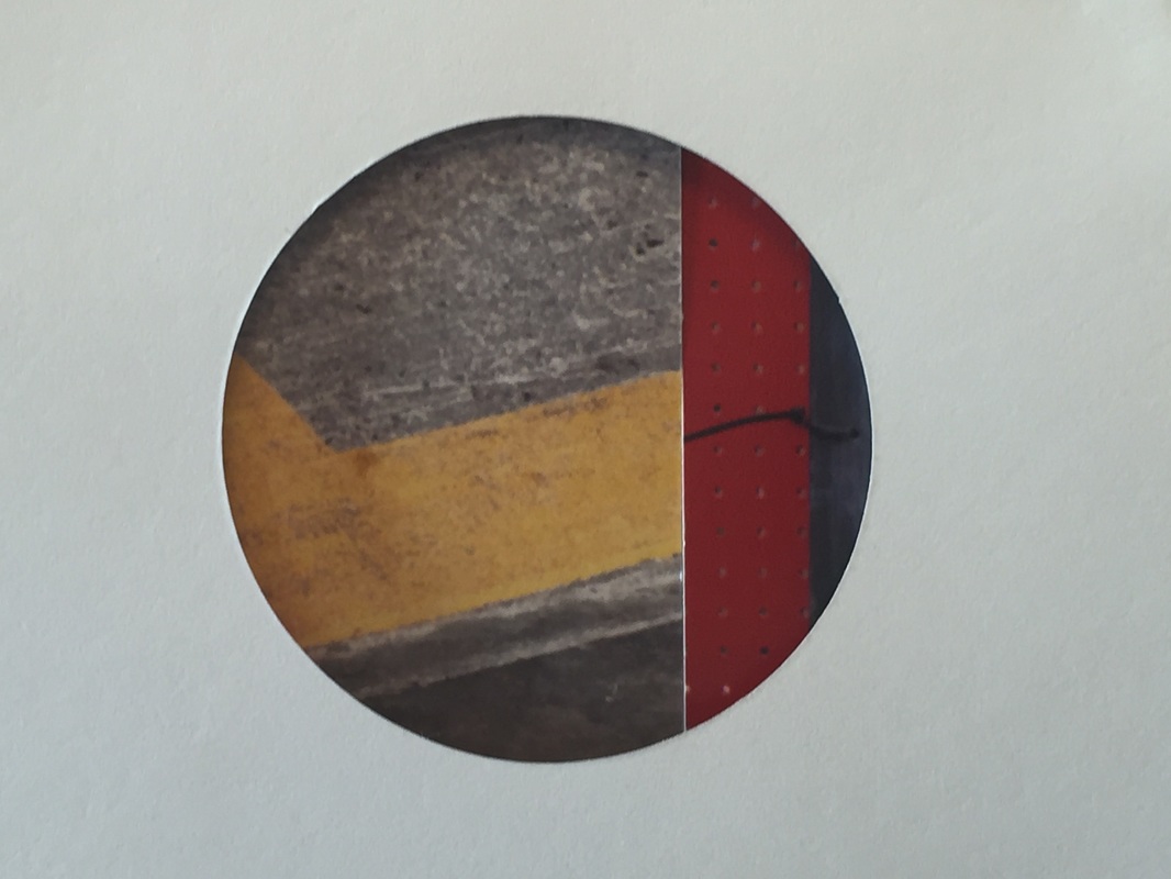
I especially like the effect the circular view finders have on each photograph as they totally shift the components and focus of the image compelling the viewer to see what you see, drawing them into the now abstract image. This can allow you to manipulate the formal elements, as I did to the image on the far left, causing the viewer to notice the contrasting colours, and overlapping lines in addition to the smooth textures over the rougher ones.
Final Outcome process
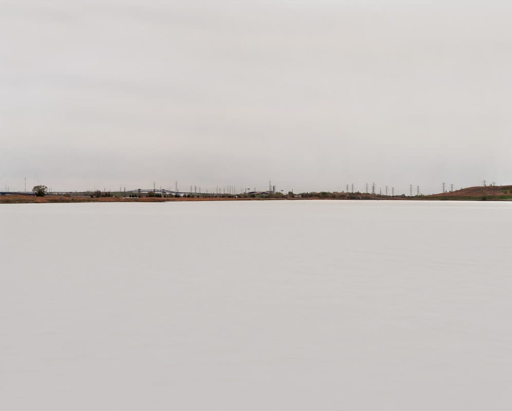
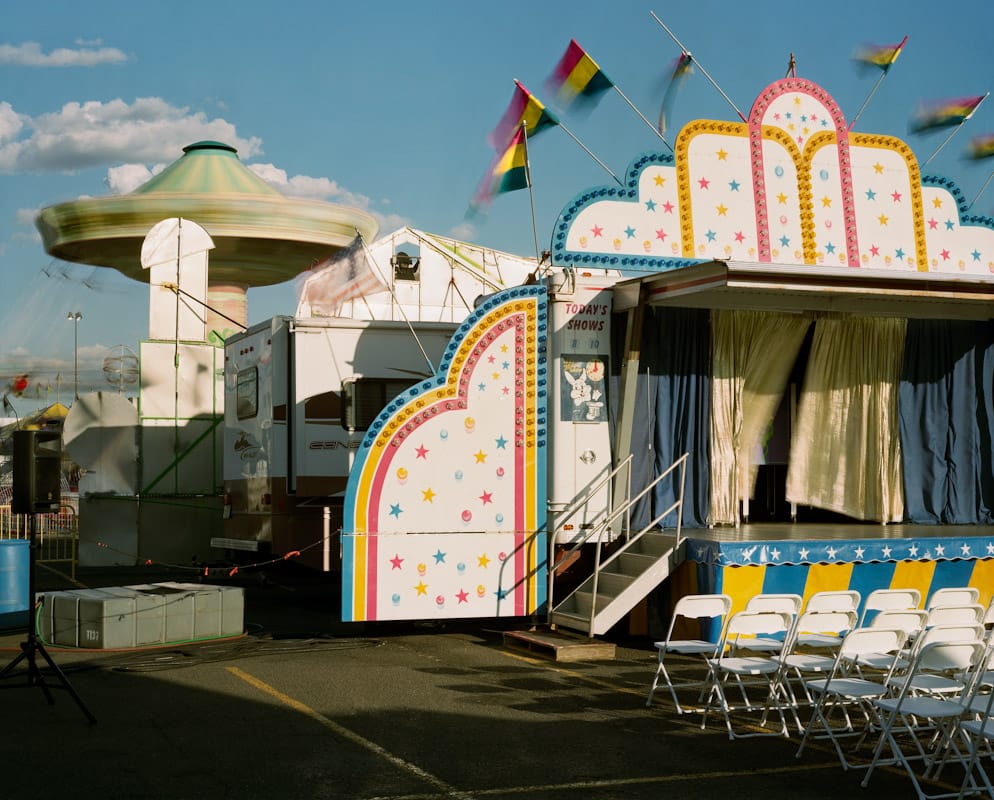
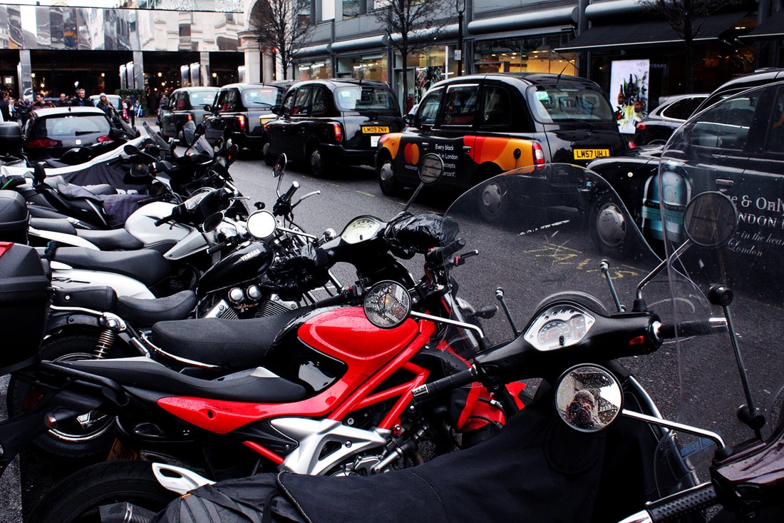
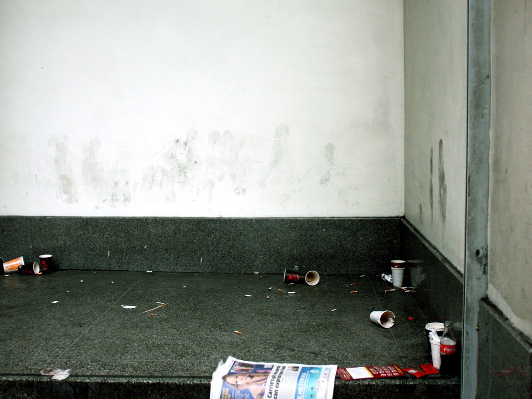
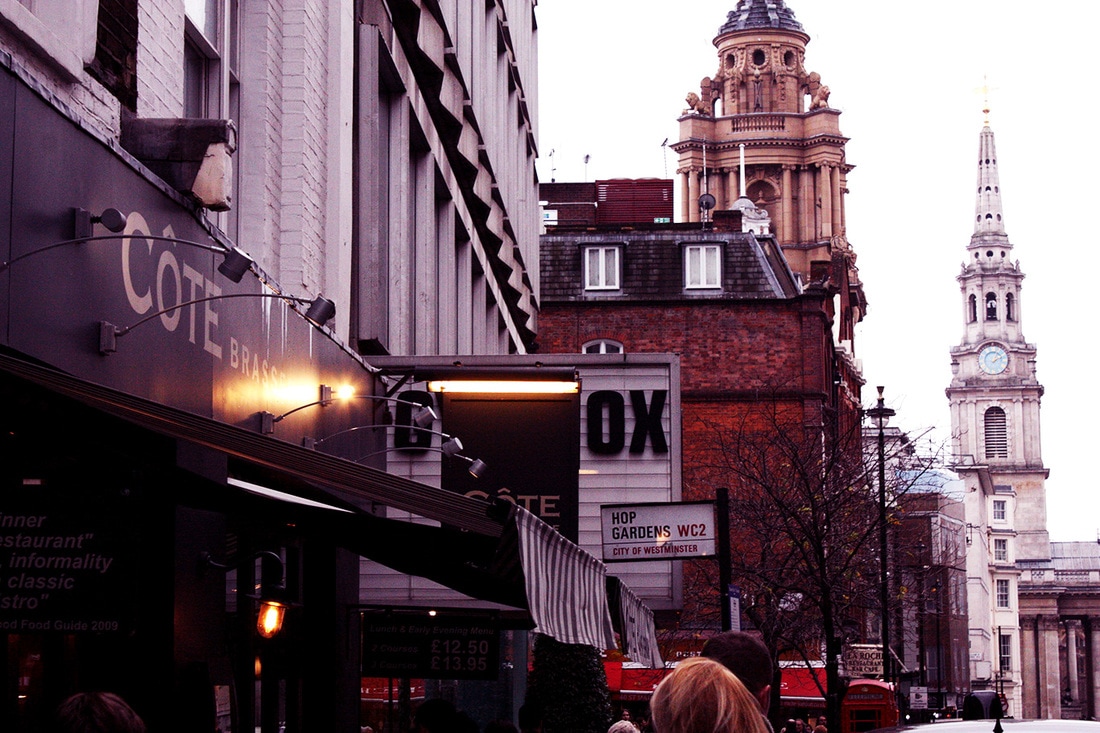
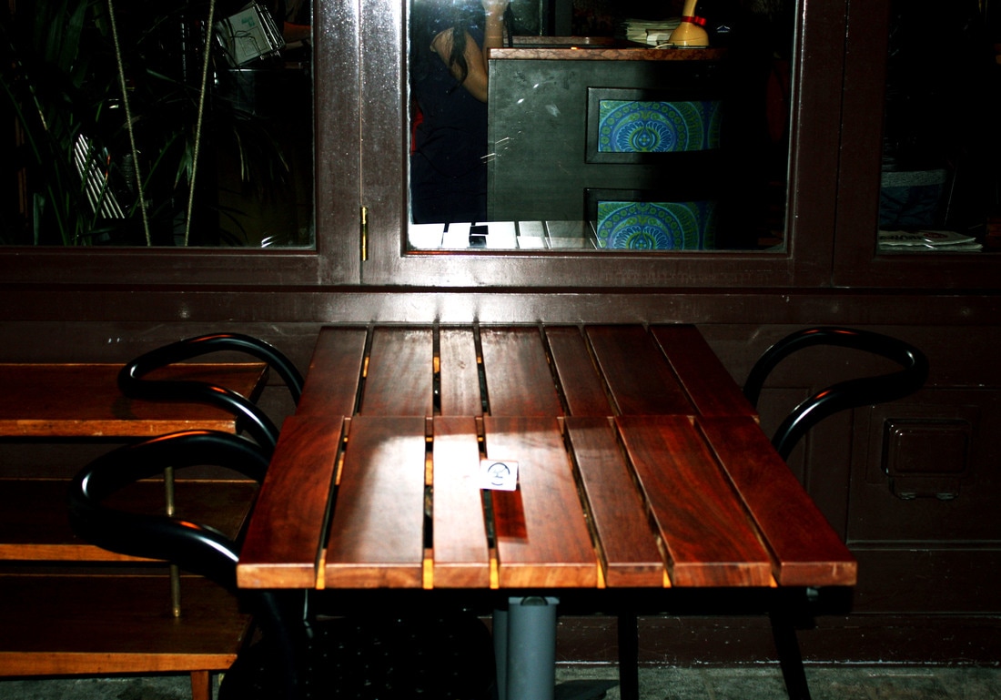
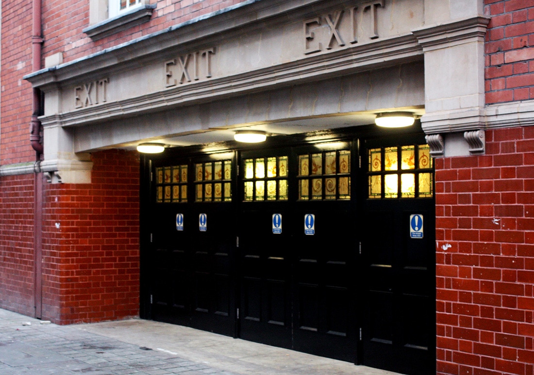
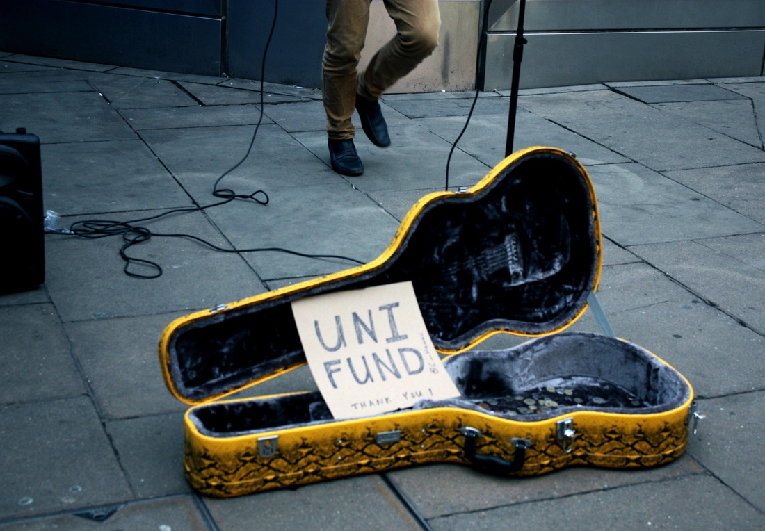
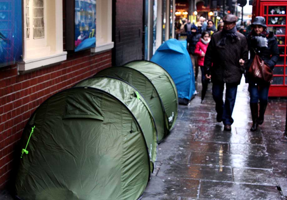
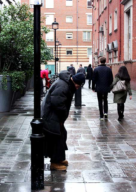
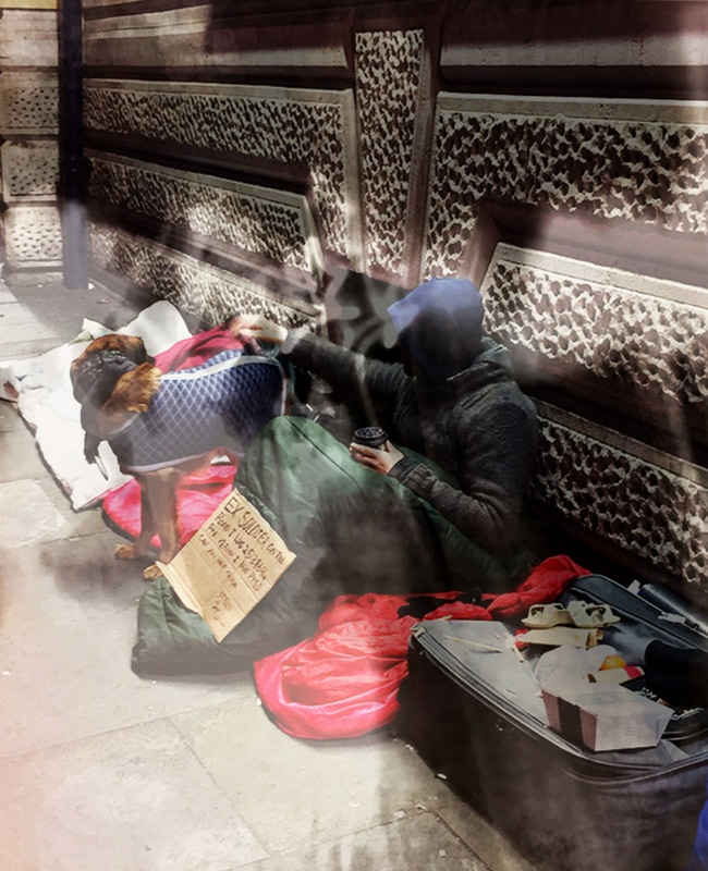
Inspired by Joshua Lutz' 'Meadowlands' book featuring forgotten places, and his 'Hesitating beauty' photobook, I began to think about ways to combine these ideas, connecting them more to intimacy. Something I have always had strong feelings about are the homeless, like the places in Mollison's book, they go unnoticed by people going from one place to another.
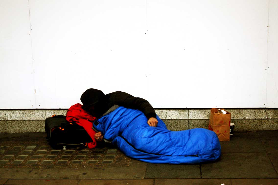
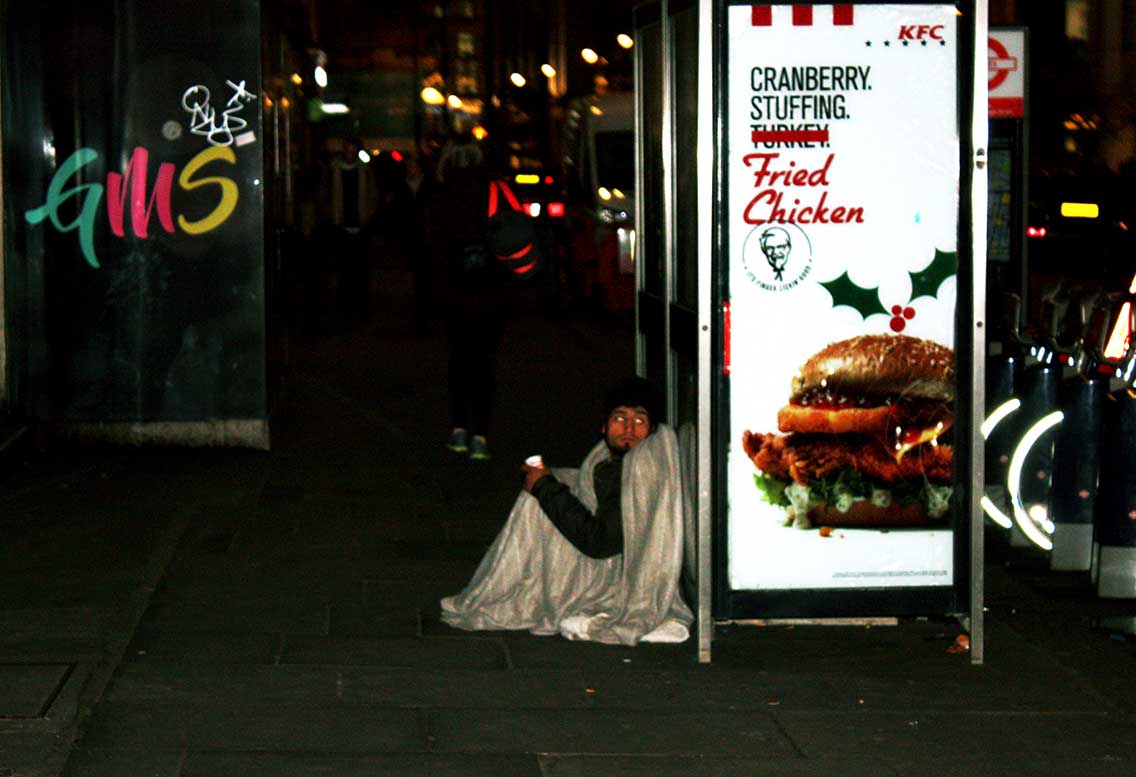
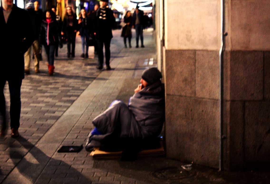
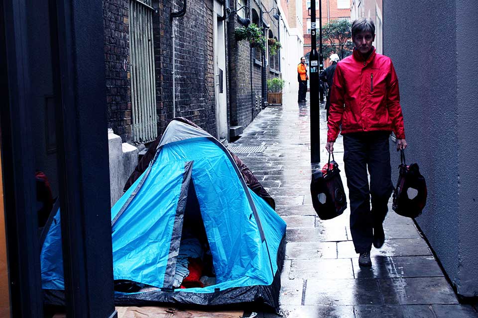
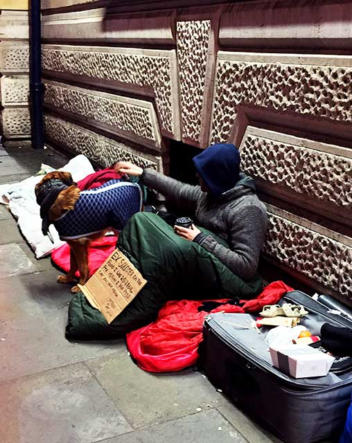
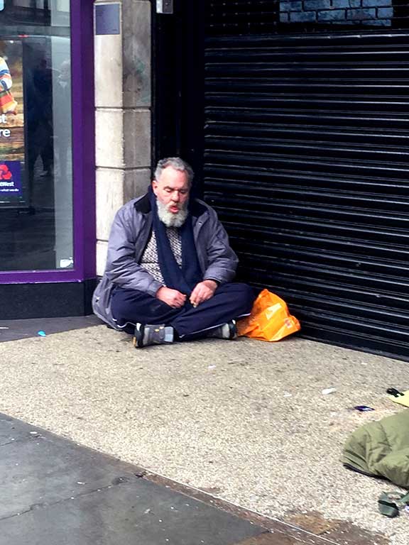
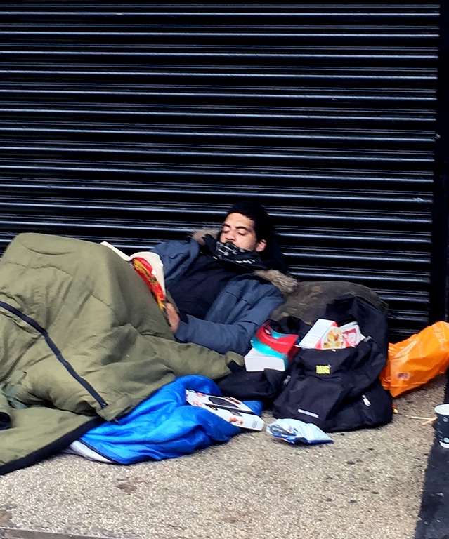
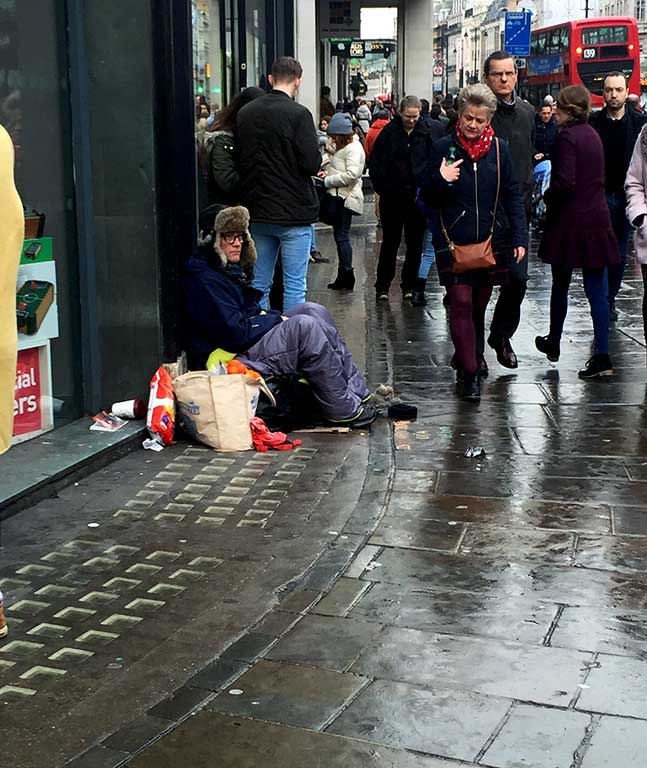
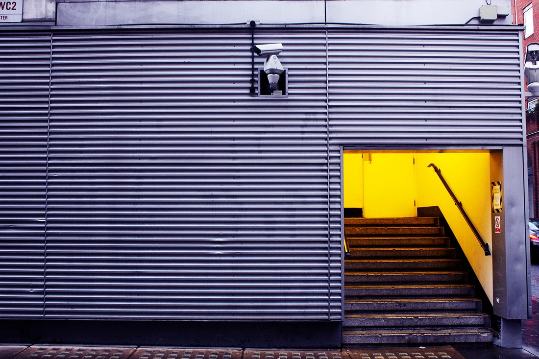
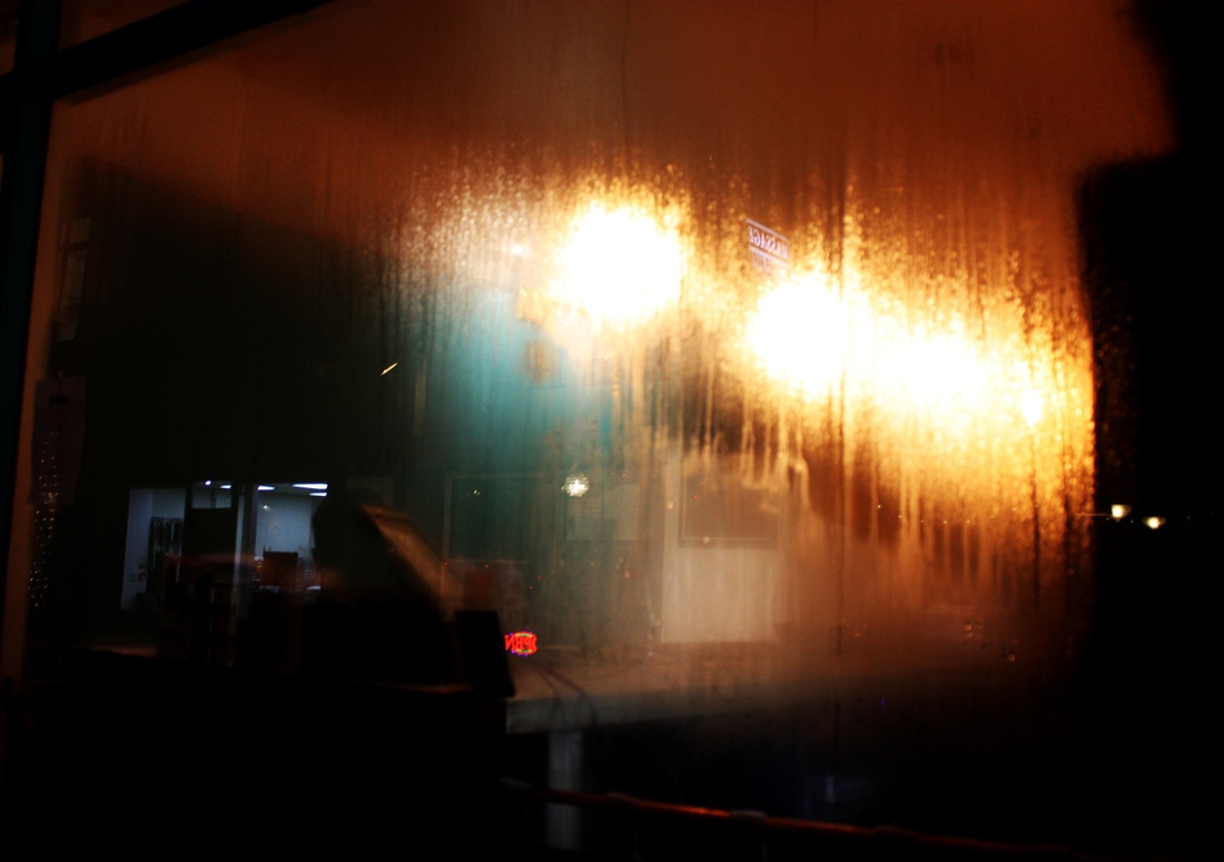
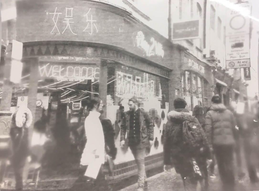
Once I had taken images - and selected my favourite ones that I felt worked well together - I began thinking about where to go with them. Looking back over my investigation so far I chose to further develop the idea of contrasting intimate images with less intimate ones. I chose vibrant images taken in Central London and began experimenting with ways to present the images together. I first did this using photograms as I thought - like polaroids - they cannot be manipulated and are permanent.
first Outcome Development:
Experiment 1:
stage 1: places photograms
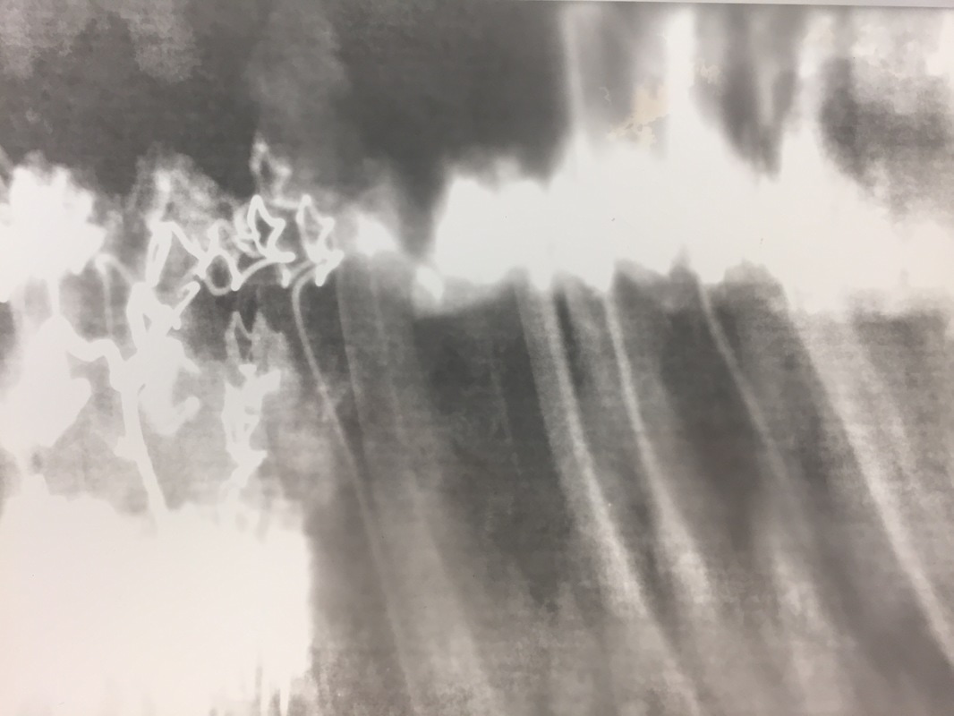
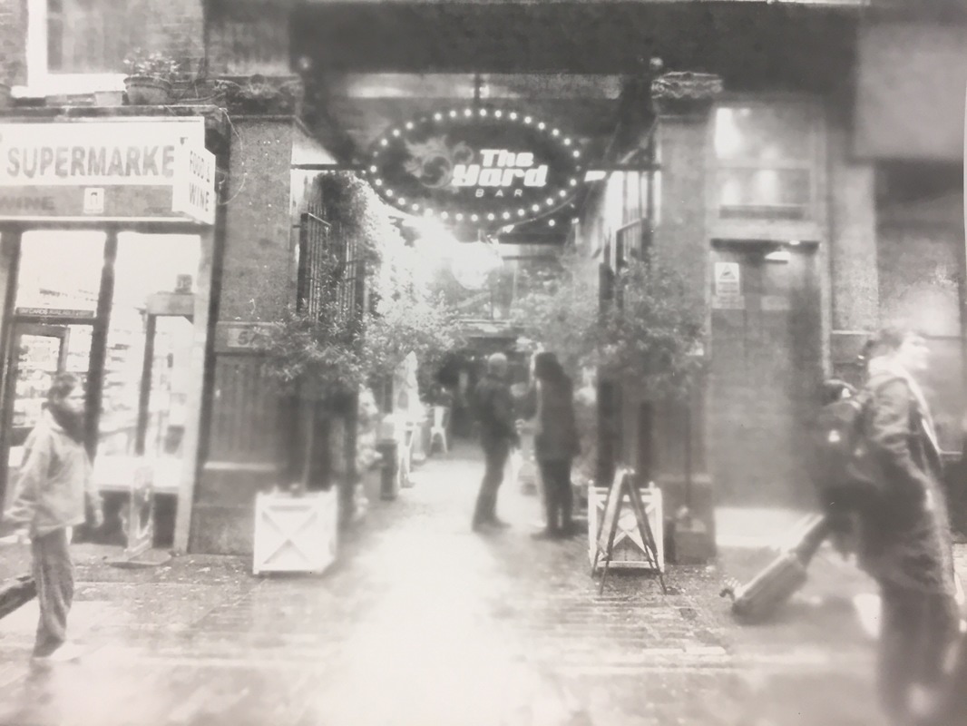
When selecting these photographs of places I was looking at which images had high contrast and had some element that lead you to focus on the element of light. I think the image on the far left and the images second to last on the right best fit this criteria and are both visually interesting. I also thing the image second to last on the left is suitable when creating this manual sort of double exposure effect as the image is both high contrast and visually interesting but also simple so when layered with another image it won't distract the viewer from the subject. When developing these images in the dark room, as they were digital images, they didn't come out as I had intended. This could have been due to the fact they were digital or the fact they were originally in colour, but they lacked the high contrast that the original images had and the reasons I chose each one.
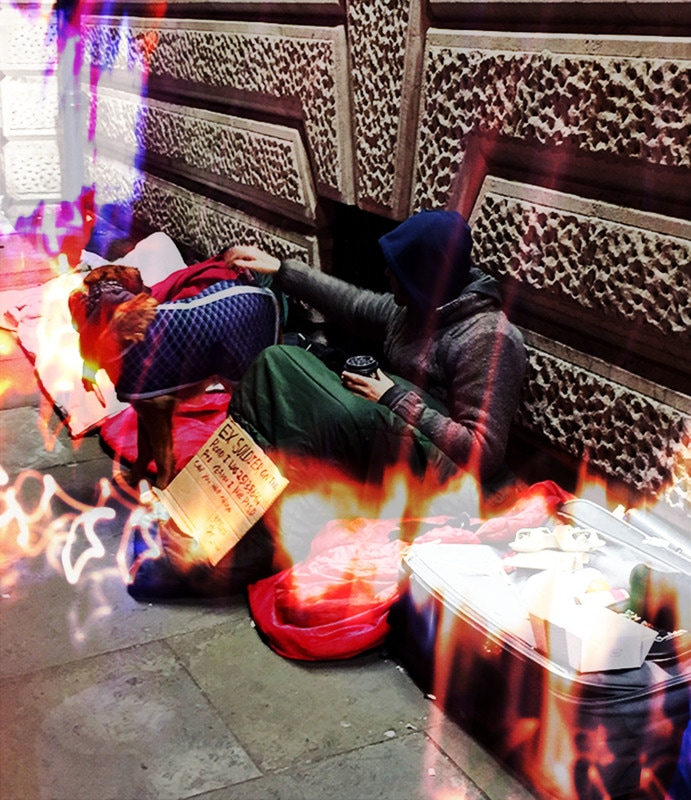
stage 2: creating photograms with intimate images of the homeless onto places
I had to try this multiple times before achieving the best outcome, but although it was the best, it still wasn't anywhere near how I envisioned it looking. I began by developing the top two images and then the bottom left one, after further experimentation I produced the bottom right image (my best outcome). This came out wonky and still not slickly merged to the background image. I realised that using a dark room was definitely not the best way to achieve a double exposed look as it simple took away from the image, so I chose to return to digital processes.
Experiment 2:
using photoshop to create a double exposure effect when overlaying colour image onto black and white image
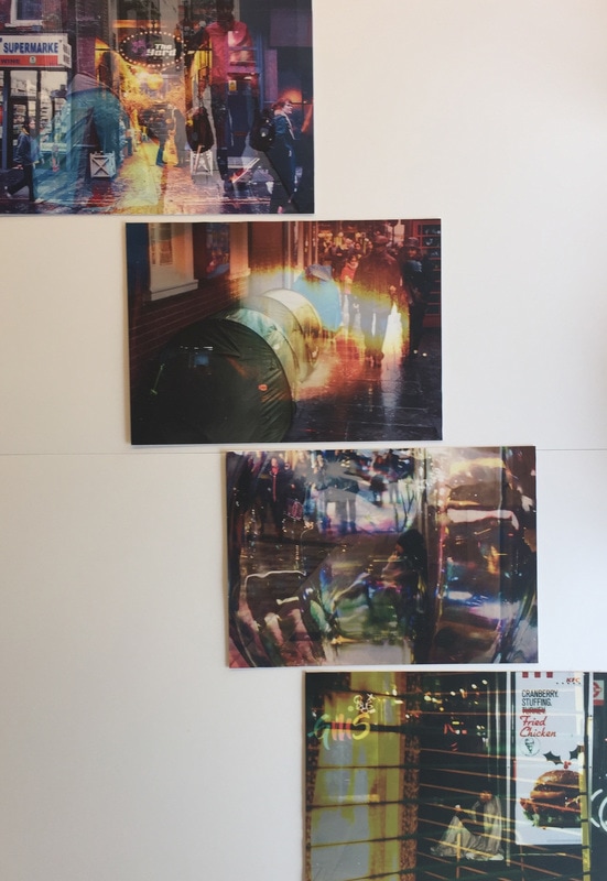
I began trying to create this double exposure/ layering effect using photoshop. I started to consider the element of colour more strongly as before I didn't consider it due to the fact I could only develop them in black and white. I chose to keep the image in the foreground in colour and put the image in the background in black and white which will allow the viewer to focus on the image in the foreground. I played around with brightness, contrast, and opacity of the images until I came out with the images above.
Experiment 3:
Attempt 2: USING PHOTOSHOP TO CREATE A DOUBLE EXPOSURE EFFECT WHEN OVERLAYING COLOUR ImAGEs
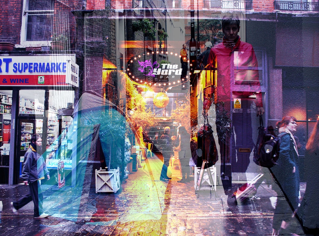
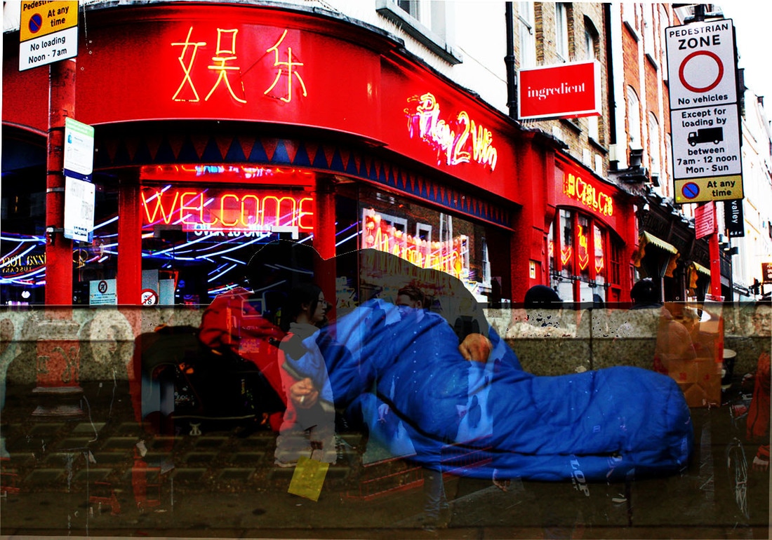
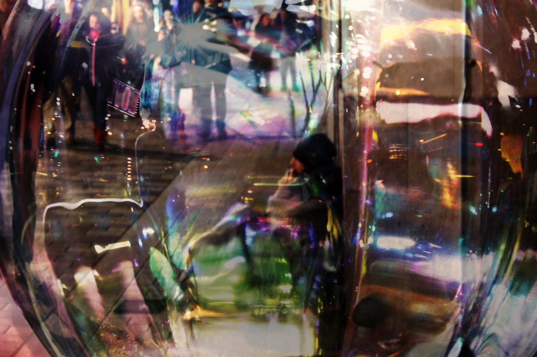
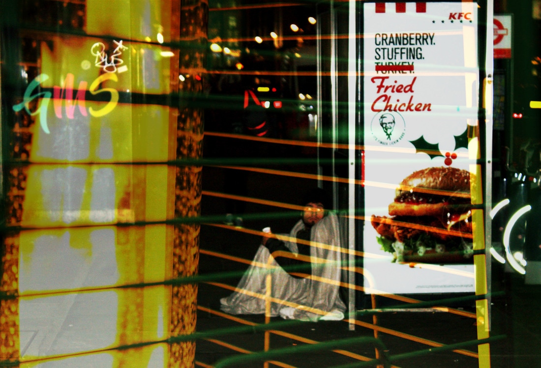
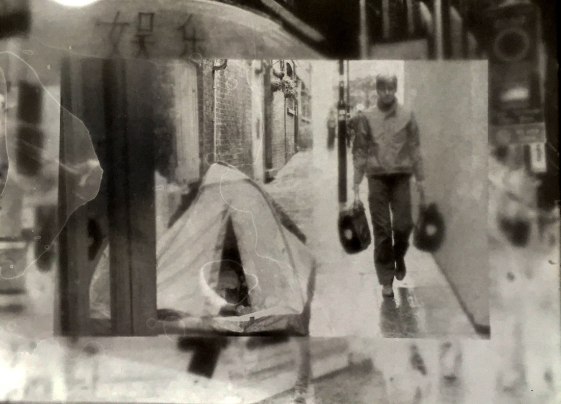
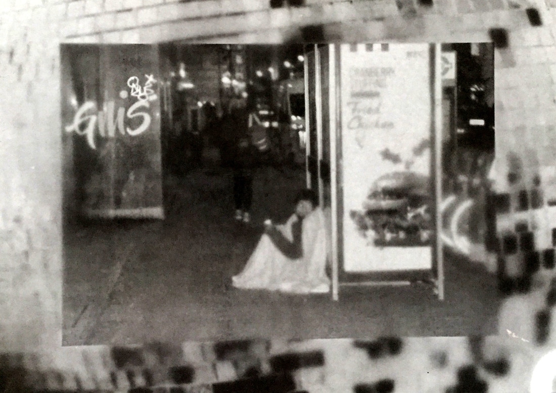
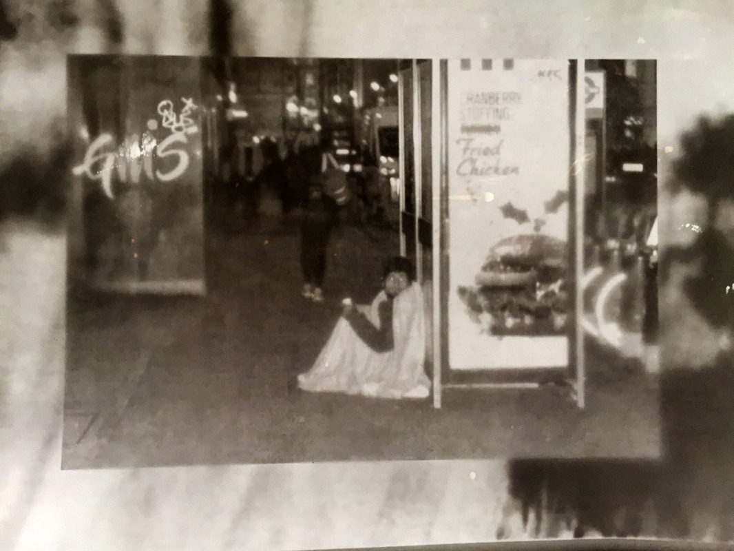
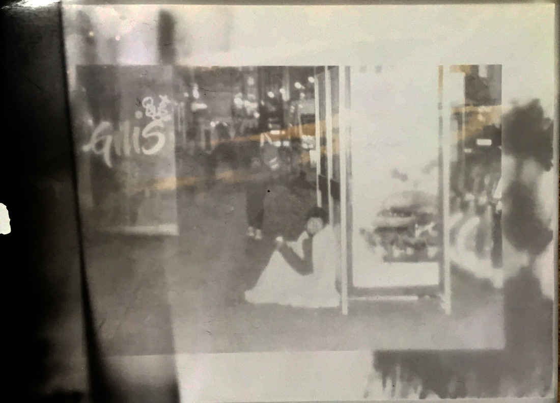
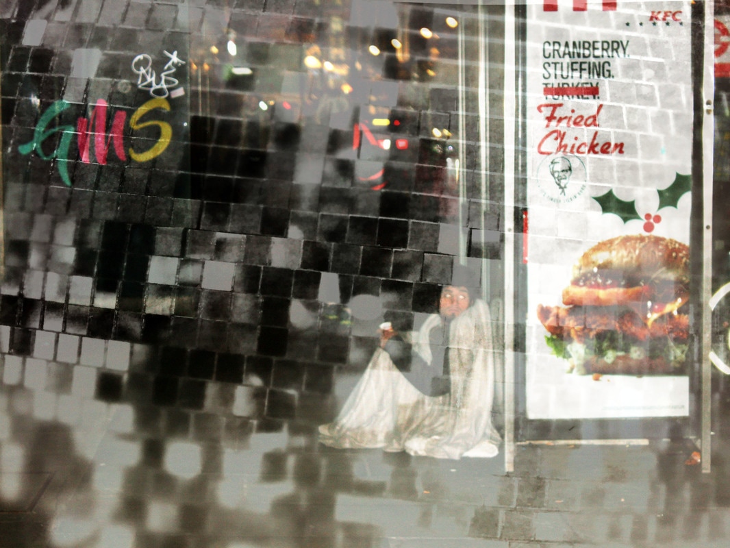
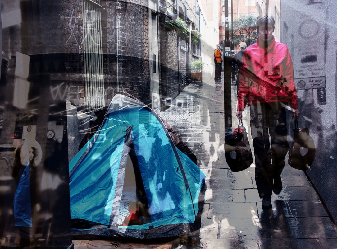
When reflecting upon the first set of digitally layered images I had created I again focused on the colour in the images. I realised that maybe the background image shouldn't be overpowered by the image in the foreground as I started to see that they were equally important. This links with Mollison's idea of capturing places that go unnoticed and reminded me how I wanted to portray this through the idea that the homeless also go unnoticed. With this, I realised that the contrasting image in the background should almost overpower the subject in the foreground. As a person walking through central London, the bright lights and striking scenery do overpower the people you see who have to live on the streets, and who don't have homes. I want my viewers to see that in reality these people should be what is striking to a person, not the material things around them. I feel like this series of images I have created show this in their own way.
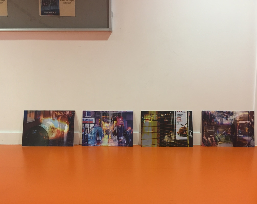
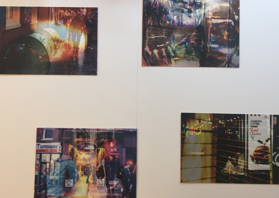
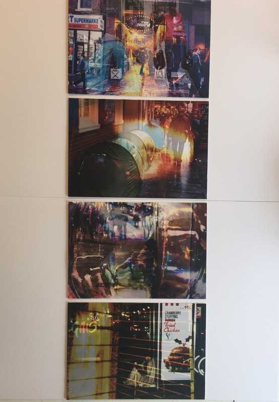
I like that the bright, high contrast images in the background almost take away from the intimacy that these images of the homeless bring as an image on their own. This series portrays the ignorance of the public and the concept that 'ignorance is bliss'. Although this strays from my initial intention of having contrasting images to provoke a reaction from the viewer and create a more contraversial meaning the the newly combined images, I instead used this technique to reinforce an ignorance that is already there. In a way this makes the series far more intimate and relevant to my theme as instead of provoking a response out of controversy, these images simply open the viewers eyes to their unconsciousness of this reality.
I like that the bright, high contrast images in the background almost take away from the intimacy that these images of the homeless bring as an image on their own. This series portrays the ignorance of the public and the concept that 'ignorance is bliss'. Although this strays from my initial intention of having contrasting images to provoke a reaction from the viewer and create a more contraversial meaning the the newly combined images, I instead used this technique to reinforce an ignorance that is already there. In a way this makes the series far more intimate and relevant to my theme as instead of provoking a response out of controversy, these images simply open the viewers eyes to their unconsciousness of this reality.
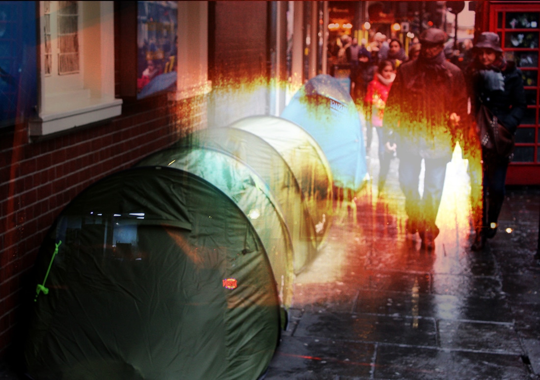
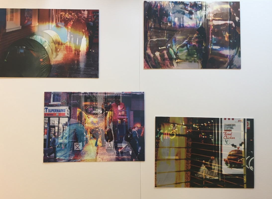
Playing with presentation:
I thought of a lot of different ways to present these four images, trying to convey the concept behind them not only through the images but also how they're displayed. I considered placing them on the ground against the wall to enhance this idea of being unnoticed, but I realised that I don't want these images to go unnoticed as I want the viewer to realise their ignorance. After thinking of abstract ways to present them I decided the I should simply present them in a conventional, formulaic way (like the image on the far right, and second to left). This will set an expectation for the content of the images, so when the viewer looks at them properly the photographs subject will become more striking.
